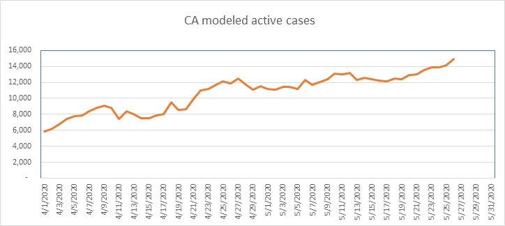
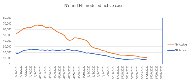
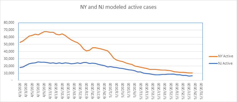
I estimate that NY has less COVID than CA
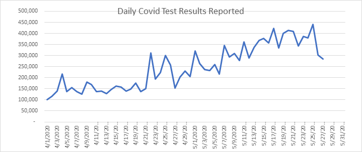
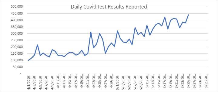
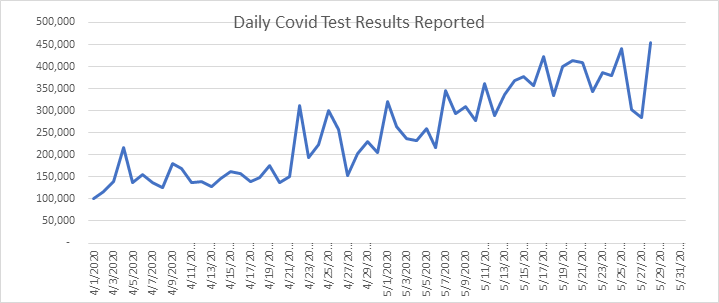
Things continue on track — COVID is receding at a good pace. Everything is looking good, other than California and Virginia, but Virginia shows a decline today – just one day, but better than the alternative. Record tests were reported today – over 450,000! – 95% were reported negative, a very good number.
I continue to think that with COVID declining quickly, that these reports are no longer useful. However, the press hasn’t received the memo yet, and nearly all headlines are still inaccurate and overwhelmingly negative, so I’m determined to keep producing these until the news catches up with the facts.
As always, feel free to send me your questions about my assumptions, methodology, or modeling in general.
- Likely date of active case peak (Chalke modeling): April 10
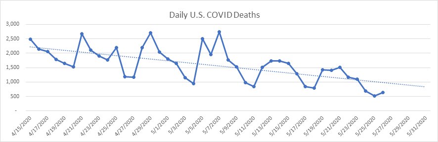
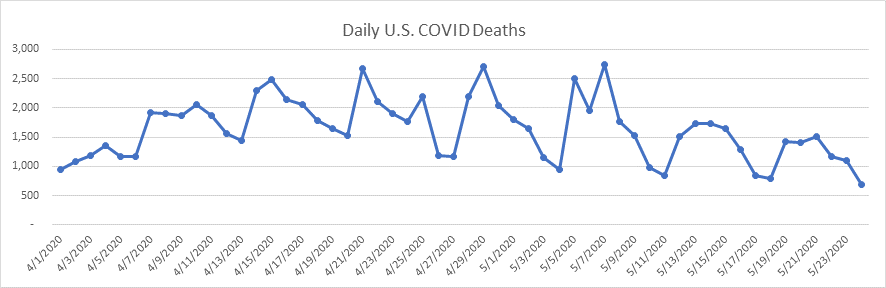
- Likely date of peak deaths (IHME): April 15 (last revision on May 26)
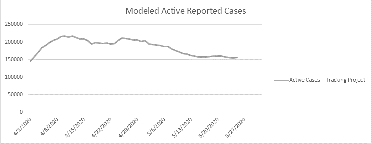
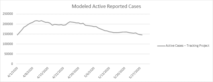
- Short term projection for active cases tomorrow: 143,000
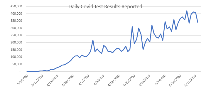
- Total Test Results reported today: 453,560 (record high)
- Total Pending tests reported today: 1,906 (very low)
- National reported case Growth Rate today: 1.36% (very low)
Shane Chalke Interviews
Website
Groom Ventures has agreed to host a website that will archive my daily reports, and supplement with other commentary. John Groom worked at one of my companies back in the day, and is an excellent writer. The website is: www.howmuchrisk.com For those of you that post my daily report on Facebook, let me suggest you link to this site, as the direct Facebook posts don’t seem to copy the graphs.
Daily Analysis
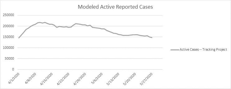
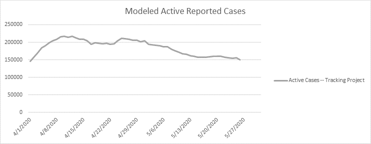
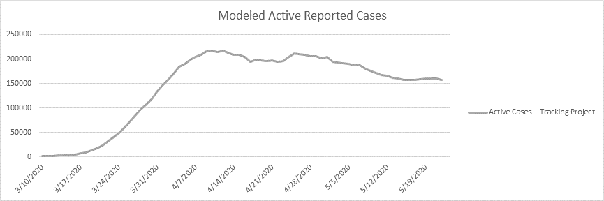
Here is the national picture of active cases – another decline today down to 145,000. We’re down 33% from the peak. I projected a few weeks ago that we’d be down 50% by the end of May. With the issues in CA and VA we might not make it, but we’re heading there. I now model known active cases at a tiny sliver of the U.S. population – about 0.043%.
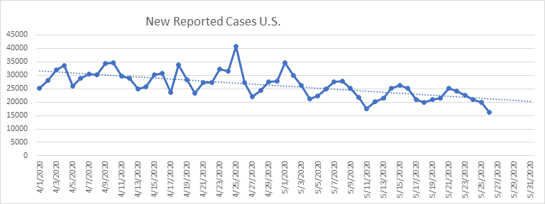
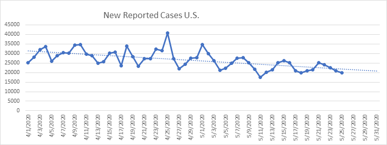
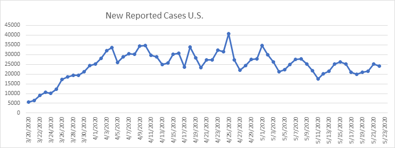
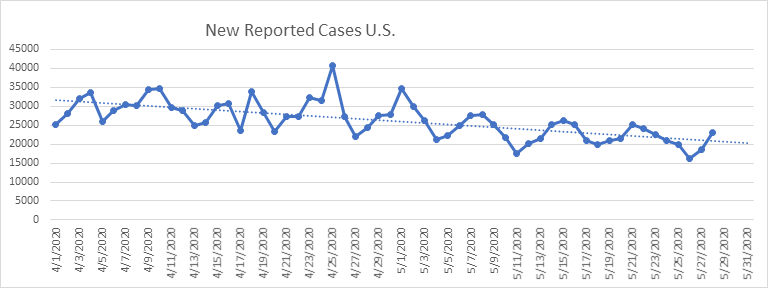
Here are the new reported cases nationally. All still tracking in the right direction. Thursday is usually a big day for reporting, so I think all is tracking well.
Here are the daily reported tests. A new record set today – we must be testing a lot of asymptomatic people now. It’s the only explanation. As a result, I think the number of undiscovered cases as a percentage of reported cases must be falling.
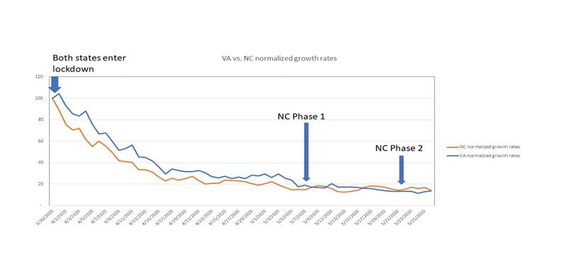
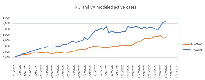
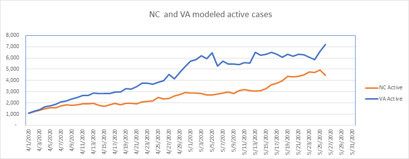
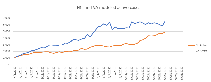
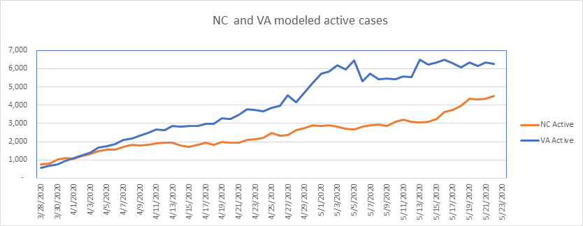
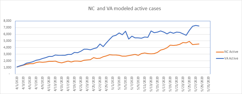
On to the states. VA and NC are diverging recently, even though NC is in Phase 2 and VA hasn’t substantially entered Phase 1 yet. We see a small drop in VA today, which is hopeful.
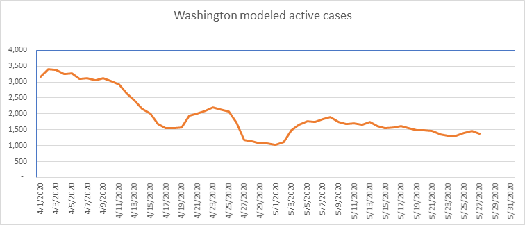
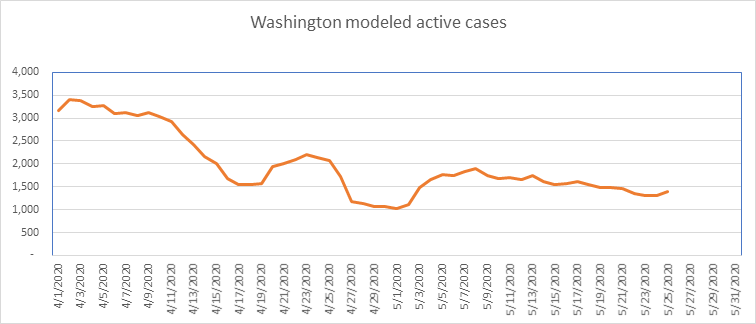
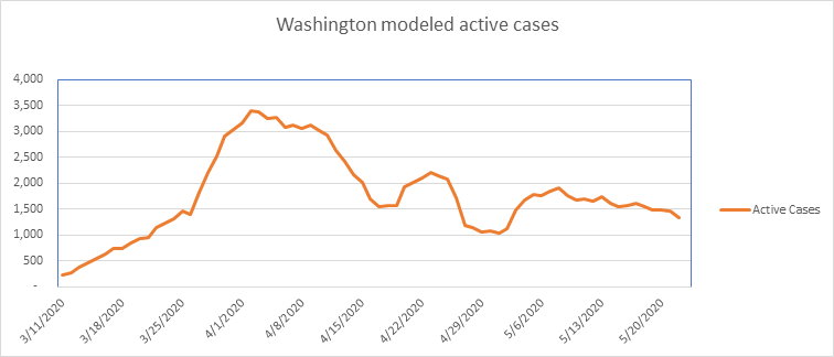
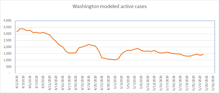
No surprises with Washington – long slow decline – total remaining cases are small – about 1400. It’s so small that it’s not really worth reporting on, but Washington was an early hot spot, so we’ll continue with it until the end.
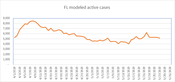
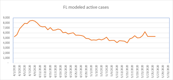
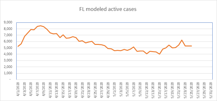
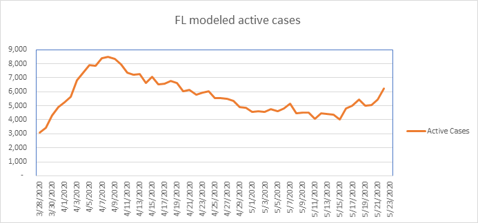
Significant drop in Florida today. Florida is now down 46% from the peak. The hot spot in Florida continues to be Miami. Other than in SE Florida, COVID presence is small.

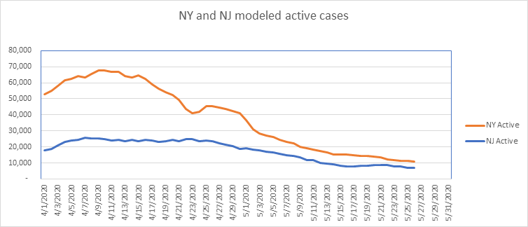
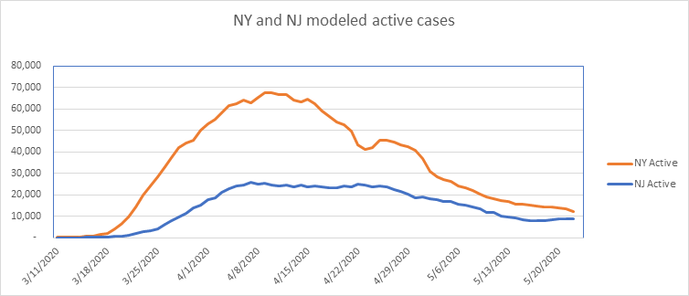
Here are NJ and NY. Both continue to decline. I estimate that NY now has only about 10,000 known cases left, which is less than the active known cases in California. NY is now down 85% from the peak, which is remarkable. Both states are recovering well. It’s commonly thought that NY will be one of the last states to open up, as they were hit so hard. But with only 15% left, I disagree with this.
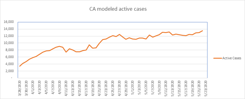
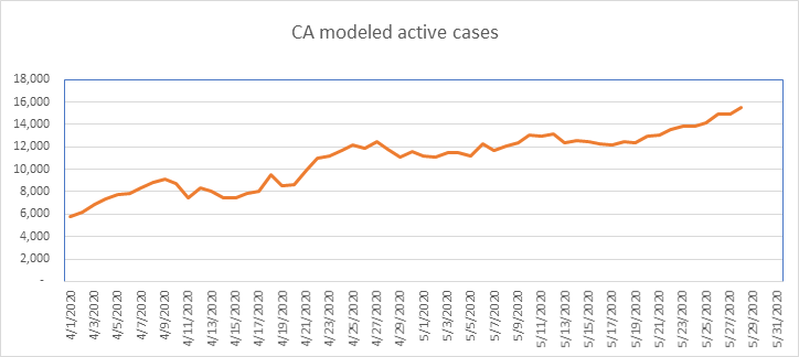
California has problems in Los Angeles, which is skewing the entire state’s numbers upwards. Overall, California continues to increase, but still smaller than NY on per capita basis.
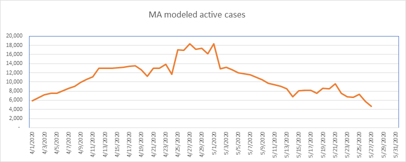
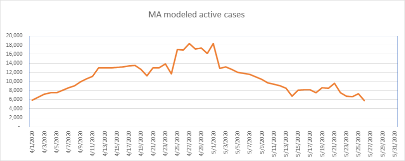
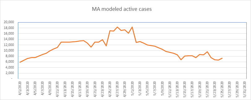
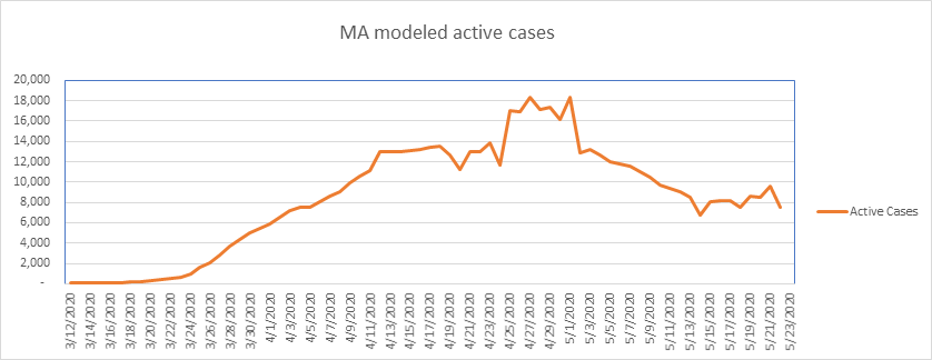
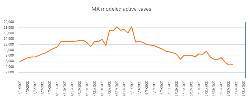
Massachusetts continues to do well, with a remarkably rapid recovery. MA is flat today, with 2 days of reporting – expect another drop tomorrow.
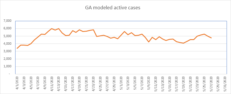
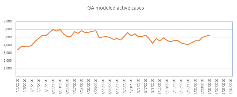
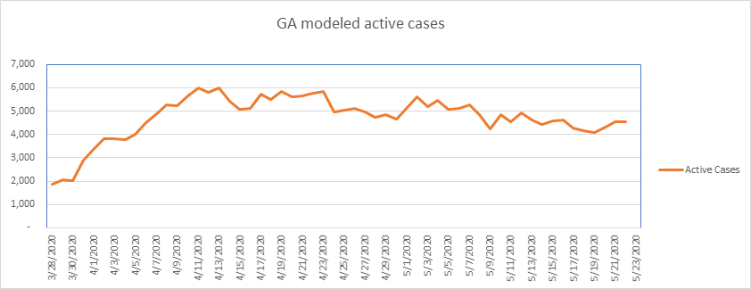
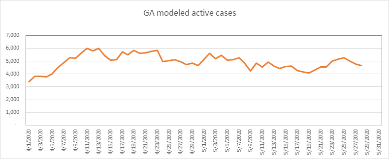
Georgia shows another decline today, now down 22% below the peak.
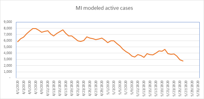
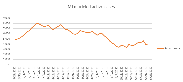
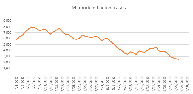
Another drop in Michigan today. Michigan is down 68% from the peak on April 6th.
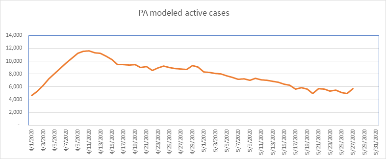
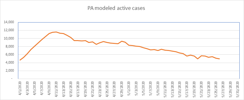
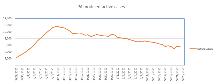
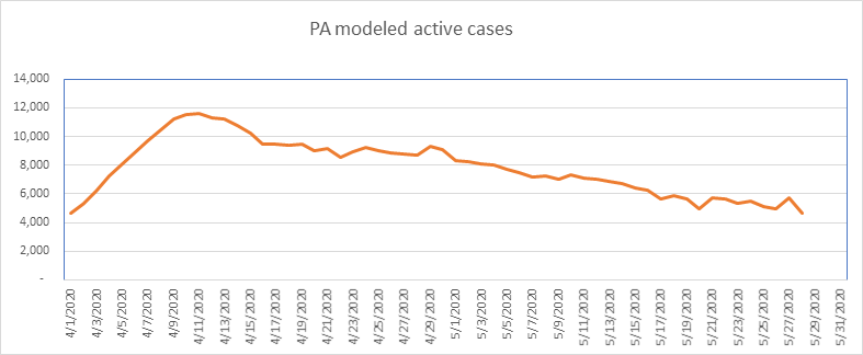
A drop in Pennsylvania today, now 60% below their peak.
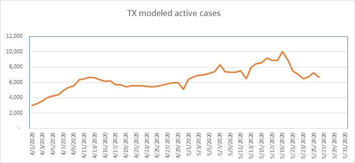
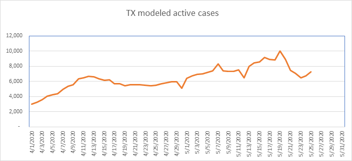
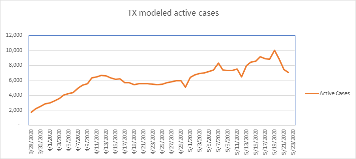
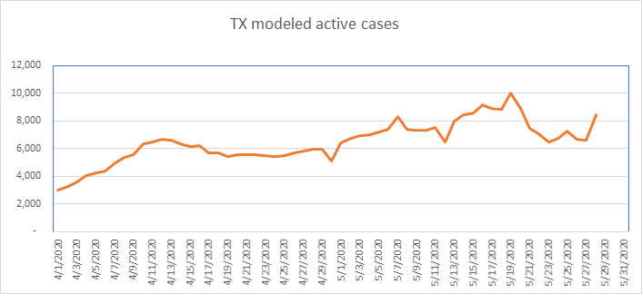
A significant increase in Texas today. I believe Texas peaked on May 19th. Texas has a small COVID presence per capita.
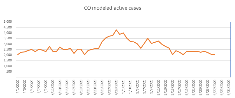
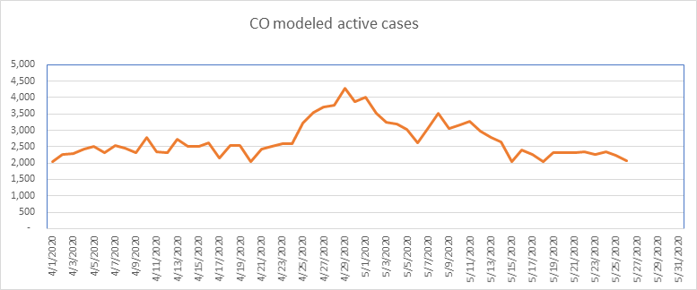
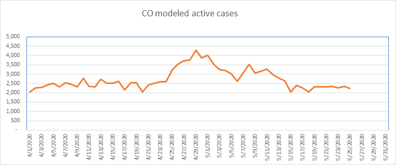
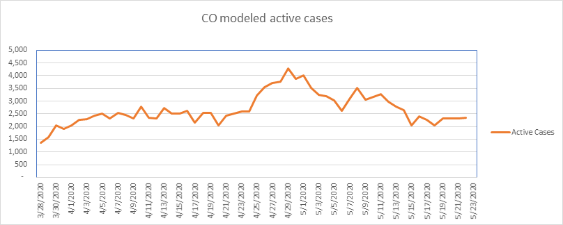
And finally, here is Colorado. Colorado is one of the states that has had aberrations in their data. In any event, it looks like Colorado is about 54% below the peak on April 29th.

So that’s it for today. The numbers are very small as a percentage of the population. Unless you’re in a high density area, your chances of contracting COVID are very small. However, even though the probability is very small, that doesn’t help if you’re the one catching it. Everyone please continue to be as cautious as circumstances dictate.
–Shane Chalke, FSA