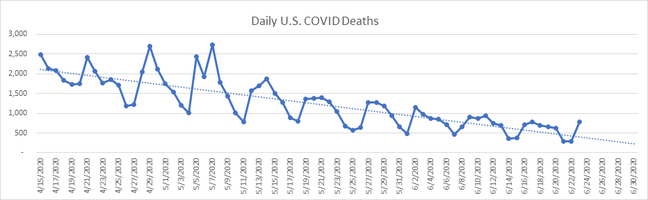
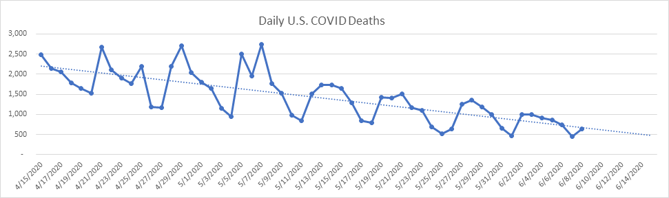
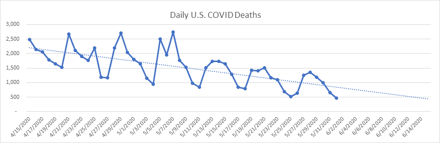
I wasn’t going to report until tomorrow, but when extraordinary things happen in the data, I feel compelled. So, I was doing my daily inspection of the numbers, and noticed that national deaths increased by 2,500. With daily deaths under 1,000 for 23 days in a row, this didn’t seem believable. I examined each of the states, and voila, there it was – NJ increased their death count today by 1,877. What? NJ only has about 2,000 active cases left, so how is this possible, I’m thinking! Well, today is the day that NJ began reporting “probable” deaths in addition to confirmed deaths. Today they reported just 23 confirmed deaths but 1,854 probable deaths. Of course, it’s impossible that 1,854 people probably died today from COVID. To report these numbers, department of health workers have been combing through data for weeks, going all the way back to late winter. I have no problem with this, but the new “probable” deaths are all reported today, and I guarantee that tomorrow you’ll see at least some headlines which say “largest daily death count in two months!”. Most states don’t even report probable deaths, but many do. In my analysis below, I’ve corrected for the 1,854 probably deaths in NJ. Eventually, the COVID Tracking Project will likely correct for these as well, as they have with some other states in the past.
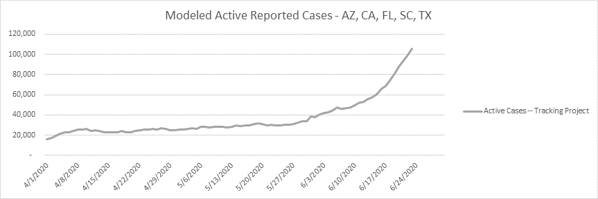
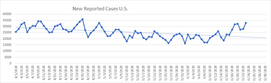
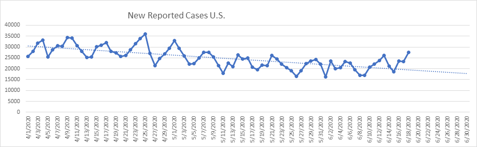
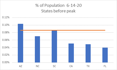
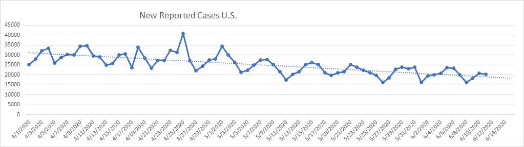
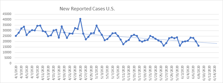
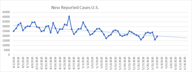
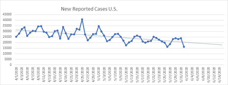
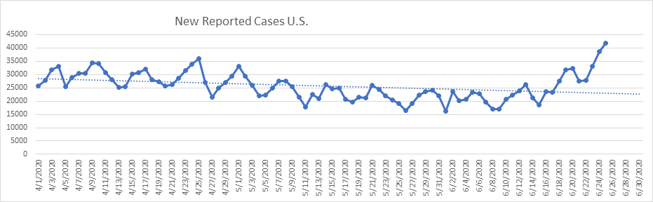
Today we set a record for new reported cases. Today’s new case count came in at 41,939. These numbers are pushed up almost entirely by 5 states: Arizona, California, Florida, South Carolina, and Texas. 20,530 new cases came from these 5 states alone today – 49% of all new cases. These are the states to watch. For the past two days, Arizona and California look marginally better. But I don’t like the looks of FL, SC, and TX. Also, if we don’t see a change in the next couple of days in GA, I’ll add that to the “problem” list.
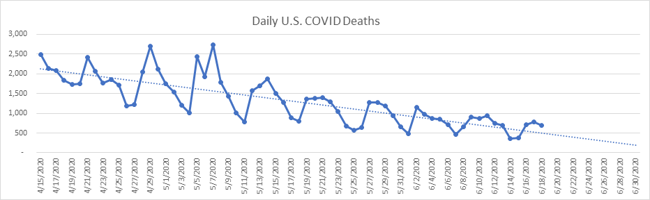
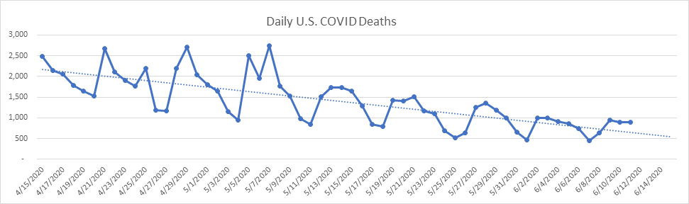
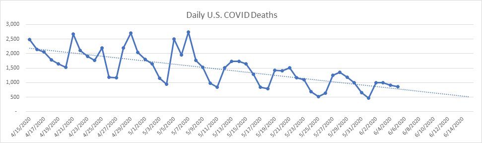
Deaths, on the other hand, continue their downward trend, with 646 deaths reported today (other than NJ’s historical probable deaths). National cases have been on the rise for 2 weeks now, yet we see no increasing trend in daily deaths. We may yet see real increases, but not so far. I’m now thinking that this divergence between reported cases and deaths is a result of:
- We’re testing people who are less ill as the testing protocol widens
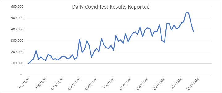
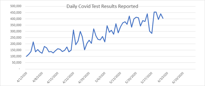
- General expansion of testing (we hit a new national record today)
- We’re testing a younger demographic, and younger people are becoming infected at a higher rate than previously (their mortality rate is close to nil)
- Double counting of cases is increasing, including antigen and antibody tests, as well as PCR tests – we know that AZ, CA, TX, and SC double count cases
I’ll possibly report again tomorrow, or if no news, after the weekend…
As always, feel free to send me your questions about my assumptions, methodology, or modeling in general.
- Likely date of active case peak (Chalke modeling): April 10
- Likely date of peak deaths (IHME): April 16 (last revision on June 24)
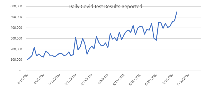
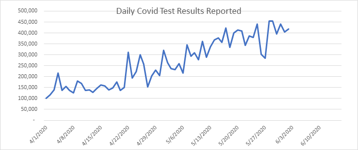
- Total Test Results reported today: 640,465 (a new record)
- Total Pending tests reported today: 2,133 (extremely low)
- National reported case Growth Rate today: 1.77% (low)
Shane Chalke Interviews
Website
Groom Ventures has agreed to host a website that will archive my daily reports, and supplement with other commentary. John Groom worked at one of my companies back in the day, and is an excellent writer. The website is: www.howmuchrisk.com For those of you that post my daily report on Facebook, let me suggest you link to this site, as the direct Facebook posts don’t seem to copy the graphs.
Daily Analysis
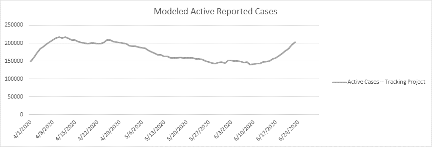
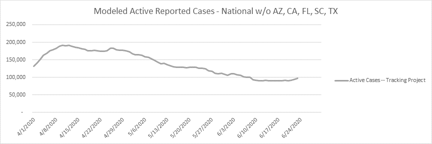
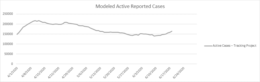
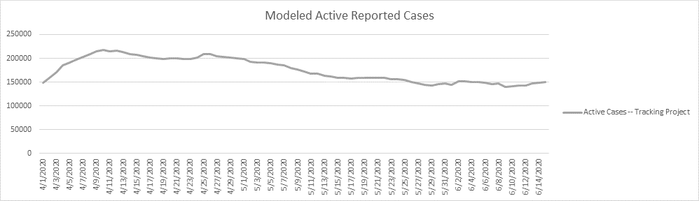
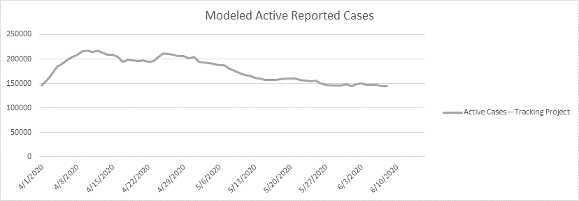
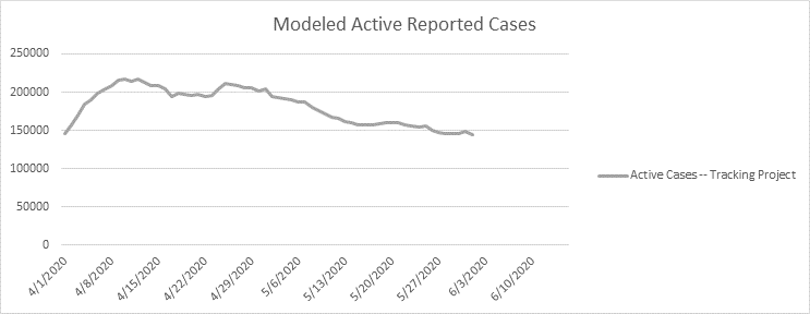
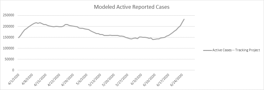
Here is the national picture of active cases – I’m modeling about 233,000 known active cases. Over half of the active cases I’m modeling come from the 5 problem states. Again, this number is high (I don’t know by how much), as many states routinely double count cases.
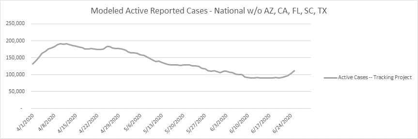
Here is the rest of the country without the 5 focus states. Not great, but a much better picture.
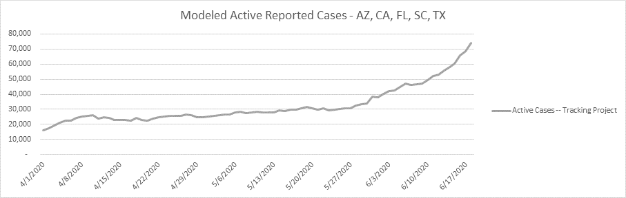
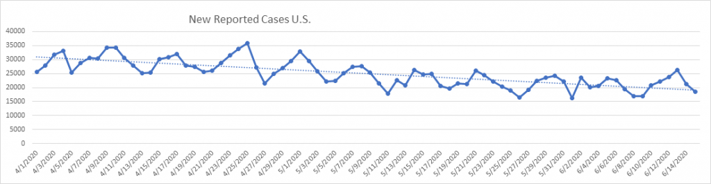
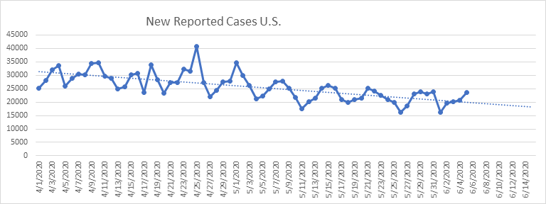
Here are the new reported cases nationally. Increasing for 10 days now – half of all new cases are in 5 states.
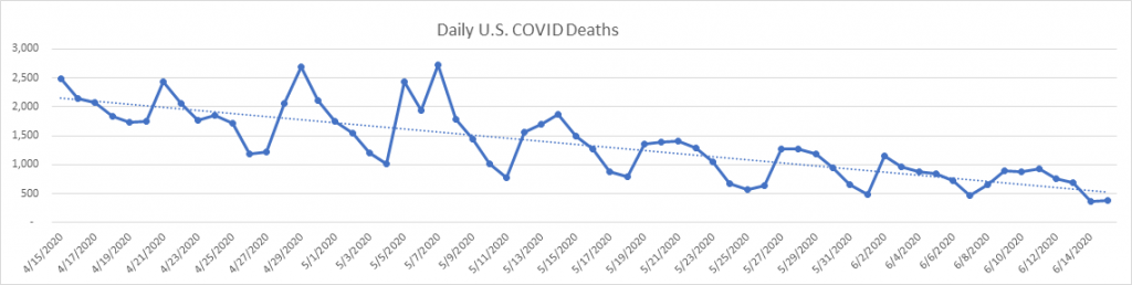
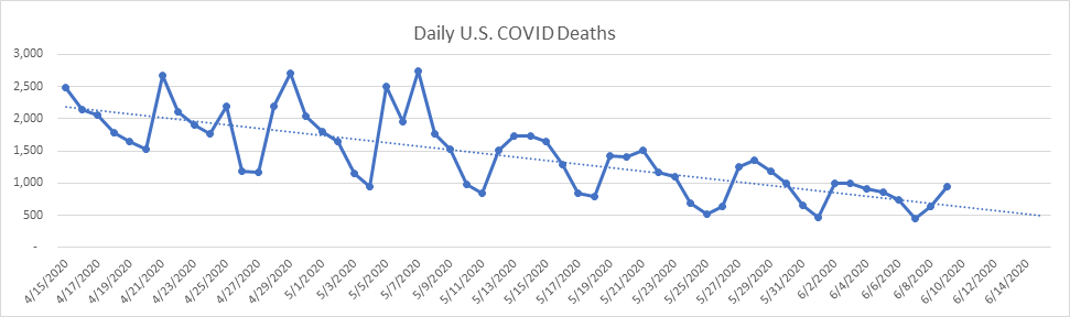
Here are the daily death reports. Deaths are running a small fraction of what the experts predicted for June. We’re definitely seeing a divergence of active cases vs. deaths.

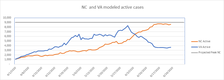
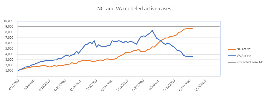
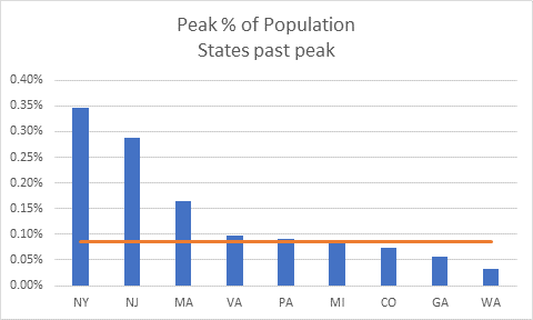
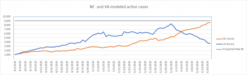
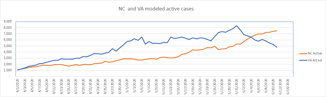
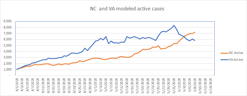
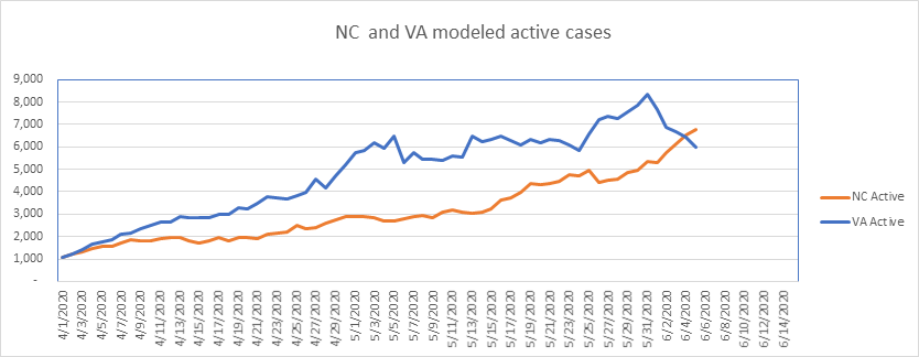
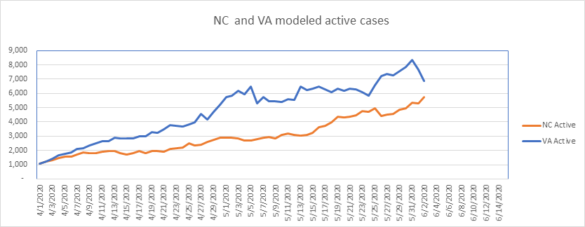
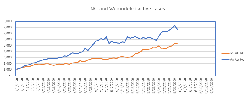
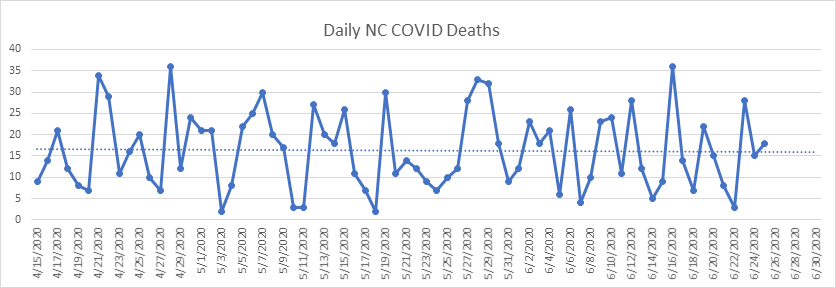
On to the states. NC has been roughly level for 11 days now – this is a significant improvement from the growth rate in the previous 2 weeks. It looks like it may be peaking right around the average as a percent of the population, and at a lower rate per capita than Virginia. Ironically, NC decided to stay in Phase 2 for another 3 weeks.

In addition to a fairly steady state with respect to cases in NC, daily deaths are flat as a pancake for weeks now. Look at that trend line…
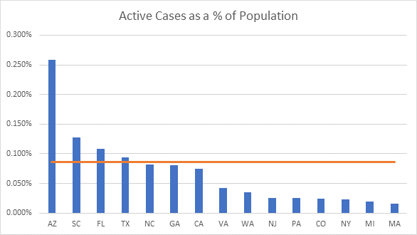
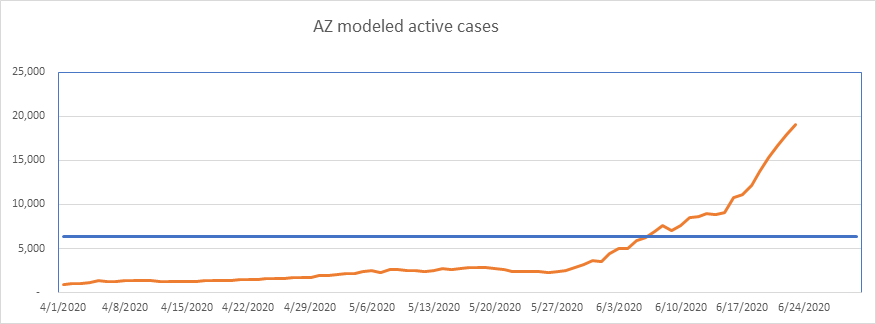
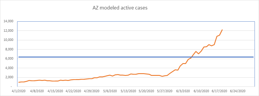
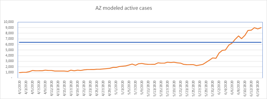
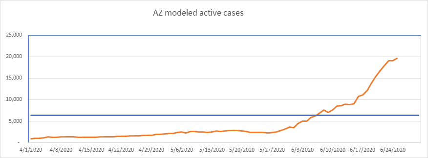
Arizona looks a bit better over the past 2 days, but it’s only 2 days. AZ is now at currently at 0.265% of the population, nearing NJ’s 0.29% at its peak. I need to point out every day that Arizona’s data is exaggerated, since they count specimens tested rather than people, and it’s not uncommon to get multiple tests if you’re sick – each time you’re tested you’d show up as a new case. Even worse, Arizona counts positive antibody tests as new cases.
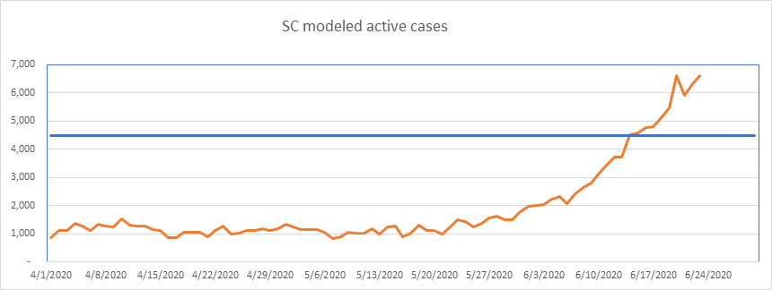
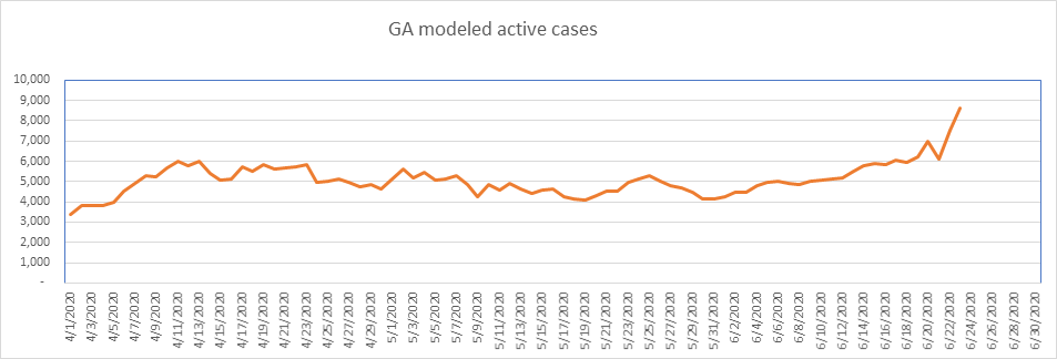
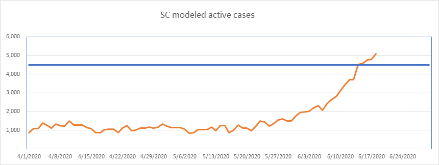
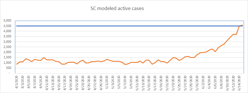
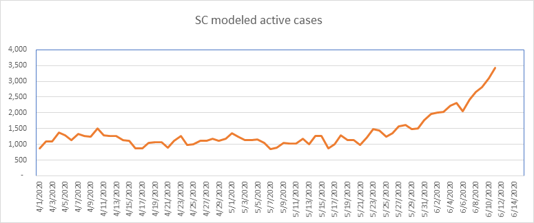
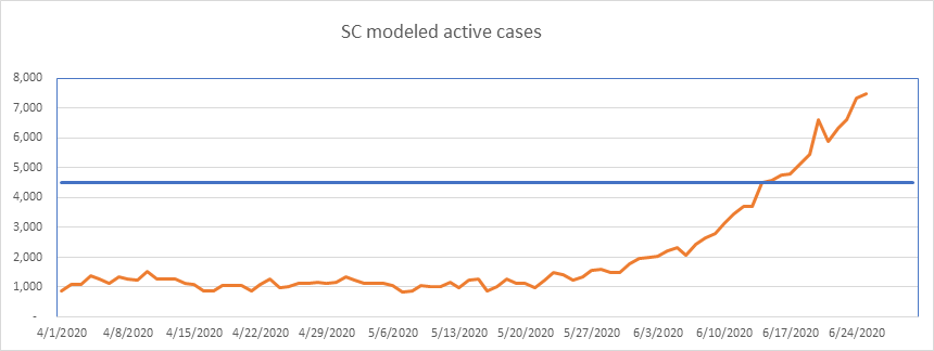
South Carolina added just about 130 new actives today, so isn’t skewing any national numbers, but we’ll keep watching it until it levels. South Carolina also double counts cases, as they treat each positive test as a new case. Worse still, until June 11th, SC counted positive antibody tests as new cases. If this keeps up I’ll take them off my “problem” list, and perhaps add GA.
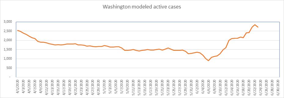
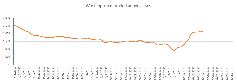
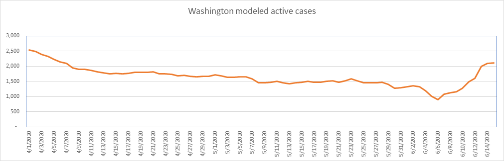
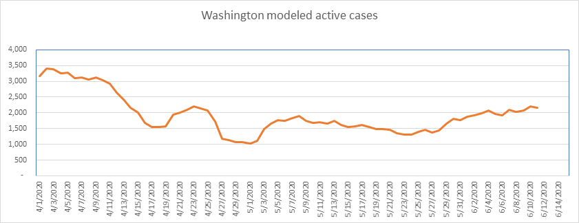
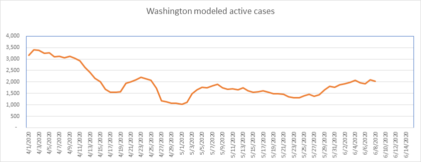
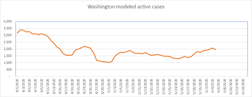
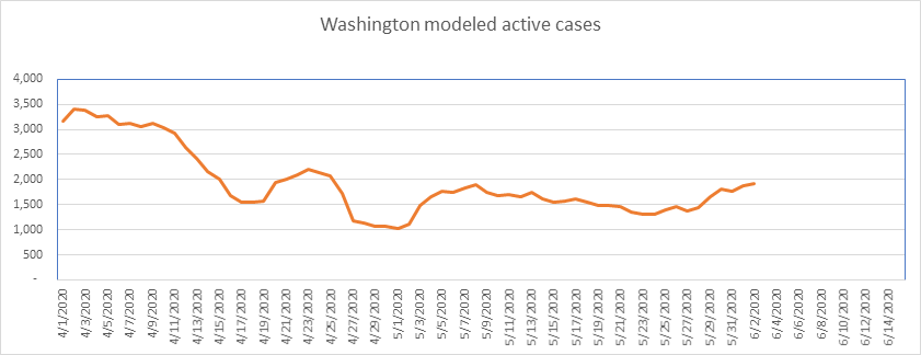
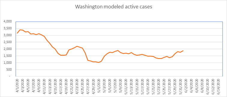
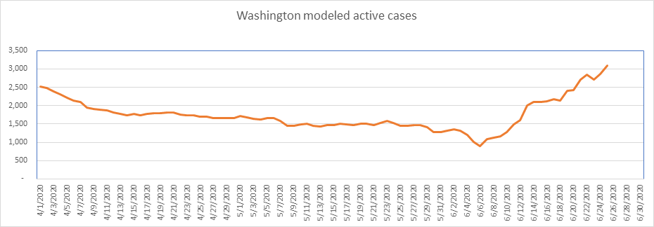
Washington reached a new peak, but is still at a low level per capita. I’d add them to the “problem” list, but the growth rate is low and the numbers are small – a couple of hundred cases a day – so they minimally impact the national numbers.
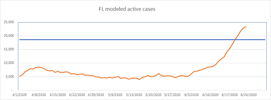
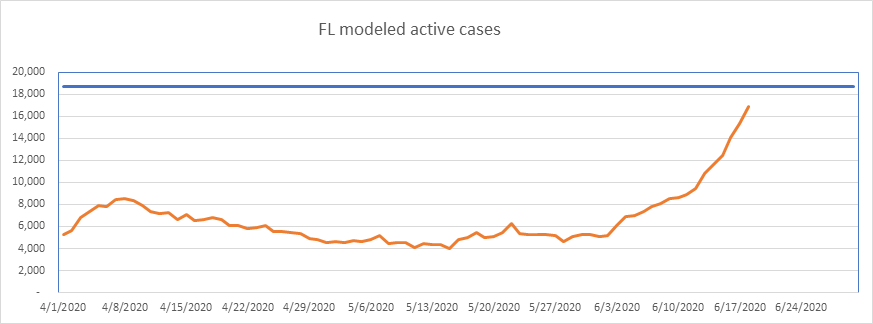
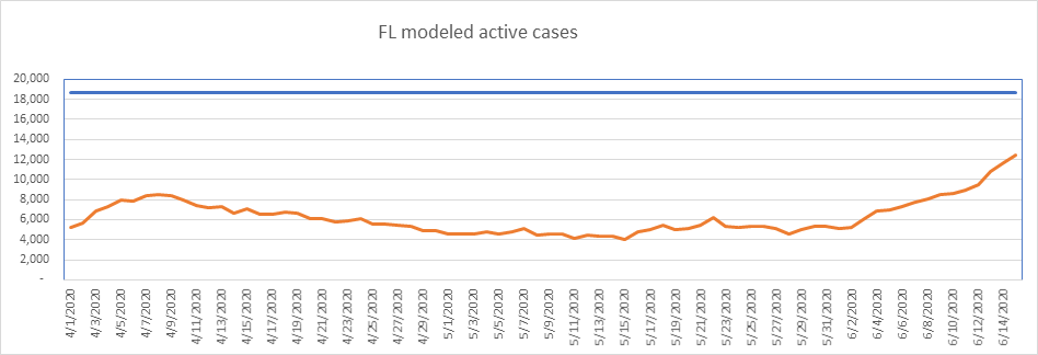
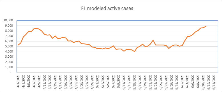
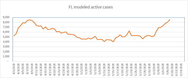
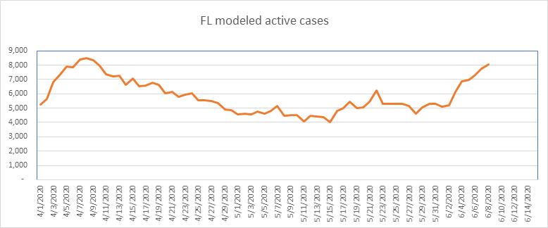
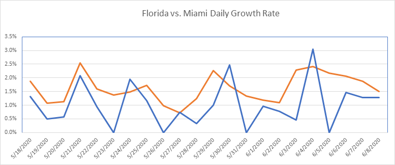
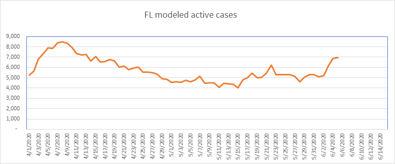
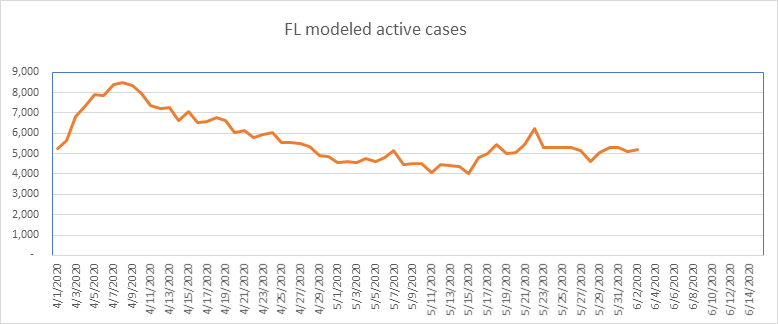
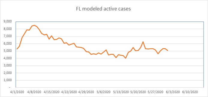
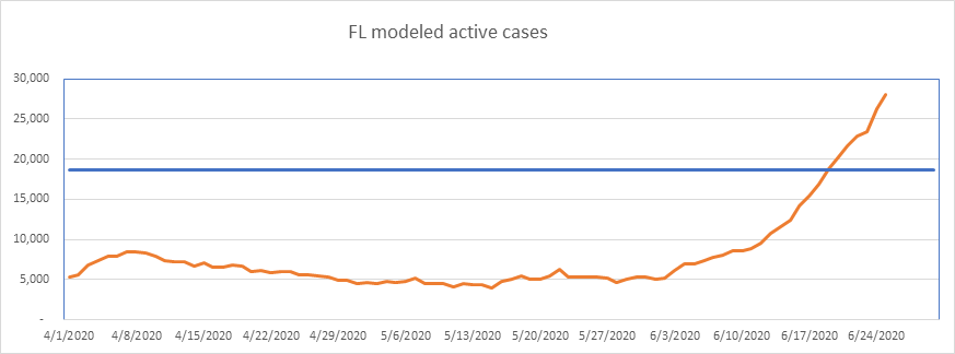
The Florida growth rate is increasing again, after a 4 day slowdown.
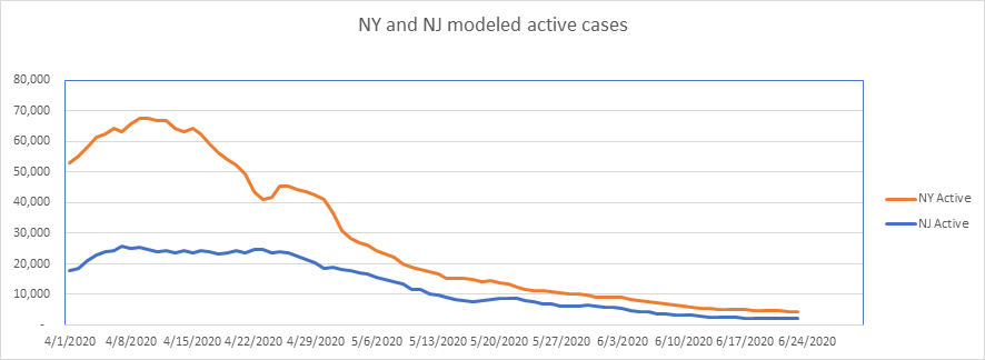
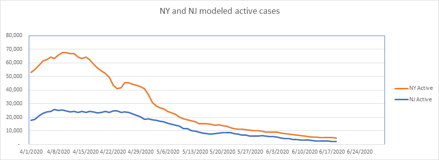
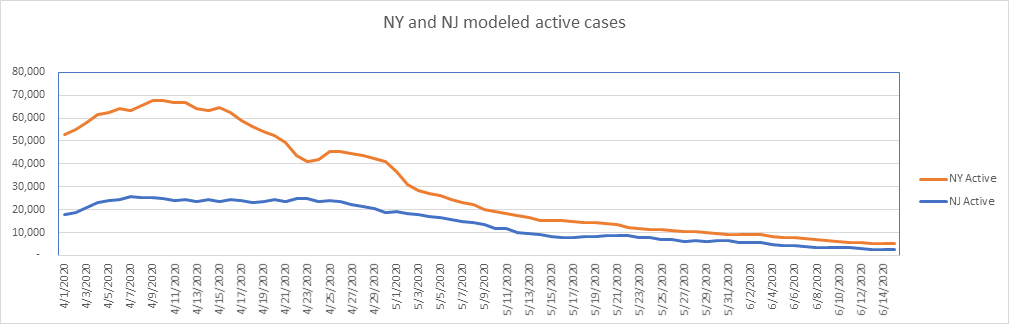
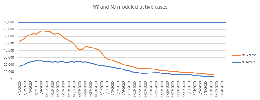
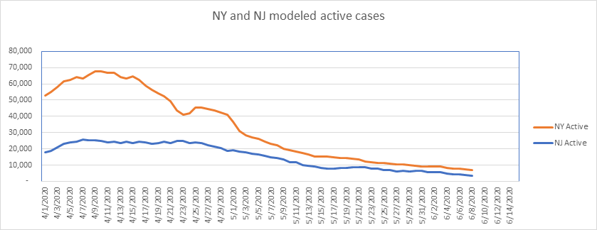
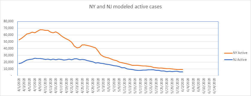
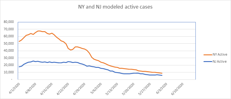
Both NY and NJ continue to be great recovery stories. I’ll keep reporting on these two states in case something happens out of pattern. It’s been a very long time since anything surprising has happened here, though. Interestingly, the new probable deaths didn’t show up in the case count in NJ. Oh, how I wish for consistent data…

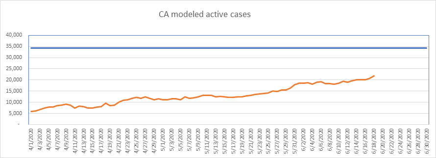
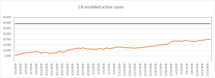
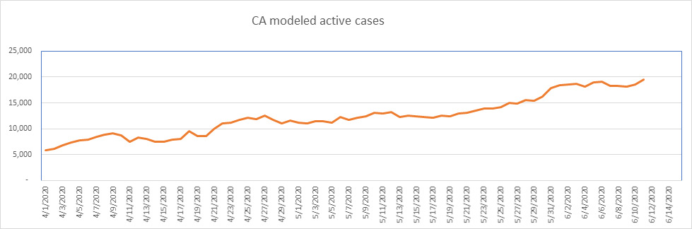
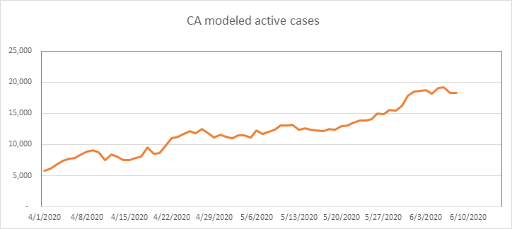
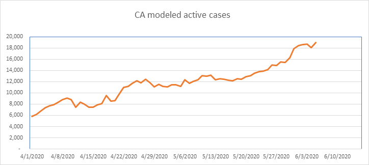
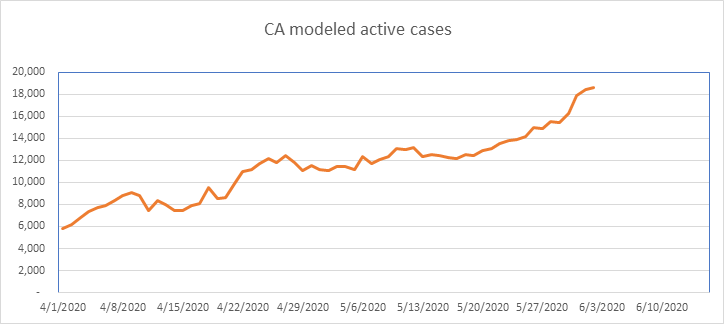
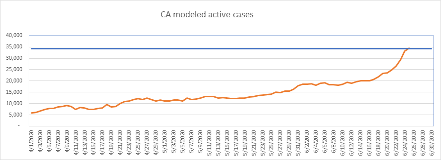
A little slowdown today in California – one day has little meaning, but I like to see it. As always, I need to report that California is one of the states that double counts cases. California is just now at the average peak, so if it begins leveling off now that would be very elegant mathematically.
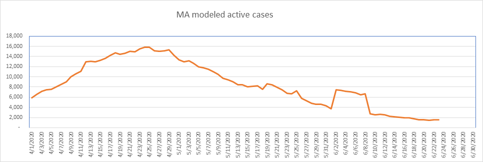
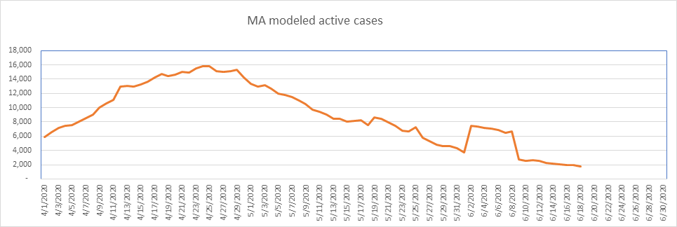
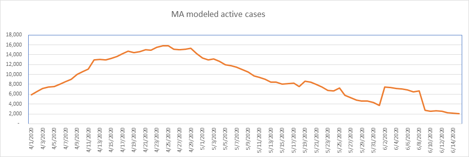
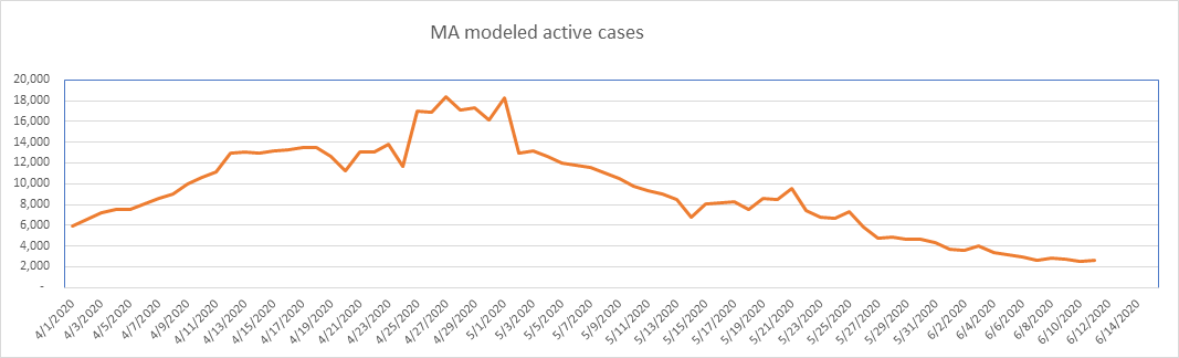
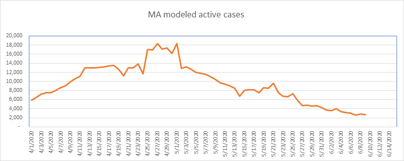
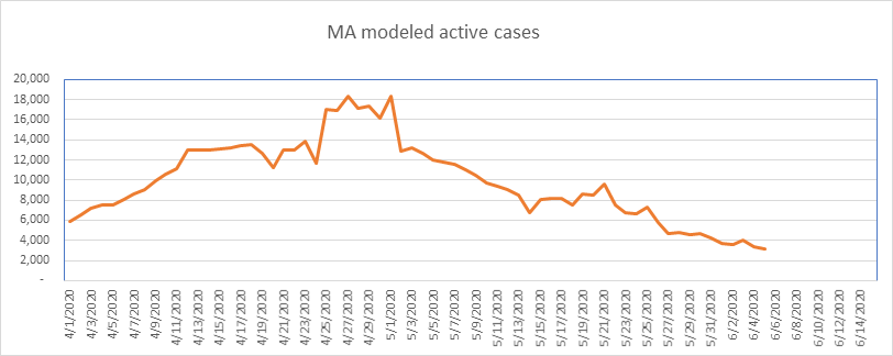
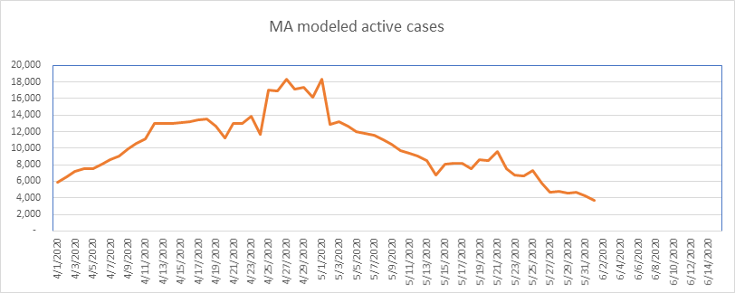
At the beginning of June, MA reported nearly 4,000 historical but newly discovered cases, which skewed the data. Now that we’re 2 weeks past this event, I’m now modeling based on the data as reported. That’s what that bump in cases in early June is all about on the graph. It’s not real. If something like this happens again, I may have to do the work of adjusting for it, but for now, I’m letting it flow through. MA is another state that double counts cases by reporting each positive test as its own case. Nonetheless, I model them with about 1,400 known and still active cases left.

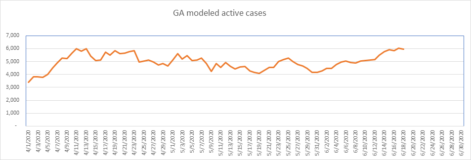
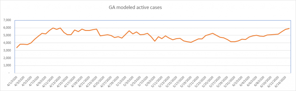
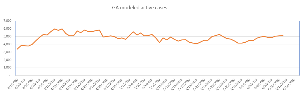
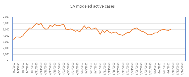
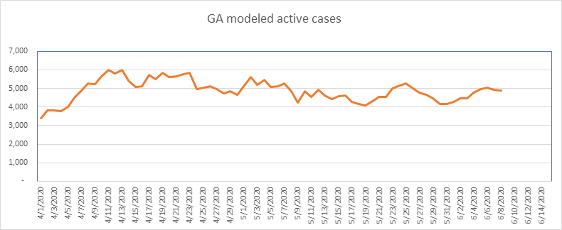
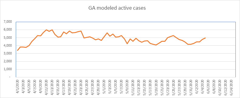
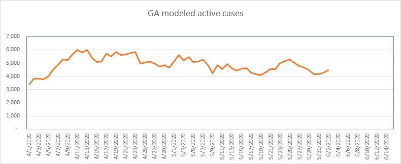
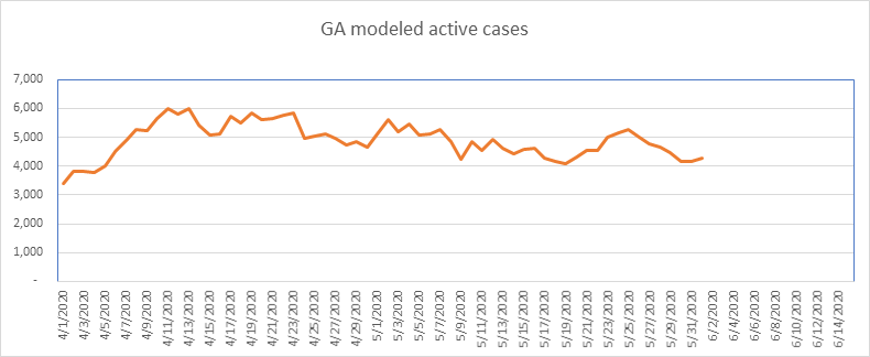
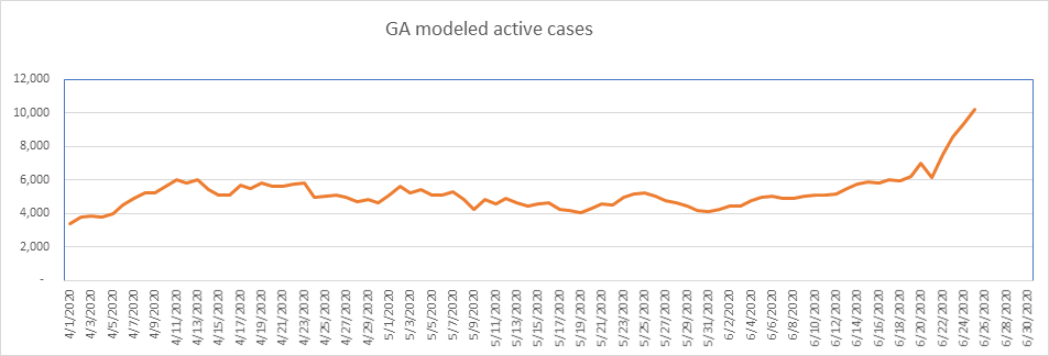
Georgia is looking worse over the past four days. If this keeps up, I’m going to add them to my “problem” list. Here again, the numbers are exaggerated. Georgia counts each positive test as a case. To make matters more distorted, until May 27th GA reported positive antibody tests as new cases.
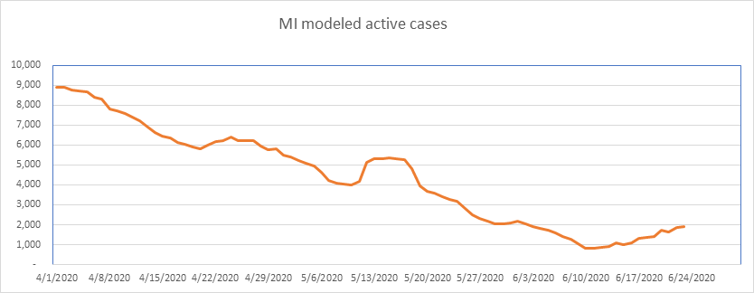
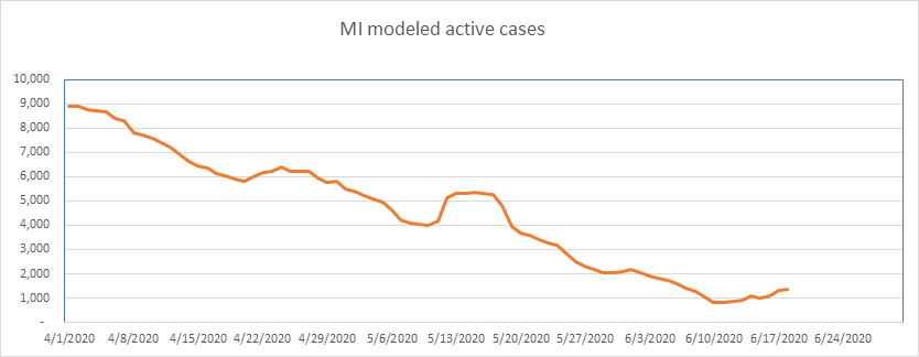
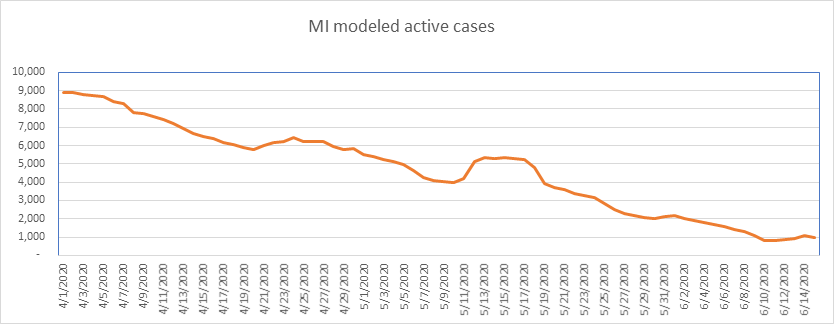
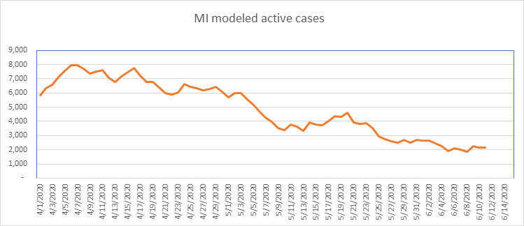
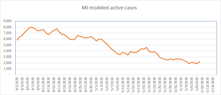
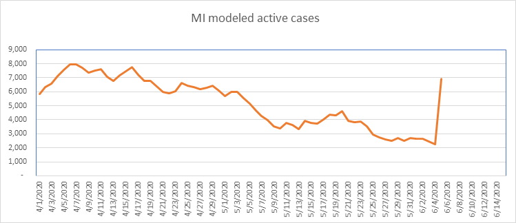
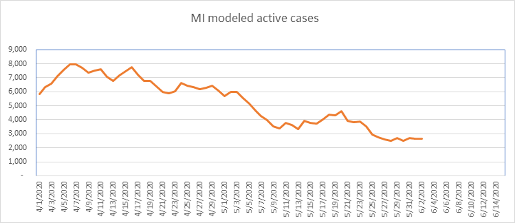
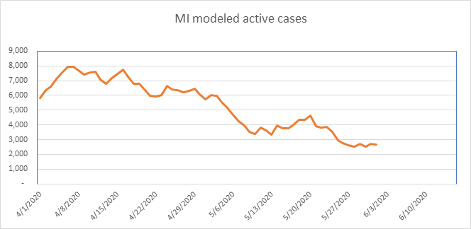
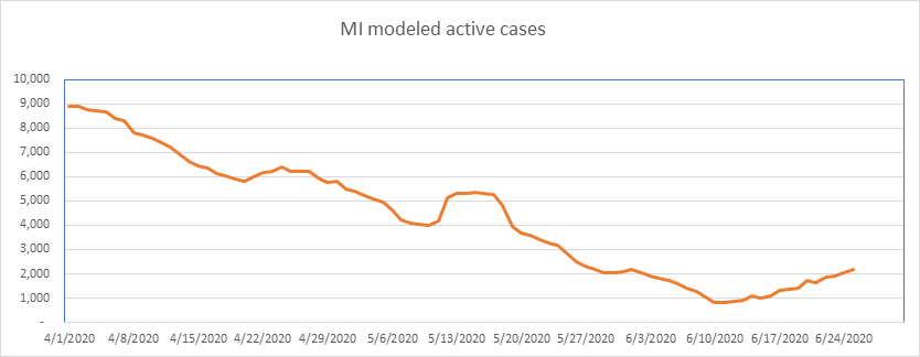
…And here is Michigan. Looking beautiful until June 10th, then beginning a slow drift upwards. Michigan still has the second lowest concentration of COVID of the 15 states I model, so it’s not on my radar yet. They’ve also had a lot of data anomalies, so I look at this graph with a grain of salt.
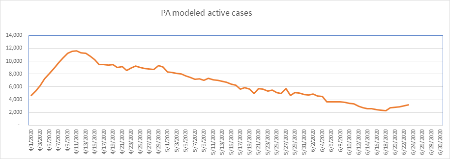
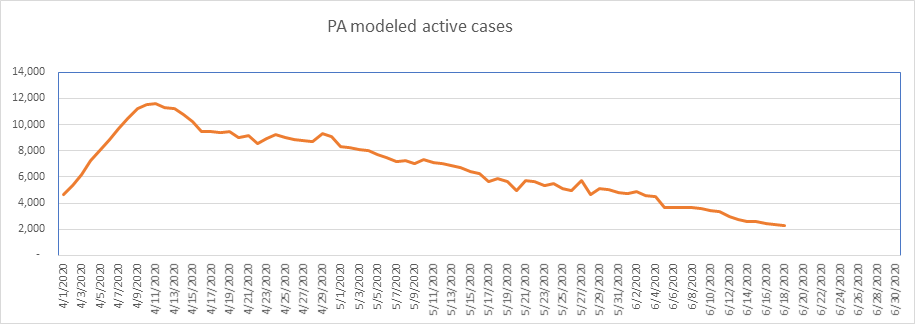
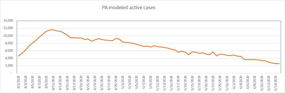
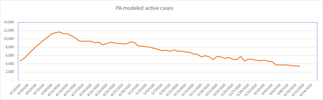
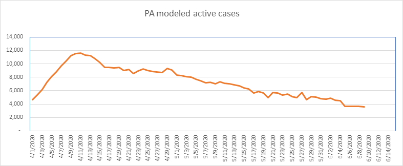
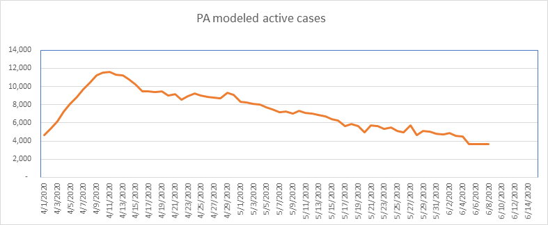
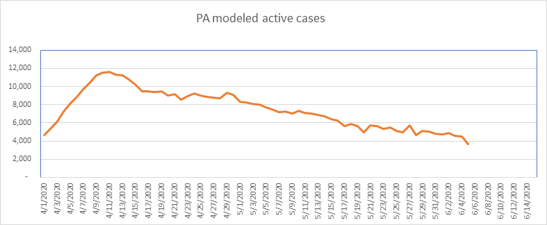
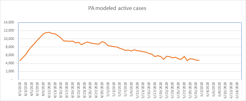
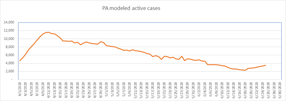
PA has been drifting up for 7 days. Worth watching, but still low on a per capita basis.
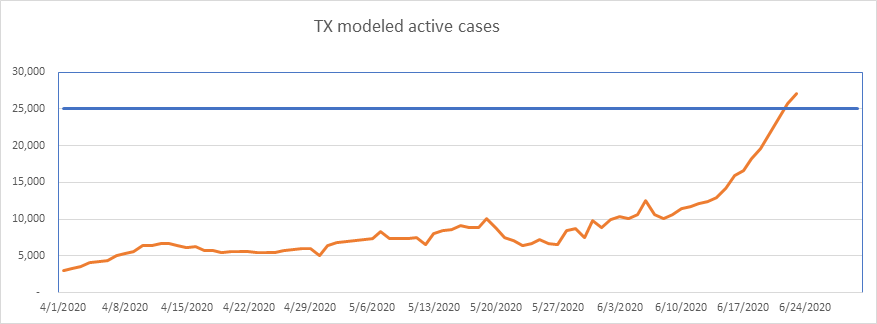
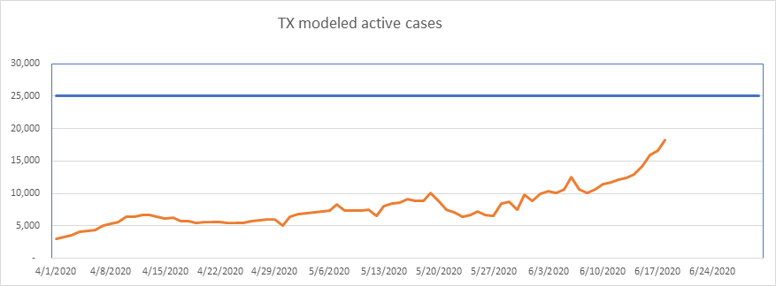
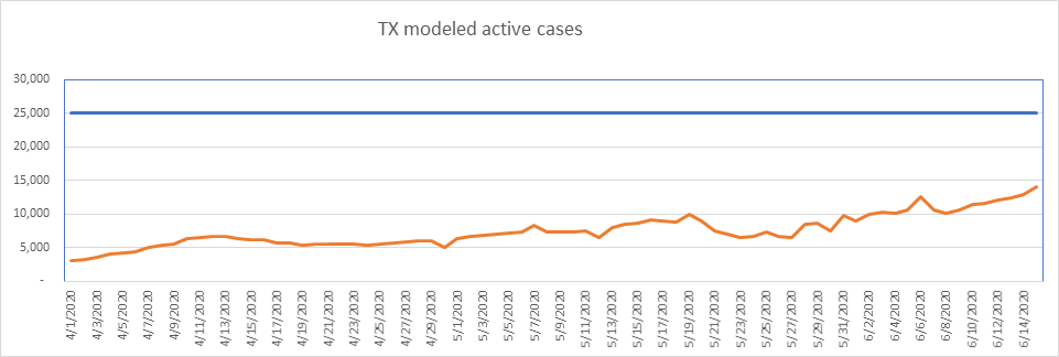
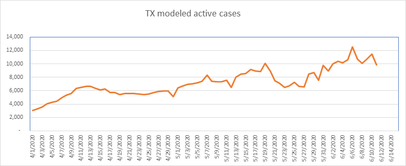
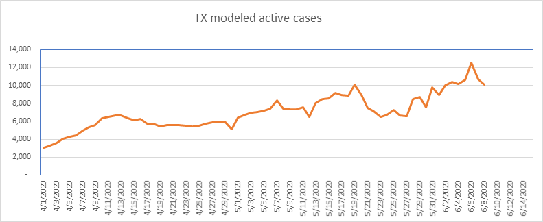
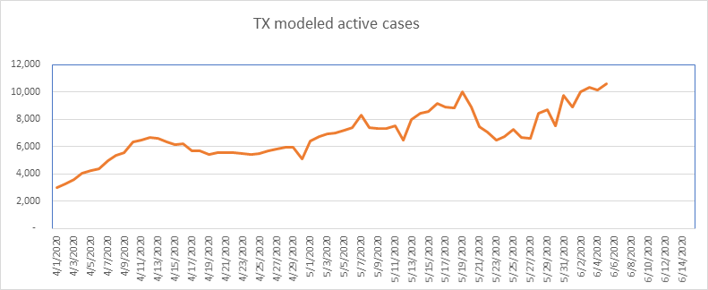
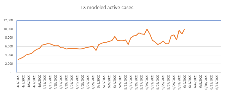
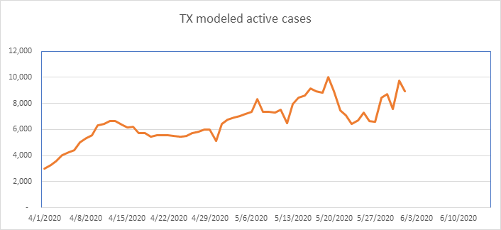
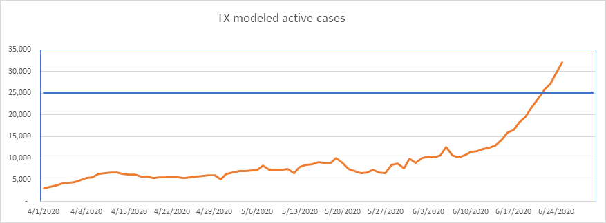
Texas still shows no signs of slowing down. Texas also reports positive tests as cases, so is doing some level of double counting, but not enough to explain this growth.
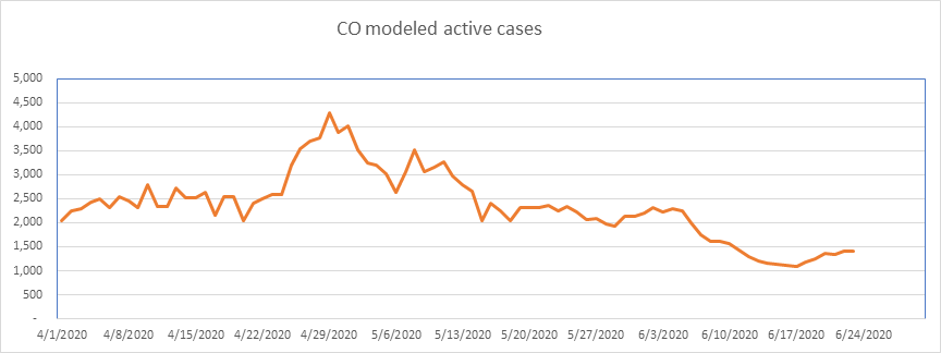
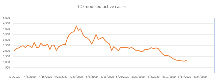
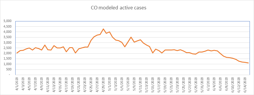
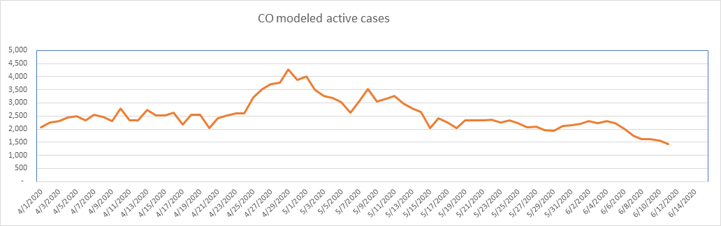
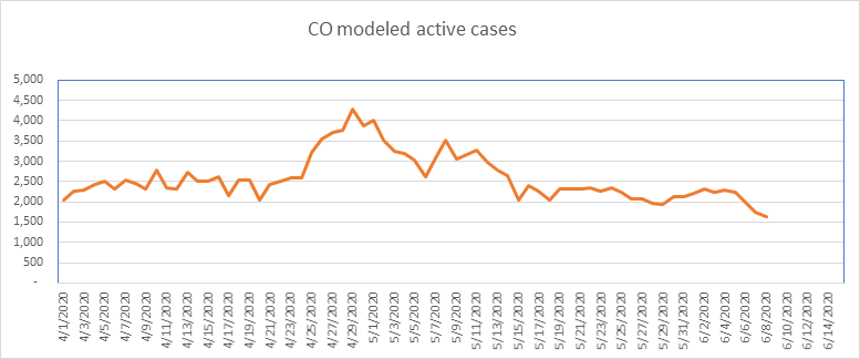
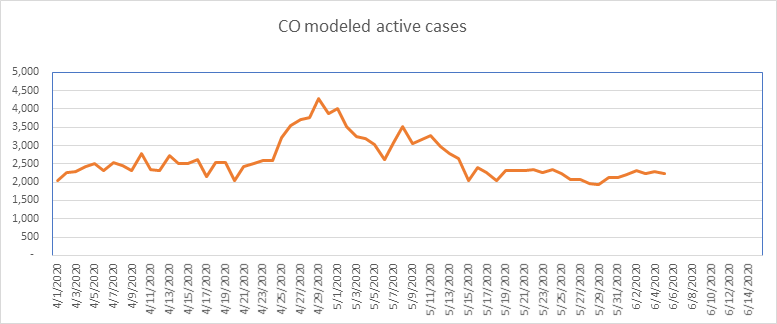
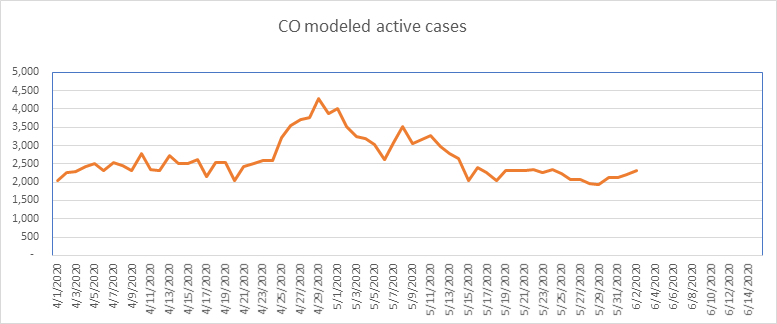
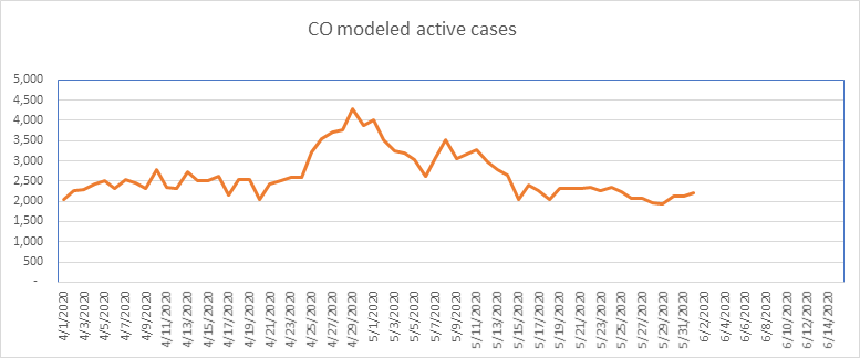
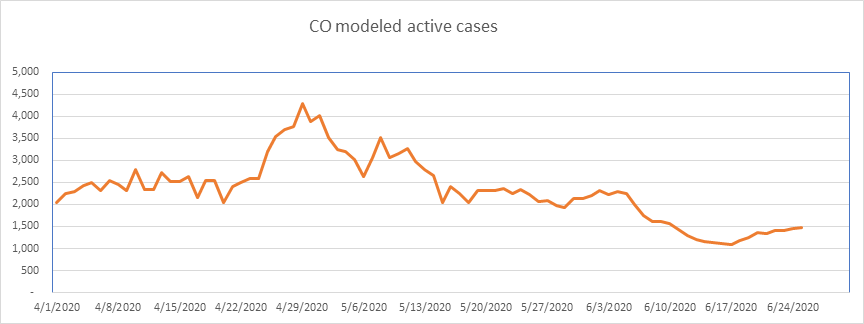
And finally, here is Colorado. Colorado is one of the states that has had aberrations in their data. I still report it, but I’ve shied away from any conclusions in this state due to the data irregularities. Very small numbers here.
So that’s it for today. The numbers are very small as a percentage of the population. Unless you’re in a high density area, your chances of contracting COVID are very small. However, even though the probability is very small, that doesn’t help if you’re the one catching it. Everyone please continue to be as cautious as you feel necessary.
–Shane Chalke, FSA