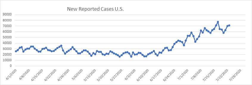
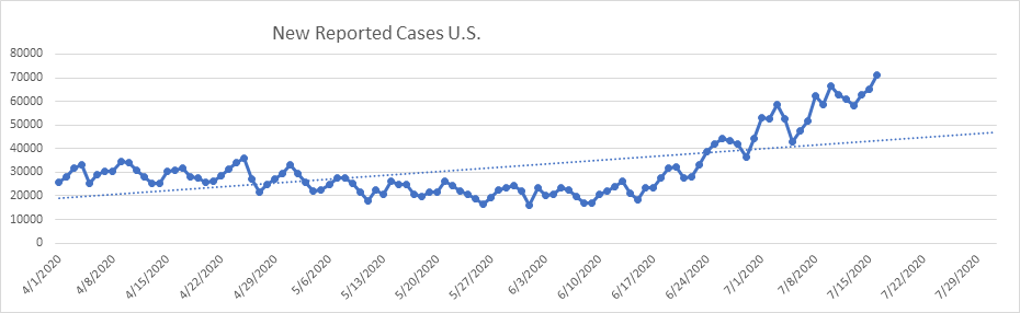
The acceleration of cases, which began around June 10th, leveled off last week, and now appears to be in decline. Here is what it looks like today:
Every one of the 6 hot spots from the beginning of July is level or in decline. We’ve now had about 20 days of flat new cases.
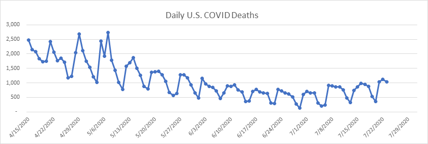
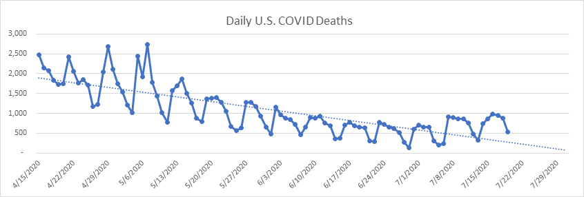
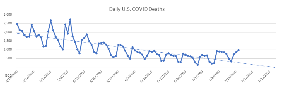
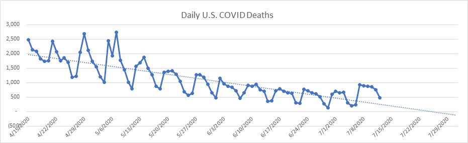
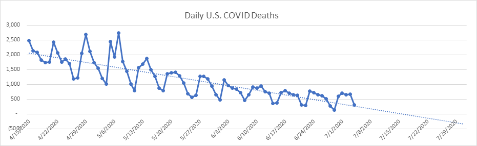
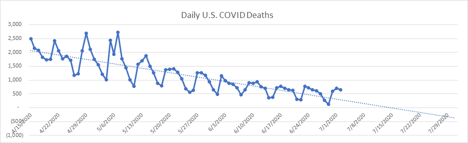
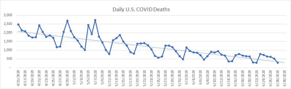
All the news now is about the daily death count, so let’s take a look at that. Here are the daily national deaths (the dotted line is the 14 day moving average):
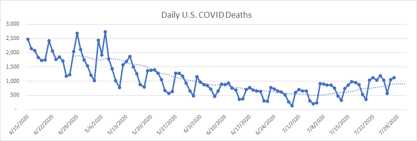
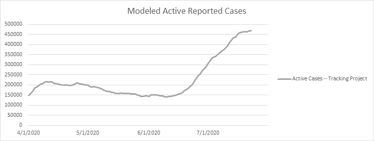
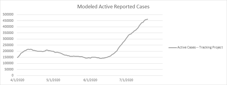
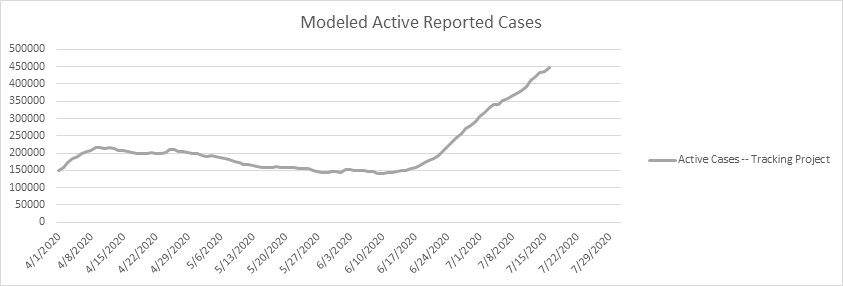
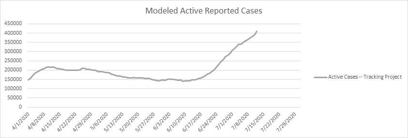
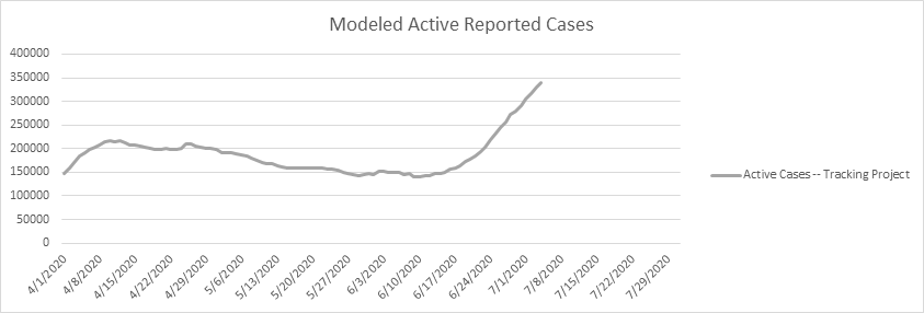
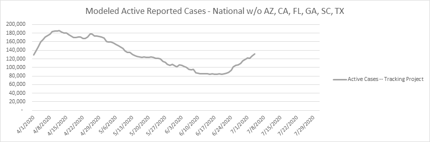
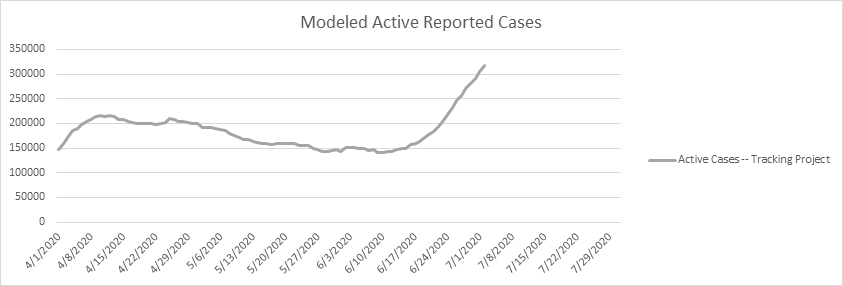
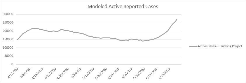
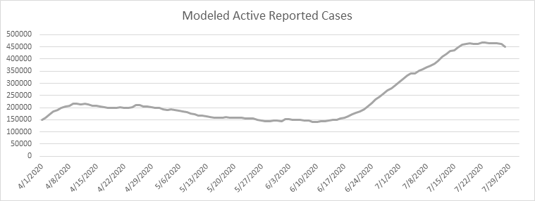
Deaths have risen from roughly 500 per day at the end of June to roughly 1,000 a day over the past week. However, this rise in daily deaths is actually small in proportion to the increased active case count. Looking at the Active Case graph, you can see a local peak on April 10th of about 217,000 active cases (the “first wave”). Yet now we see another local peak on July 23 of about 468,000 active cases (the “second wave”). To me, the logical way to look at this is the number of daily deaths per active case. Here is a graph of daily deaths per 1,000 active cases going back to April 15.
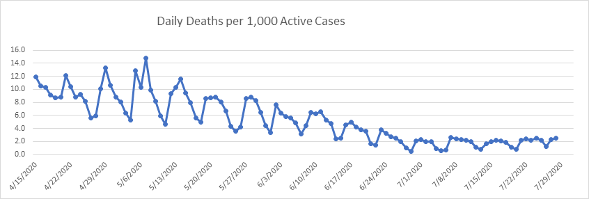
Two observations jump out at us. Most importantly, during the first wave we saw about 10 daily deaths per 1,000 known active cases. During the second wave we’re seeing just over 2 daily deaths per 1,000 cases, or about 1/5 the number. It is clear that the second wave is far less deadly in relation to active case count. The second observation is that the daily death count per active case looks relatively stable – that’s a pretty flat line through all of July. This reaffirms my conclusion that we won’t see the spike in deaths predicted by the press (not by modelers – IHME projects that we won’t average more than about 1,000 deaths per day, and that this number will peak in a week or so). For my reasoning behind this, see my discussion from July 16th at the bottom of this report.
As always, feel free to send me your questions about my assumptions, methodology, or modeling in general.
- Likely date of active case peak (Chalke modeling): July 23
- Likely date of peak deaths (IHME): April 16 (last revision on July 22)
- Total Test Results reported today: 733,243 (very high)
- Total Pending tests reported today: 3,600 (extremely low)
- National reported case Growth Rate today: 1.25% (low)
Shane Chalke Interviews
Website
Groom Ventures has agreed to host a website that will archive my daily reports, and supplement with other commentary. John Groom worked at one of my companies back in the day, and is an excellent writer. The website is: www.howmuchrisk.com For those of you that post my daily report on Facebook, let me suggest you link to this site, as the direct Facebook posts don’t seem to copy the graphs.
Daily Analysis
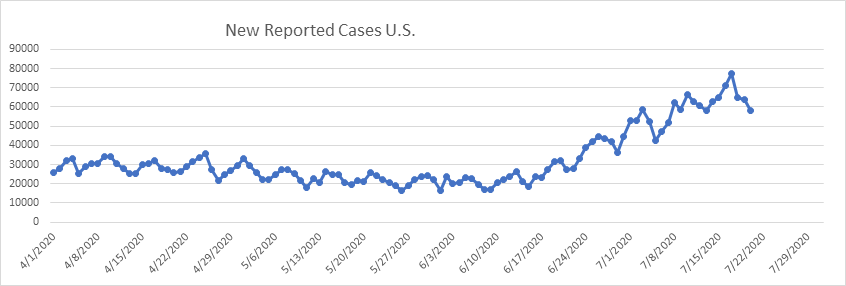
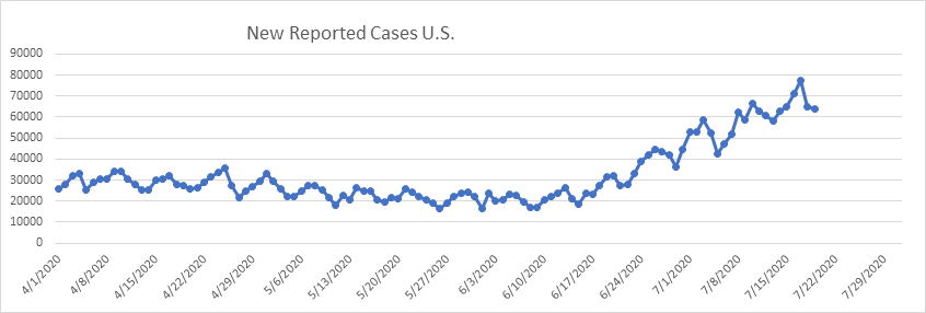
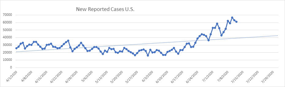
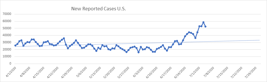
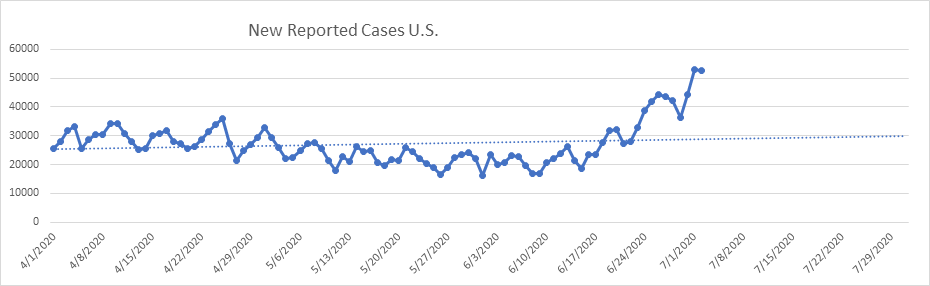
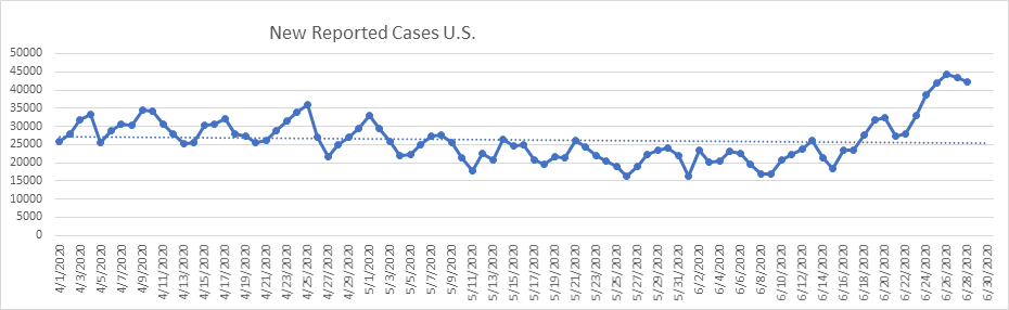
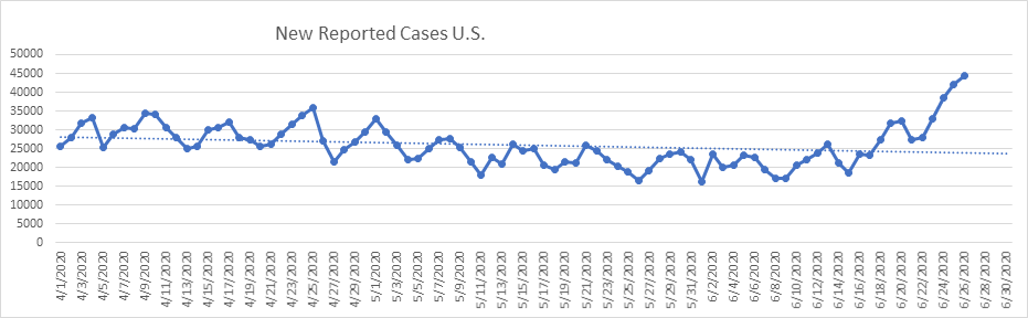
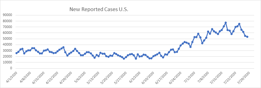
Here are the new reported cases nationally – You can see the negative convexity over the past 3 weeks. The daily growth rate continues to decline, reaching the lowest point today in 5 weeks (1.25%). This should provide some comfort, as I believe it is the reports of “out of control” growth that is most frightening. We are not seeing that.
On to the states.
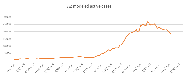
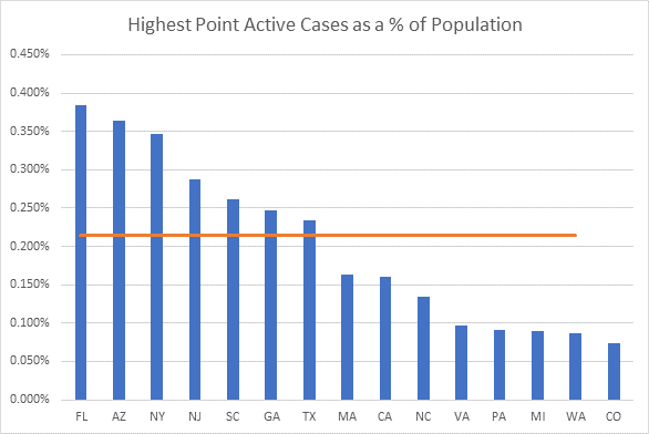
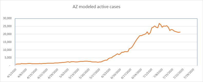
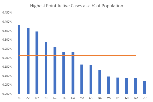
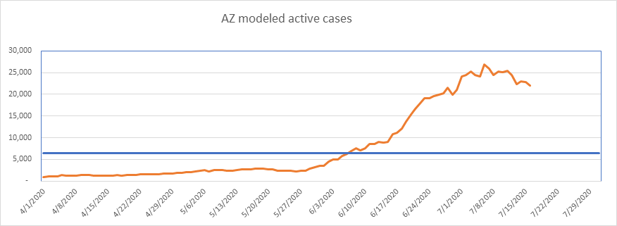
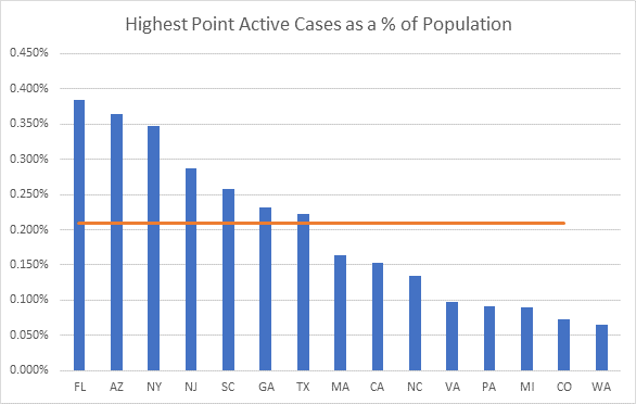
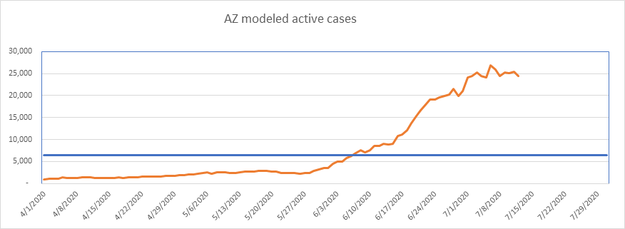
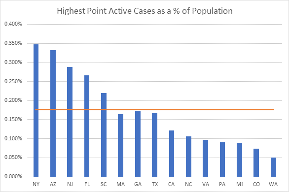
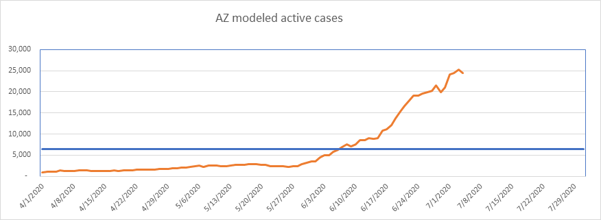
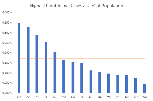
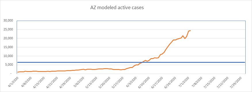
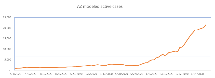
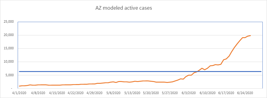
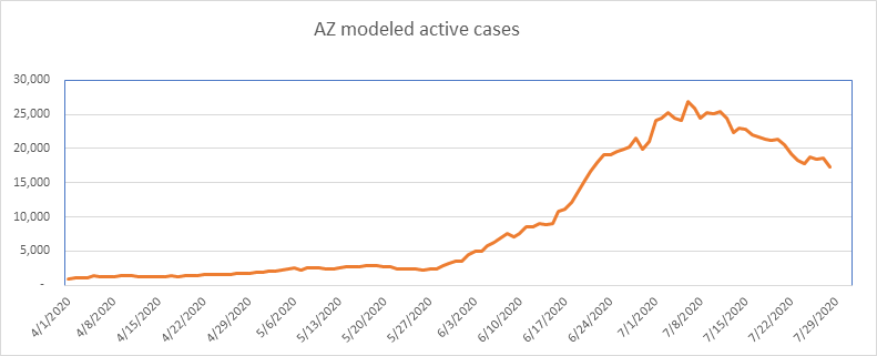
As I mentioned last week, Arizona is starting to look a lot like NY or MA, with a hard bounce off the population ceiling and a rapid decline from the peak. This state is down an amazing 36% from the peak of just three weeks ago.
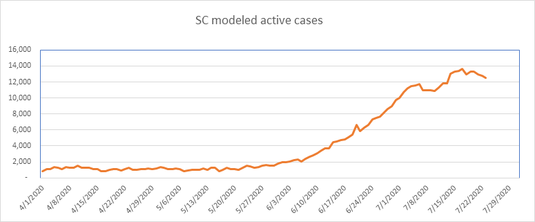
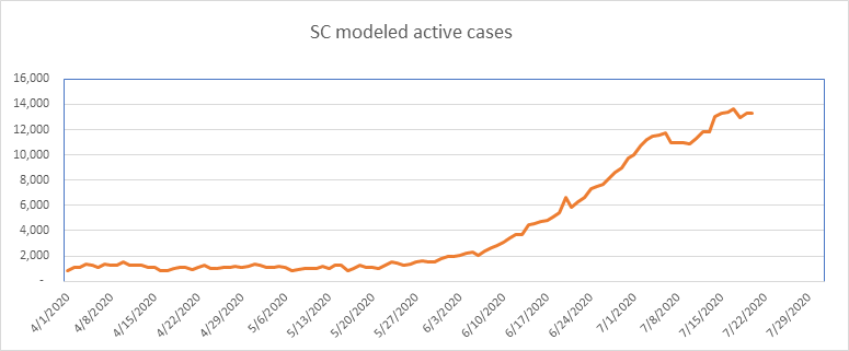
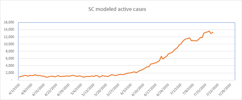
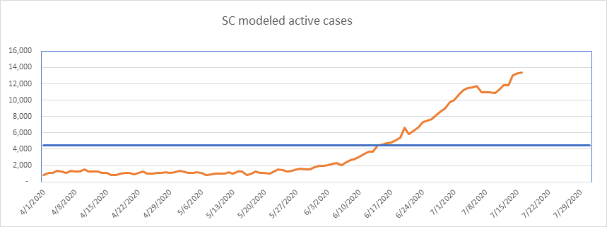
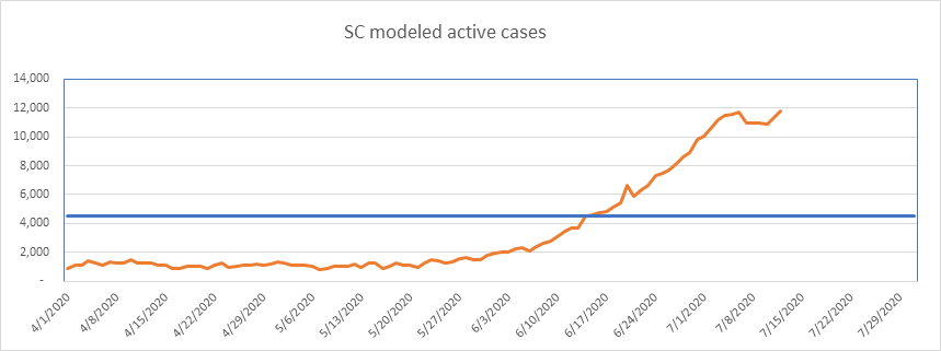
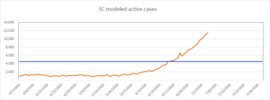
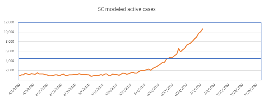
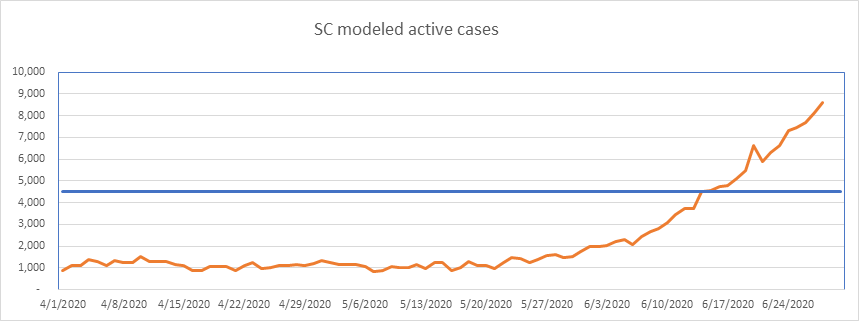
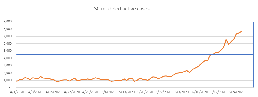
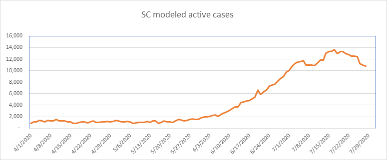
SC is now 11 days past peak, and now down 21% from the top. SC Peaked at 0.26% of the population, so I suspect this peak will hold. Note that South Carolina double counts cases, as they treat each positive test as a new case (per The COVID Tracking Project).
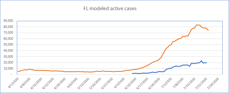
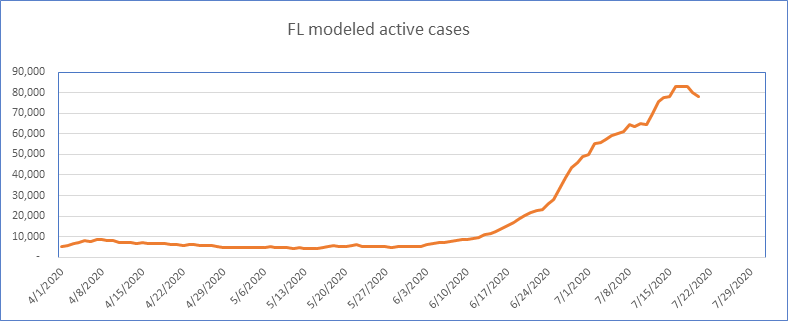
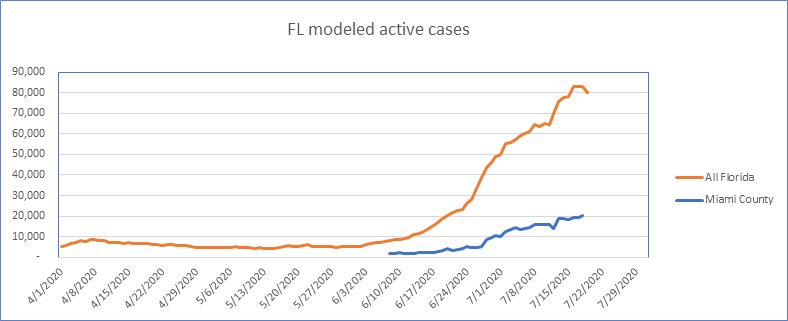
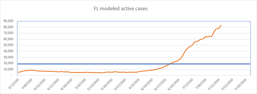
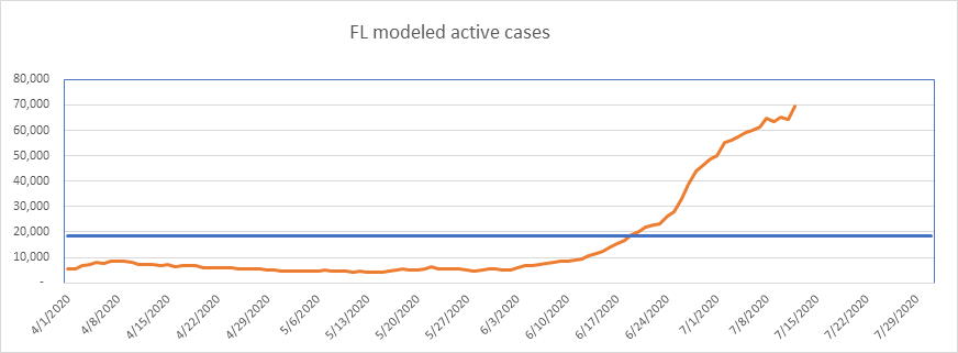
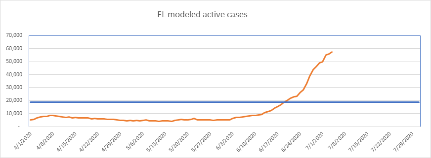
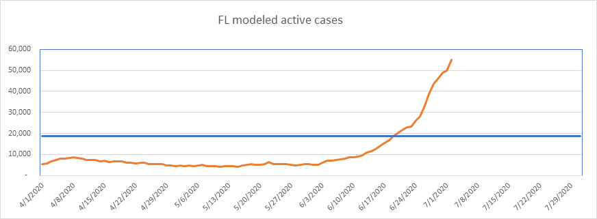
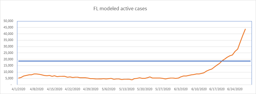
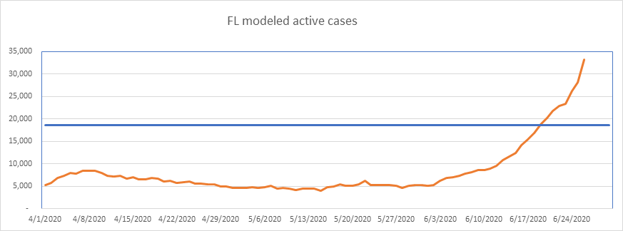
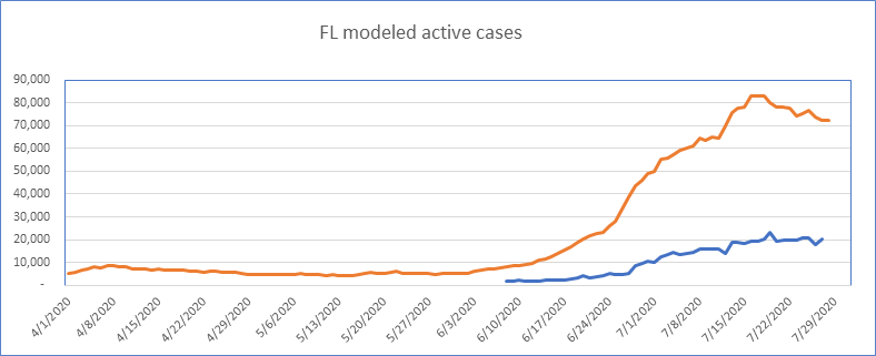
Here is Florida – 12 days past peak active cases. Interestingly, I noticed Miami flattening first, but Miami remains flat – it hasn’t declined yet at all, differing from the state as a whole. Florida peaked high, at 0.38% of the population, so I think this peak will hold.
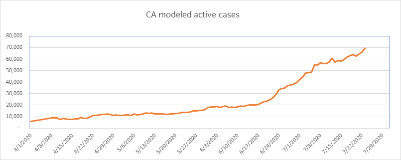
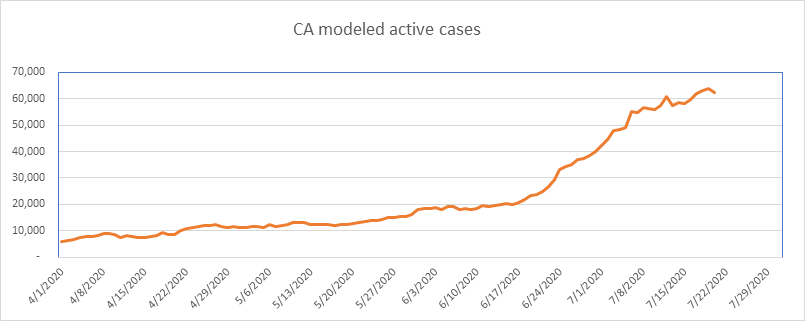
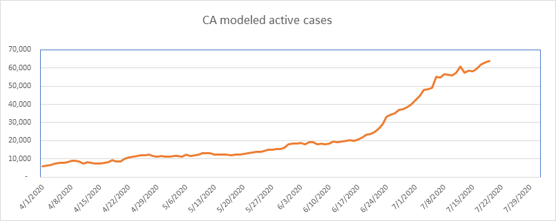
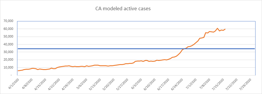
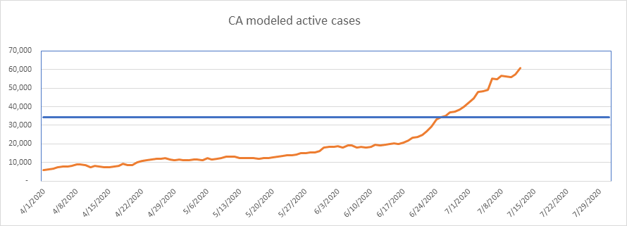
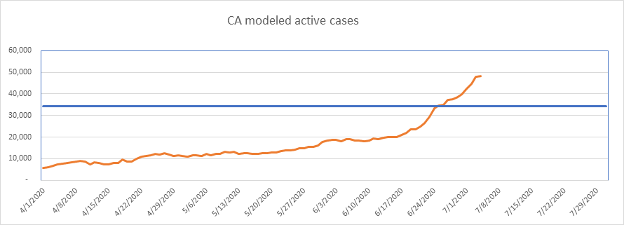
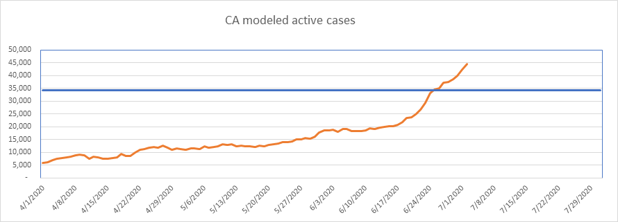
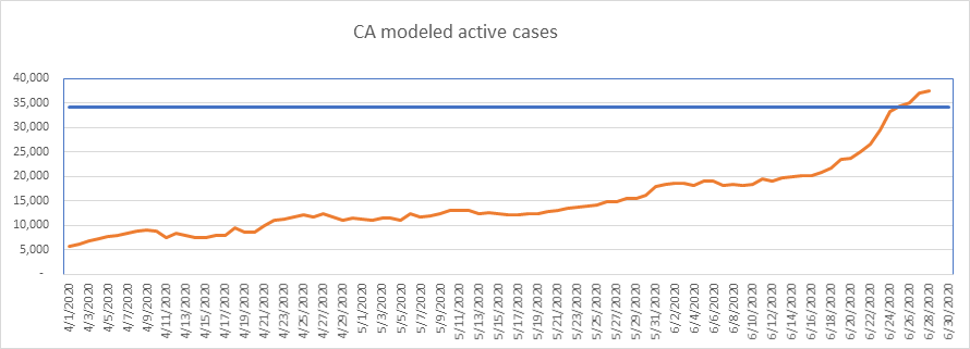
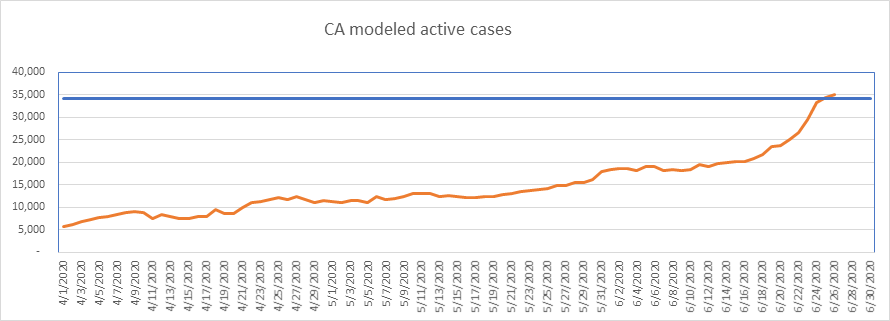
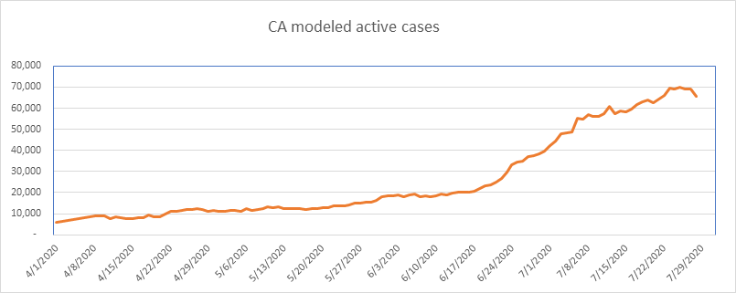
Some potentially good news from California – a definitive slowing over the past two weeks. California today sits at 0.18% of the population, so I’m thinking it has more growth to come, but I like “slow”. As always, I need to report that California is one of the states that counts tests rather than people.
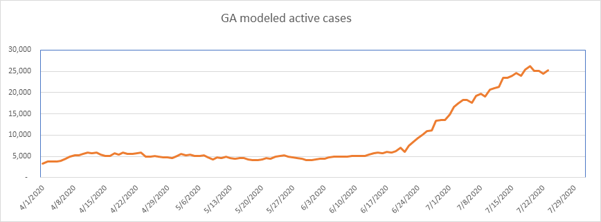
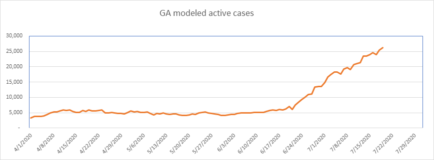
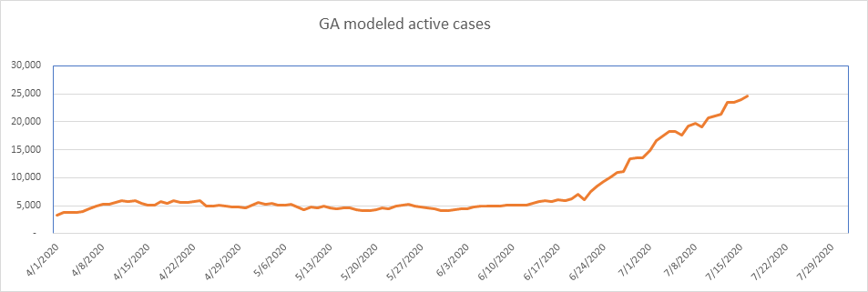
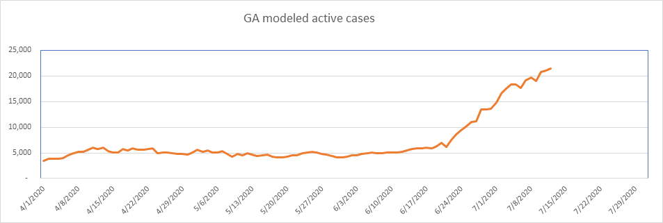
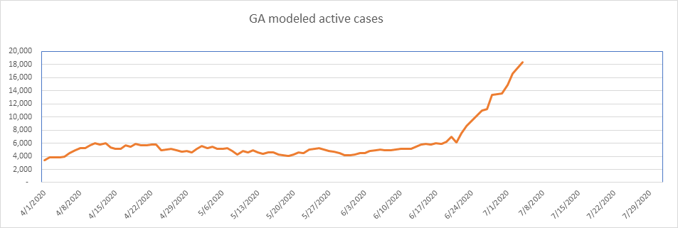
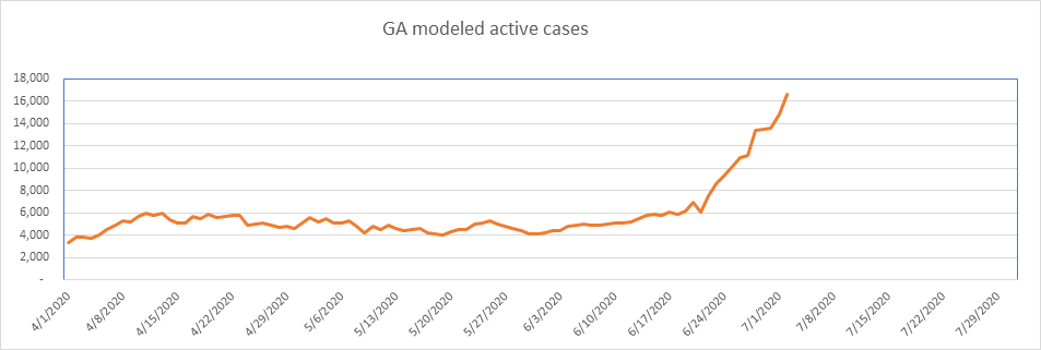
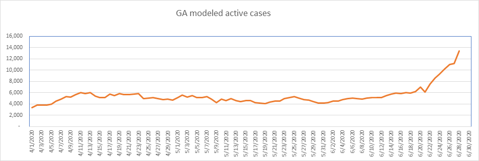
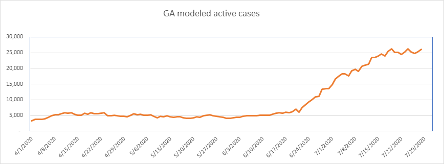
Georgia has been slowing for over 2 weeks, and is now flat for 10 days. Is this the top for Georgia? I don’t know. Georgia hit a high of 0.25% of the population, so this could be the ceiling – just below the average for states that have peaked. Note here again, the case numbers are exaggerated. Georgia counts each positive test as a case (according to The COVID Tracking Project).
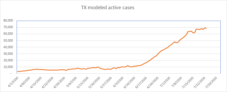
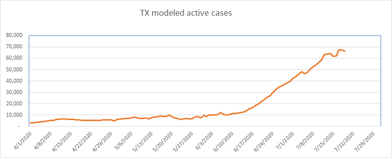
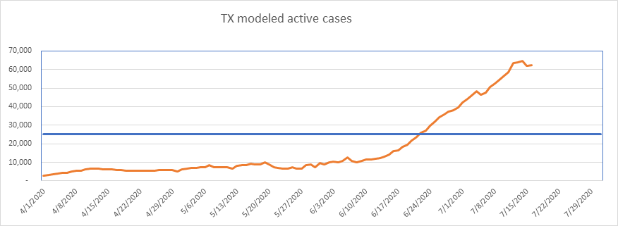
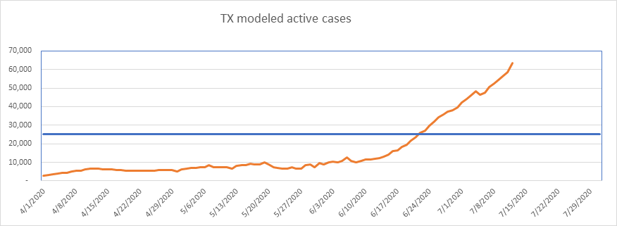
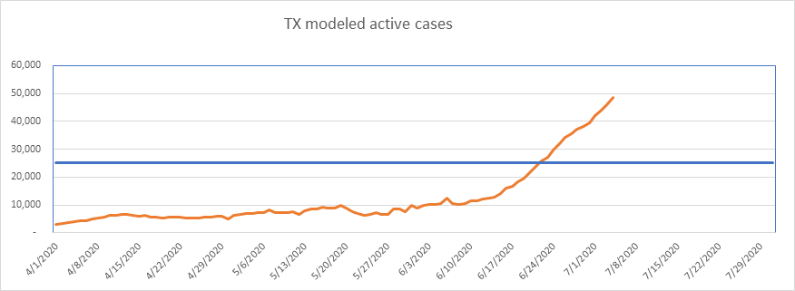
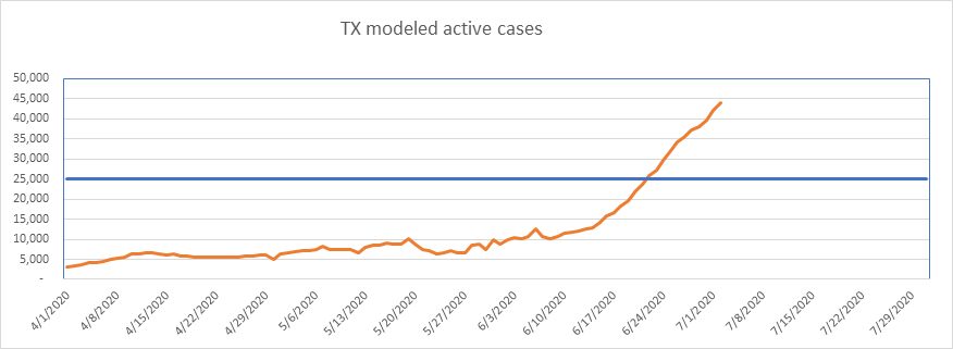
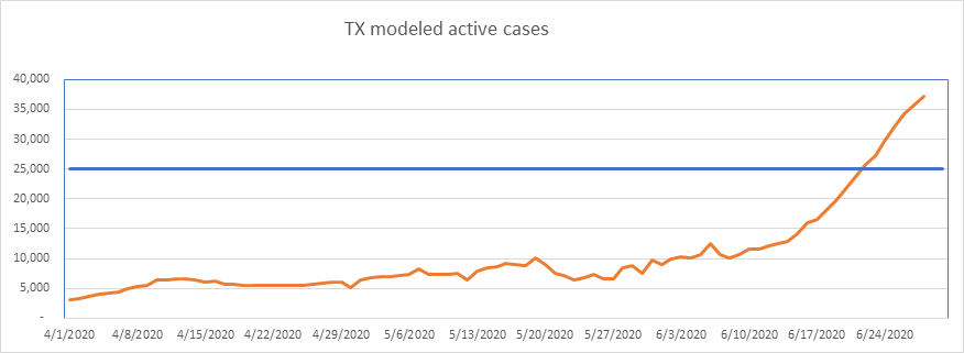
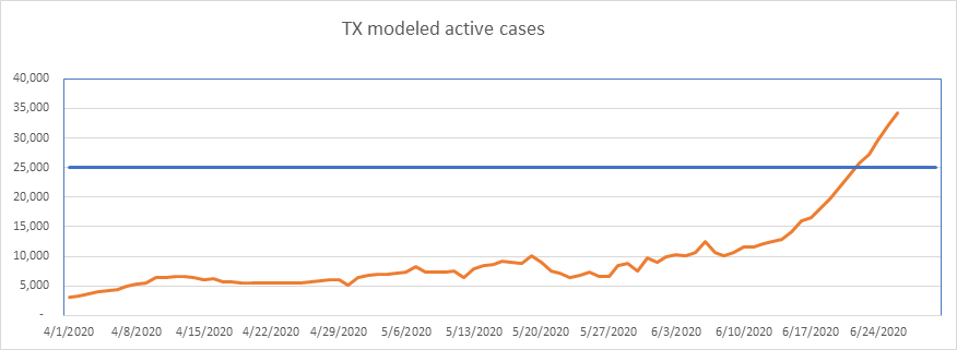
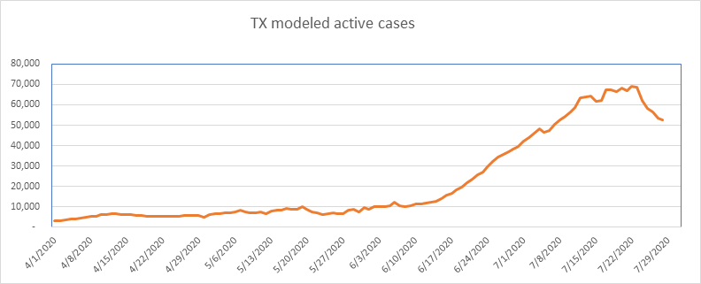
Big improvement in Texas since my last report. IF Texas peaked, it was 5 days ago at 0.23% of the population. I don’t know if this will hold, but it’s looking promising, down 24% in just five days – looking like another Massachusetts. Texas also reports positive tests as cases, so is doing some level of double counting.
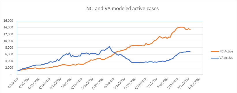
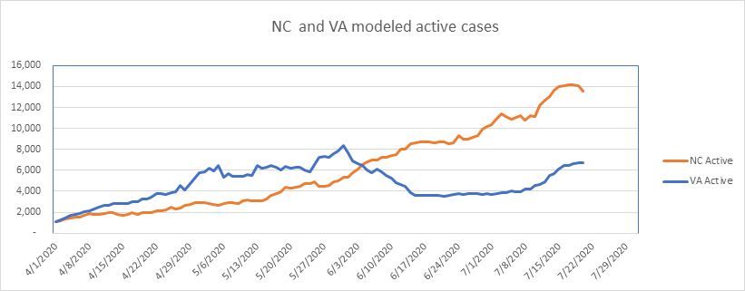
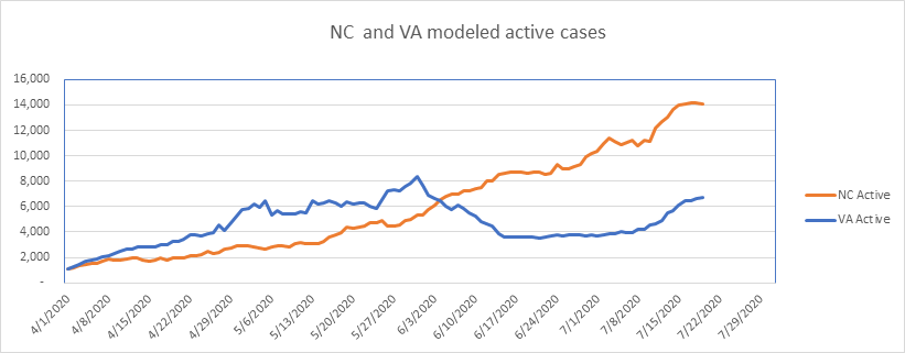
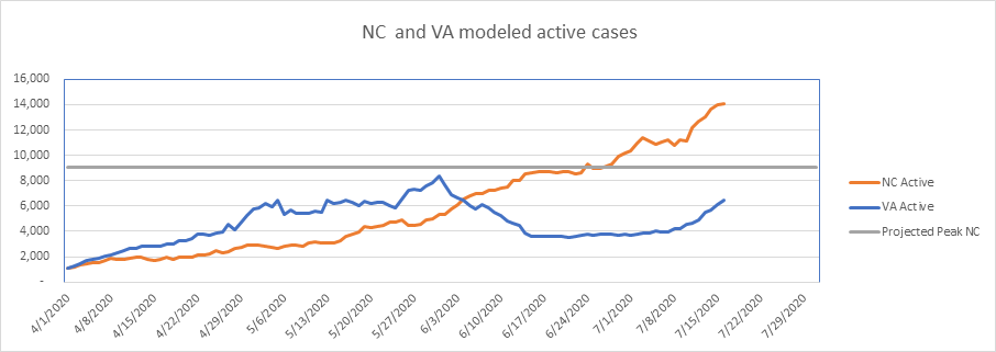
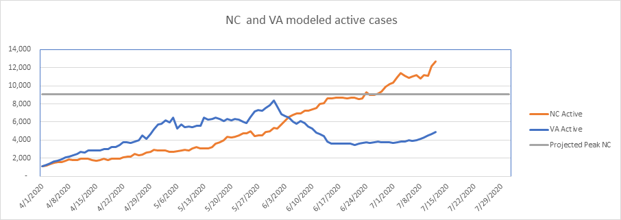
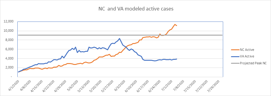
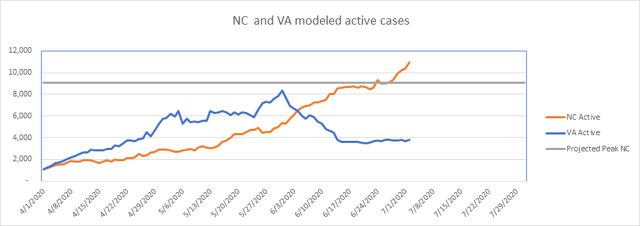
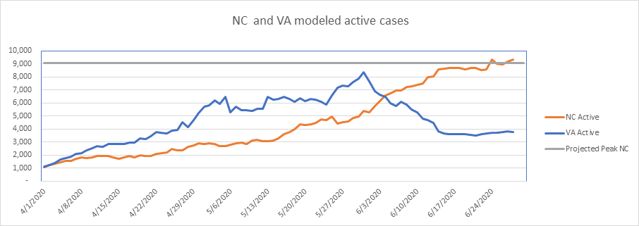
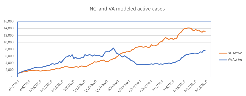
NC is looking pretty good for 12 days now, but if this is the peak, it’s at a very low level (0.14%). We’re scheduled to remain in Phase 2 until August 7th, but I’m thinking the case and death numbers are such that we’ll move to Phase 3 then. IHME is projecting peak daily deaths in NC in the first few days of August. It’s interesting how NC and VA now move together since mid-June.
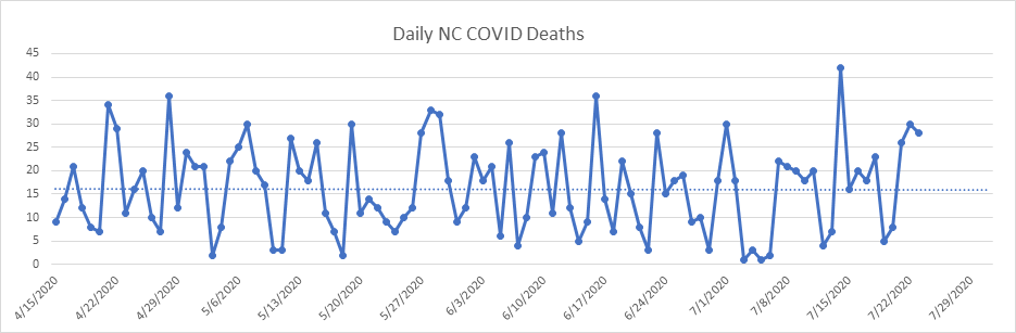
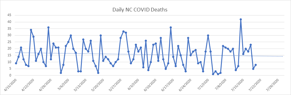
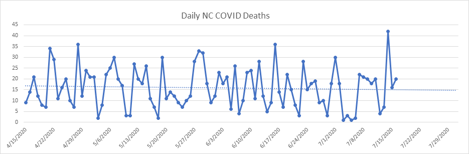
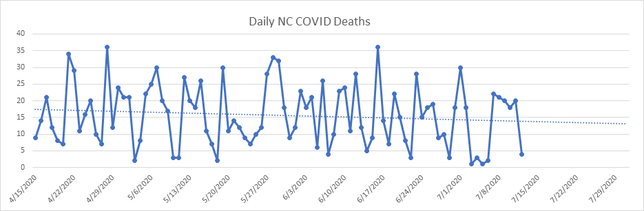
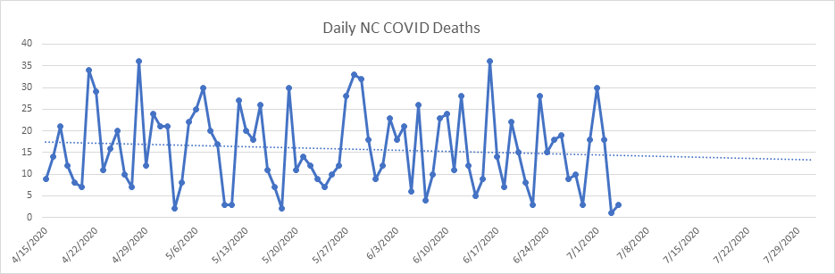
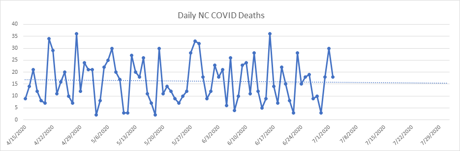
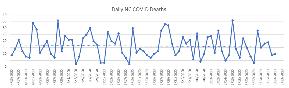
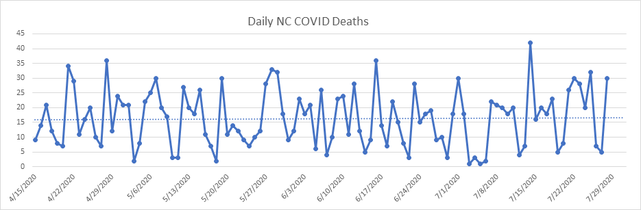
Here is the daily death report for NC. There is no visible upward drift in daily deaths yet, despite the fact that NC has had active cases increasing monotonically for over 3 months. NC extended Phase 2 until August 7th. I think we’ll actually go to Phase 3 this time if this pattern persists.
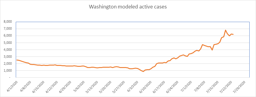
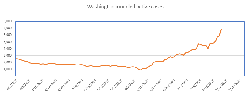
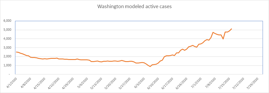
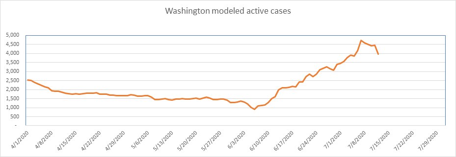
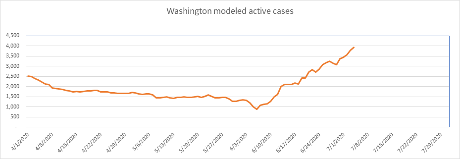
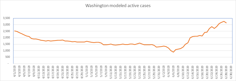
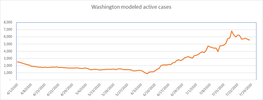
Washington could have peaked, but I’m skeptical, as the high water mark you see here is at just 0.087% of the population. It’s been 9 days, though, so this is hopeful.
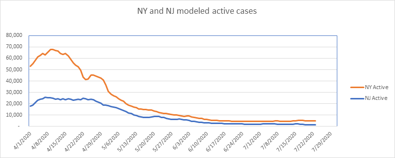
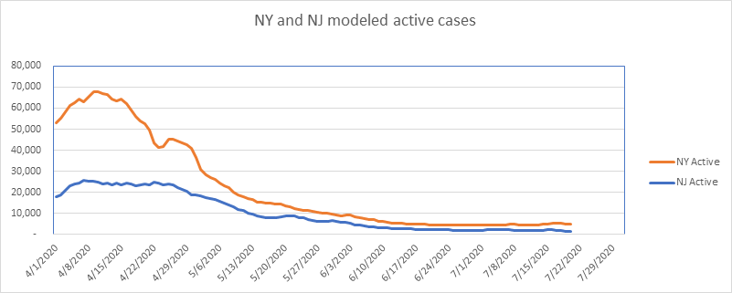
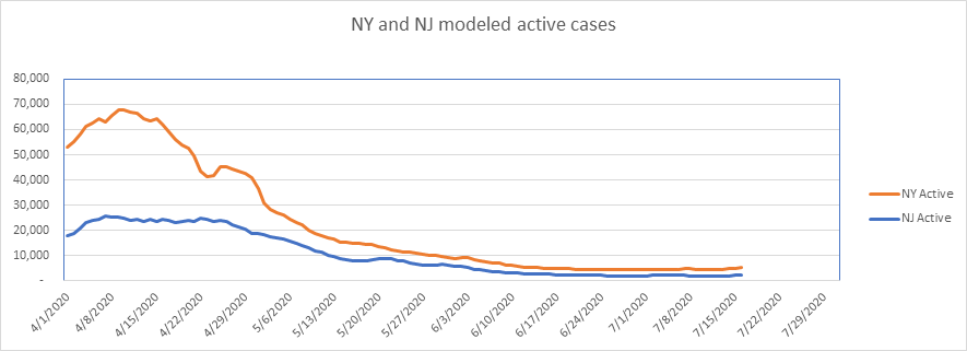
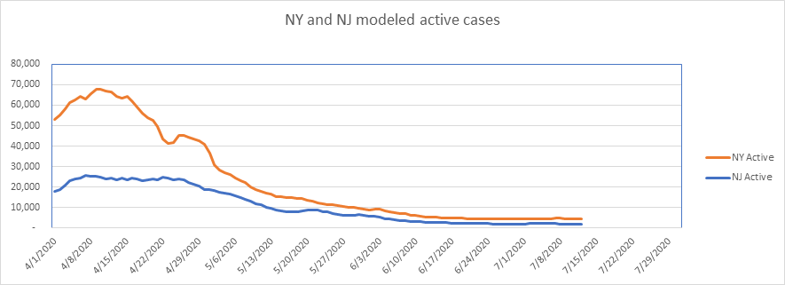
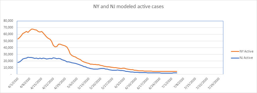
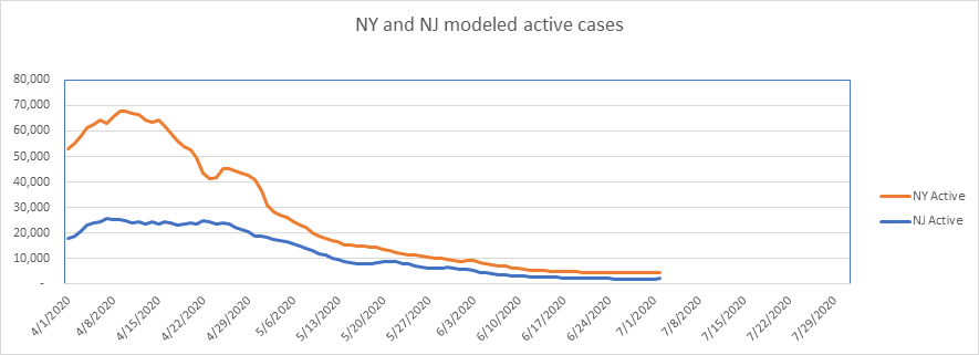
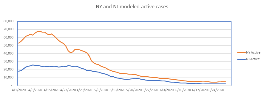
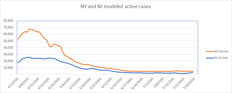
Nothing to say about NY and NJ – the picture says it all. Interesting that NJ is drifting upward lately, which NY continues to gradually fall.
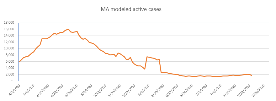
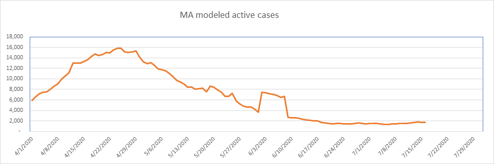
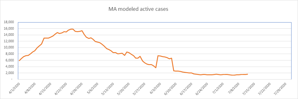
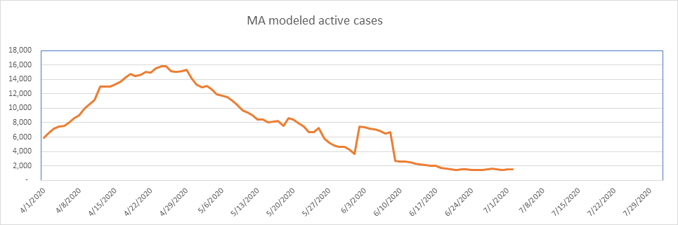
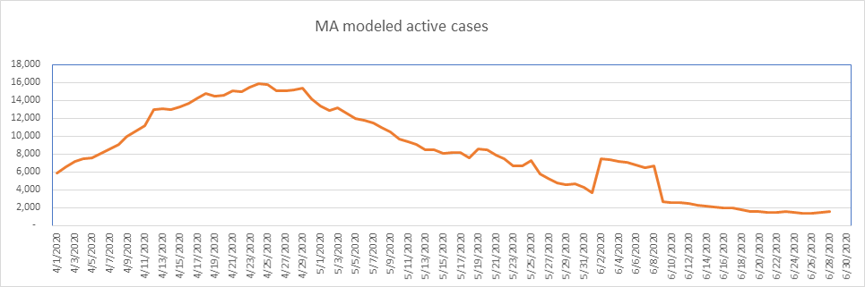
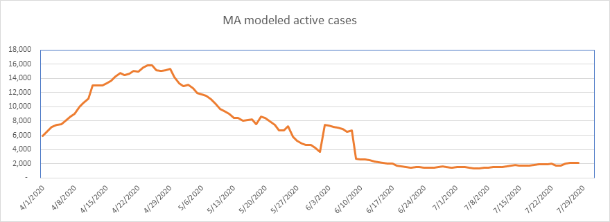
Massachusetts has exhibited a slight upward drift for the better part of July, but it’s very slight.
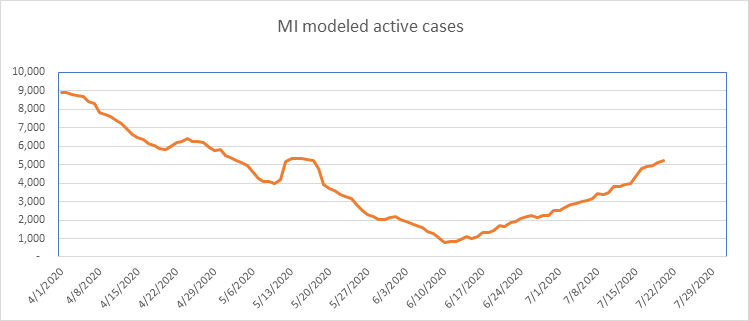
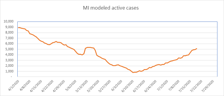
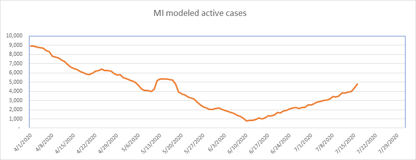
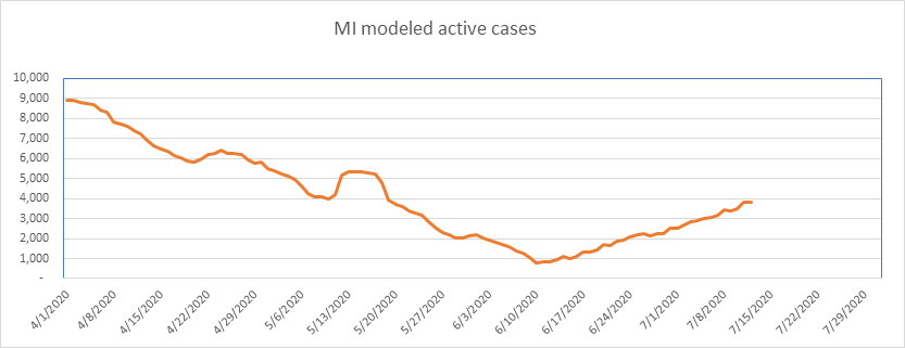
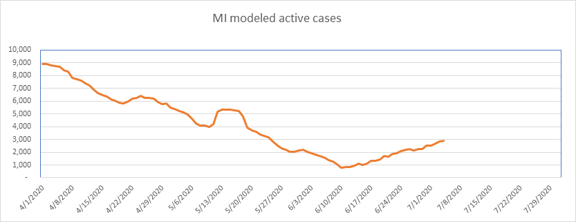
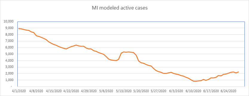
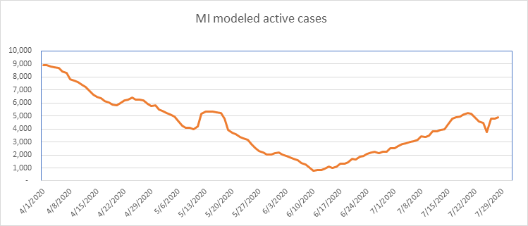
…And here is Michigan. Looking beautiful until June 10th, then beginning a steady upward drift. Michigan peaked at a low percentage of population (0.089%), so may continue to grow if my theory is correct. It is just one of several states that peaked early and low, and doesn’t seem to be done with COVID yet. Nonetheless, we’re down from a week ago, which is welcome news.
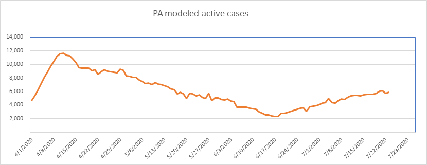
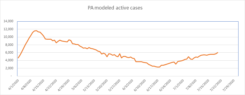
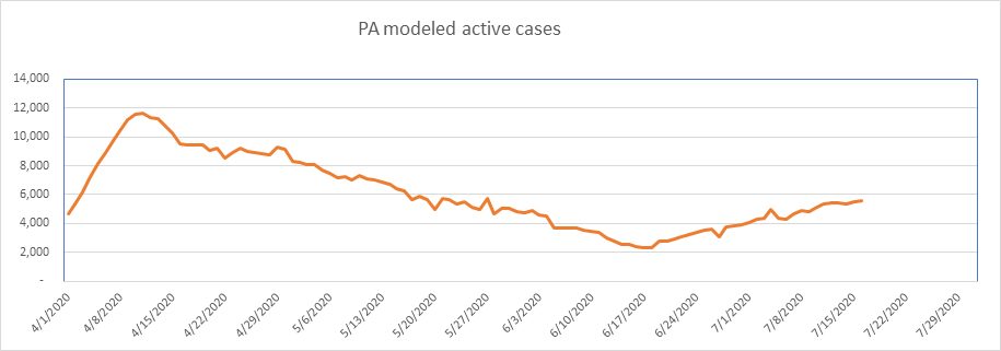
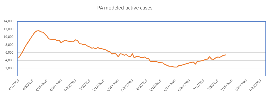
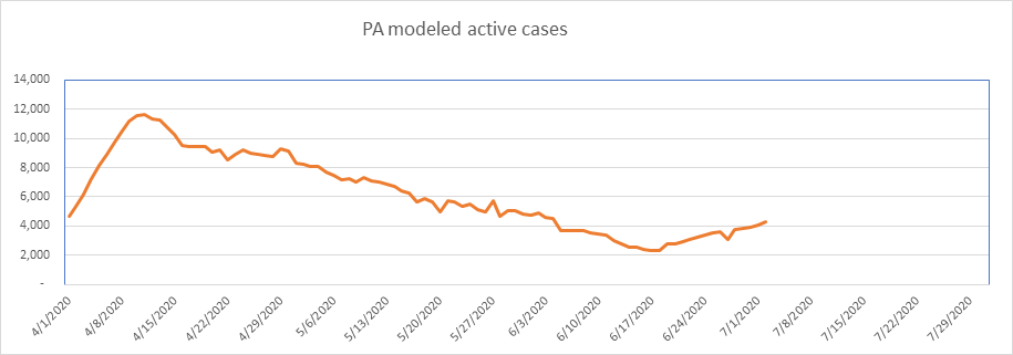
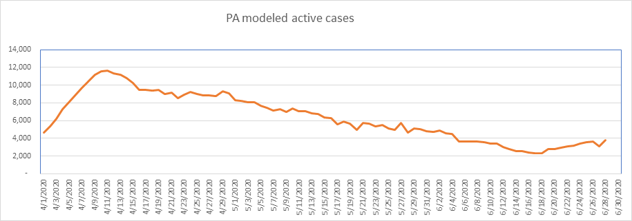
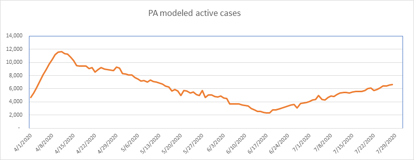
PA looks like Michigan, so the same comments apply. Like MI, PA peaked at a very low population percentage (0.091%), so my expectation is that it will continue to grow.
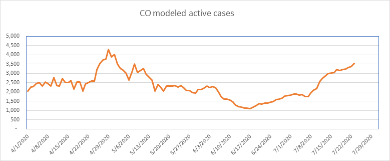
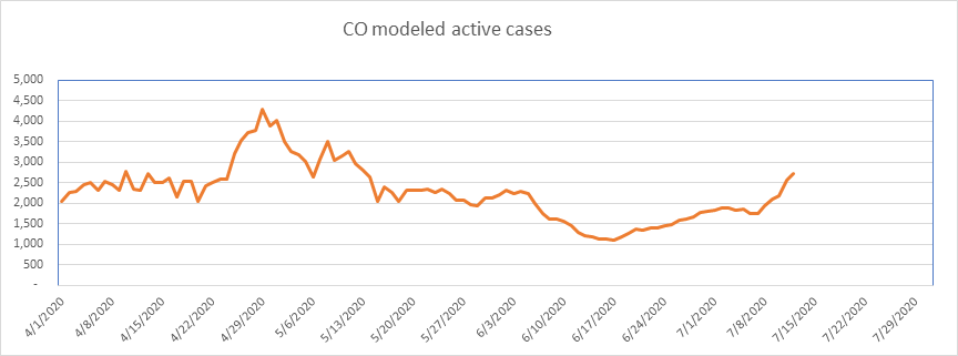
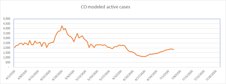
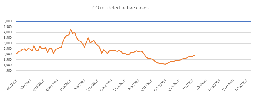
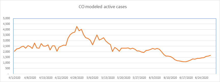
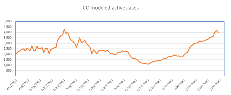
And finally, here is Colorado. Colorado is one of the states that has had aberrations in their data. I still report it, but I’ve shied away from any conclusions in this state due to the data irregularities. Very small numbers here. Colorado peaked at a very small percentage, so could peak again as well. It’s pretty close to a new high lately.
So that’s it for today. I’ll report again on Saturday or Sunday.
The numbers are still very small as a percentage of the population. Unless you’re in a high-density area, your chances of contracting COVID are very small. However, even though the probability is very small, that doesn’t help if you’re the one catching it. Everyone please continue to be as cautious as you feel necessary.
–Shane Chalke, FSA