Well, it’s been a long 20 days since my last report. The propagation of this disease continues to be quite slow, and in fact, not a lot has happened in the last 20 days. We’ve added about 45,000 active known cases, yet the daily death count continues to fall (albeit slowly). In both of the last two updates to the IHME model, they have reduced substantially their forward death predictions. Prior to October 2nd, IHME was projecting nearly 3,620 daily deaths by year end. With their October 2nd update, they lowered that to 2,941, and with the October 9th update, that number is now 2,197. That’s a remarkable 40% reduction in 2 weeks (that should make headlines, but no). I still don’t see any indicators that even this will happen. We are currently averaging less than 1,000 deaths per day, and this number is steadily falling. Even though the active case count is increasing, it is skewing younger, and will have a minimal impact on mortality.
Once I was able to calculate mortality rates by age back in April, I thought that the most effective response to the pandemic was to protect those with high COVID mortality rates, and let everyone else get back to life. Here is my quote from April 28th:
“So as we recover as a society, the methodology seems settled that we’ll unlock one geographic area at a time. But we have 2 easily identifiable populations, once with relatively high risk, and one with a tiny fraction of the risk. It occurs to me that we could more safely unlock by doing it demographically, rather than geographically. We could extend shelter in place rules for seniors and those with definable risk factors, and eliminate them for the under 65 and healthy population. It would also be fairly easy to define perhaps one concentric circle around the vulnerable by maintaining shelter in place rules for certain caregivers and health care workers. So that’s my message for today: Unlock Demographically, Not Geographically.”
At this point, I believe this is what we are naturally doing as a society. Young people have figured out that COVID is not a death sentence for them, and largely bears a similar inconvenience to that of a cold or flu. Those with certain pre-existing diseases and those of advanced age have figured out that they better take the necessary precautions to avoid COVID. Hence the slowly growing case count, and the slowly declining mortality.
This pandemic has eluded modelers from the beginning, including me. I fully expected it to follow the classic Logistic pattern of resource constrained diseases, but it slowed down rapidly and definitively. Here are the puzzling questions:
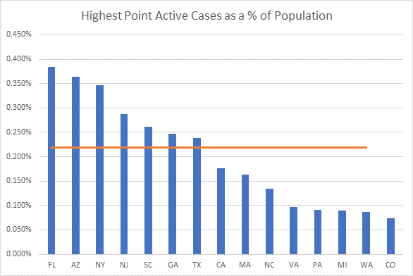
- Why do so few get this disease? We’ve observed an active case ceiling of about 1/3 of one percent of the population.
- Why do some areas have a completely different experience than others, irrespective of societal constraints?
I continue to believe that a significant level of innate resistance to the disease is a part of the puzzle, perhaps through T-Cell cross-reactivity with the common cold. This theory is now a central part of the discussion, but science is all over the place about the actual threshold of herd immunity, and to what extent prior resistance contributes to it. Here is a well written article about some of the latest: https://reason.com/2020/09/29/is-the-covid-19-herd-immunity-threshold-as-low-as-15-percent/
There is yet another possible piece of the puzzle, outlined in this article from The Atlantic: https://www.theatlantic.com/health/archive/2020/09/k-overlooked-variable-driving-pandemic/616548/?mod=djemMER_h As modelers we tend to treat all COVID carriers as the same, often quoting the reproduction rate “r”, as if it is homogeneous across carriers. However, research now shows that probability of transmission varies considerably from individual to individual. Put more simply, many, if not most of those with COVID are not contagious at all, with a minority of carriers responsible for most of the spreading. This article cites numbers in the 80/20 range, where 80% of carriers are not likely to transmit the disease, and 20% of carriers are responsible for most of the spreading.
IF this turns out to true, there are a lot of ramifications. Most importantly, it would explain why this disease grows in spurts, which tend to die out rather quickly. Think of it this way – If one out of 5 people infected is a “spreader”, and the R value is 1 (we’re close to that now), then that means that 4 out of five carriers infect no one, and the 5th infects 5 people. Of those 5 new infected people, there is a 33% probability that not one of them is a spreader, and thus the chain is halted. However, there is a 67% chance that 1 or more of the 5 is a “spreader”, so the chain continues. However, if you do the math, we find that once a single person is infected the chance of the chain dying out by the 3rd generation (about 3 weeks) is well over 50%. No one knows yet what the precise numbers look like, but this is the idea. Clusters pop up and then burn out rather quickly. This matches what we observe, and could at least partly explain why this disease hasn’t gotten more purchase (thankfully).
Another ramification of this theory is that, if true, it adds a higher degree of randomness to the propagation. If an area is unlucky enough to have linked together 5 or 6 generations of spreaders in a single chain, they see a quite noticeable eruption. It’s not nearly so smooth as if it were all homogeneous.
Testing has entered a new level, with daily counts in the million range. We set a new daily record on Saturday, with 1,233,178 tests reported. This explains some of the case count growth, as university testing tends to uncover asymptomatic cases that otherwise would never be known. The U.S. has now recorded over 115 million tests.
On another topic, I continue to be plagued by inconsistent, unreliable, and mistaken data. On September 22nd, Texas reported an additional 21,967 historical cases. On September 25, North Carolina began reporting “probable” cases, and increased their total count by 4,563 in a single day. On Saturday, a private lab in Florida reported about 400,000 test results that appear to have been previously reported, and Florida has had its hands full “de-duping” these. And on and on… It’s been too time consuming for me to run my own “shadow” database, so I’m just letting the numbers run through my model, which in most cases has skewed the case counts higher than actual.
Feel free to send me your questions about my assumptions, methodology, or modeling in general.
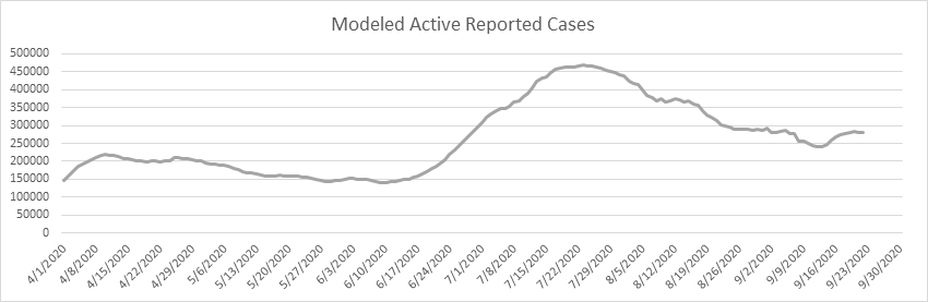
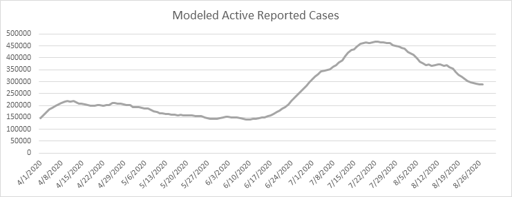
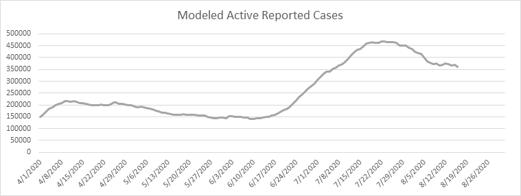
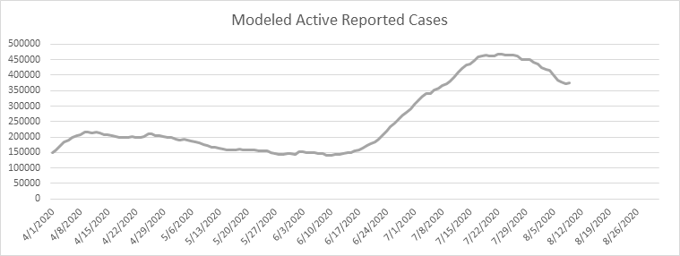
- Modeled known active cases in U.S. 343,790
- Likely date of active case peak (Chalke modeling): July 23
- Likely date of peak deaths (IHME): January 17 (last revision on October 9)
- Total Test Results reported today: 943,645 (very high)
- Total Pending tests reported today: 11,261 (very low)
- National reported case Growth Rate today: 0.61% (very low)
Shane Chalke Interviews
Website
Groom Ventures has agreed to host a website that will archive my daily reports, and supplement with other commentary. John Groom worked at one of my companies back in the day, and is an excellent writer. The website is: www.howmuchrisk.com For those of you that post my daily report on Facebook, let me suggest you link to this site, as the direct Facebook posts don’t seem to copy the graphs.
Daily Analysis
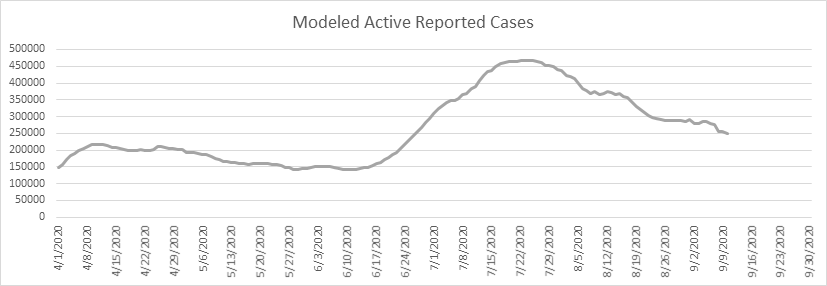
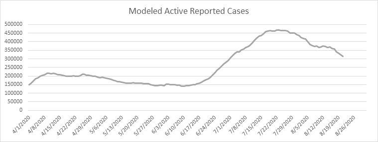
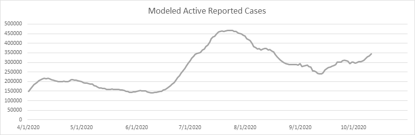
Here is the national picture. Active cases have been trending upwards for nearly 30 days. As always, it’s spotty, with some states seeing increases, and some in continued decline. I mentioned in my last report that I continue to be puzzled by the phenomenon where geographical areas will reach a low level of COVID prevalence, and, rather than continuing the decline, it remains stationary. Will this ultimately be like the common cold (another Coronavirus), where a certain percentage of the population always has it?
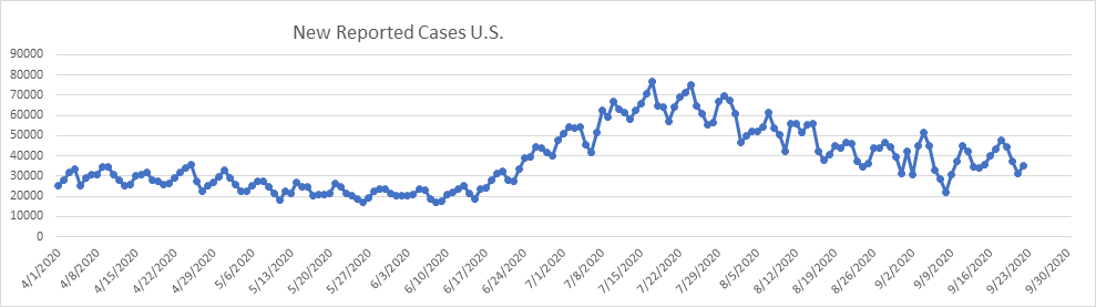
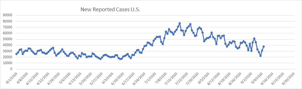
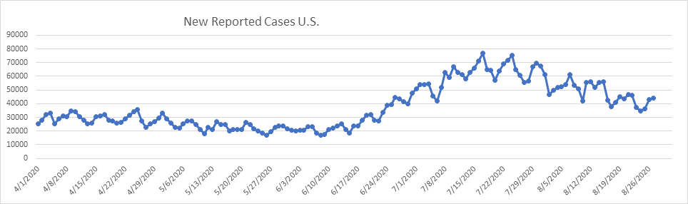
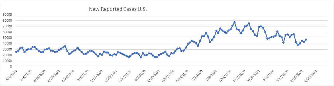
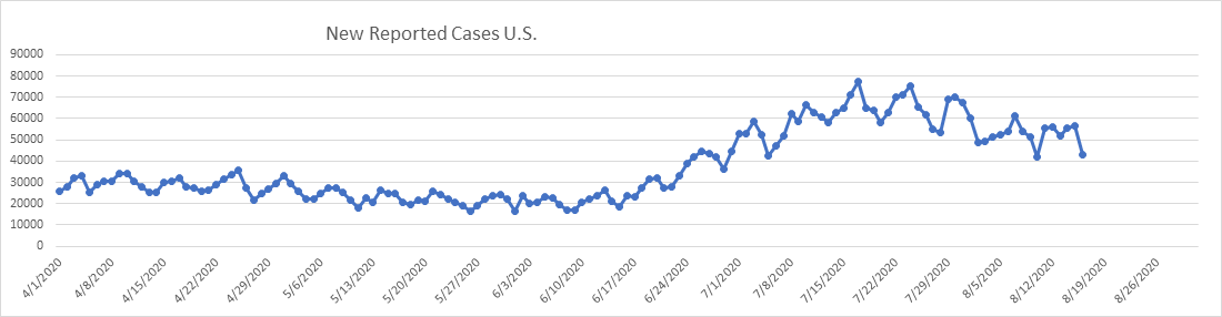
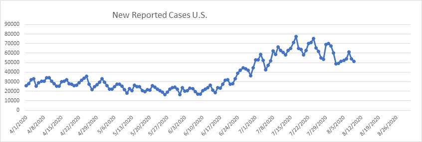
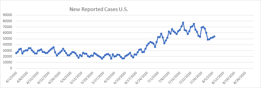
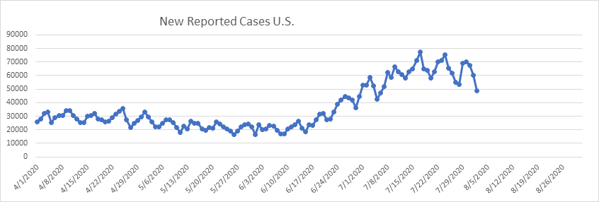
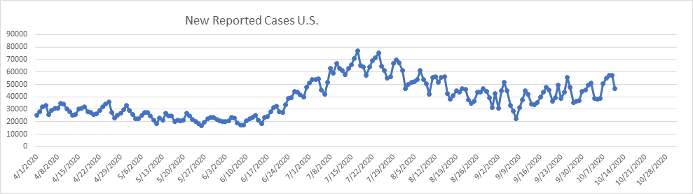
Look at the daily new cases. A strong trend upward since the localized low of early September.
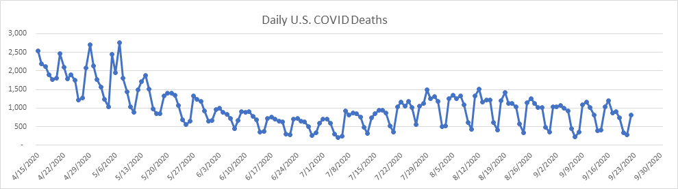
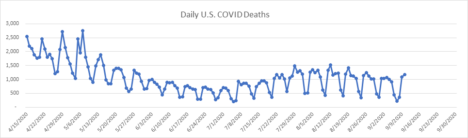
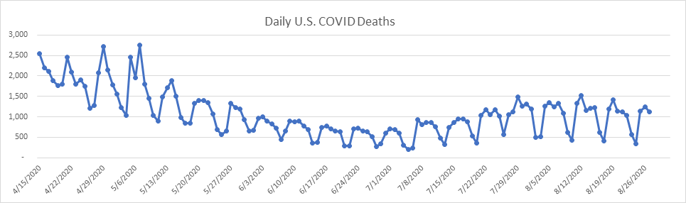
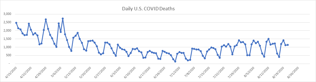
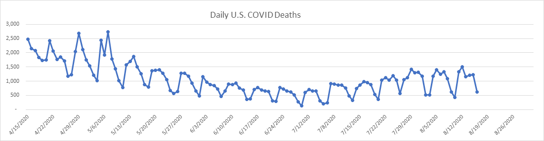
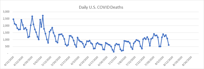
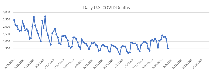
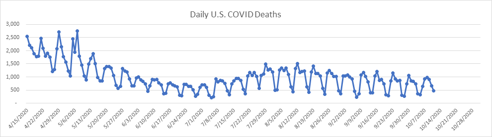
The daily death count is exhibiting a very slow decline for the better part of two months now. Here is the picture:
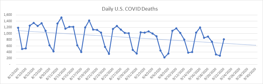
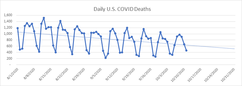
If we isolate the trend since August 1st it becomes obvious. I don’t see anything that threatens to derail this trend.
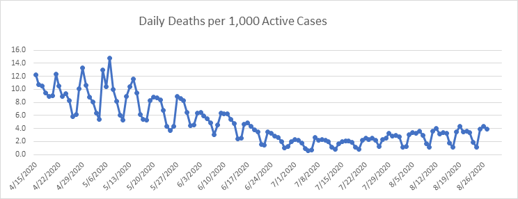
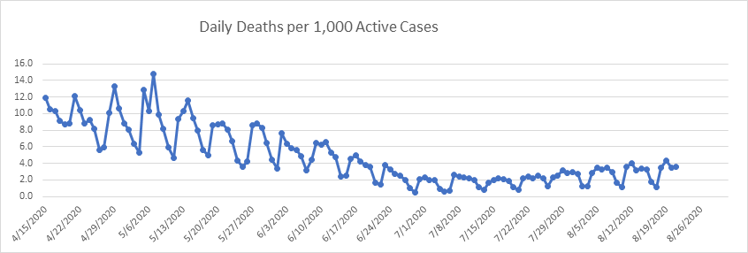
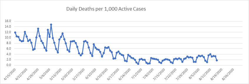
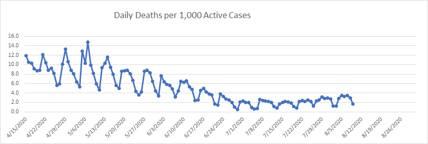
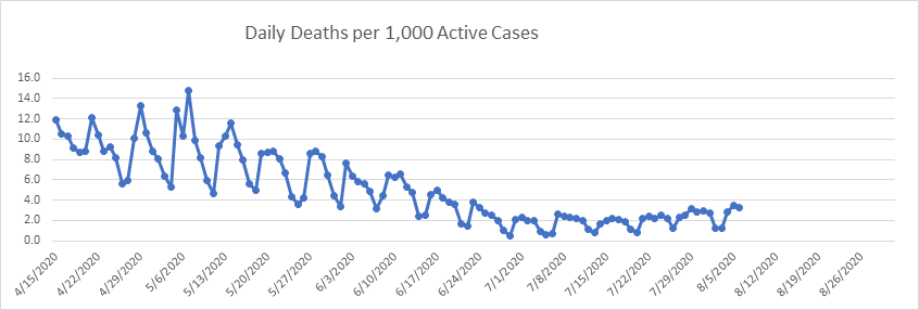
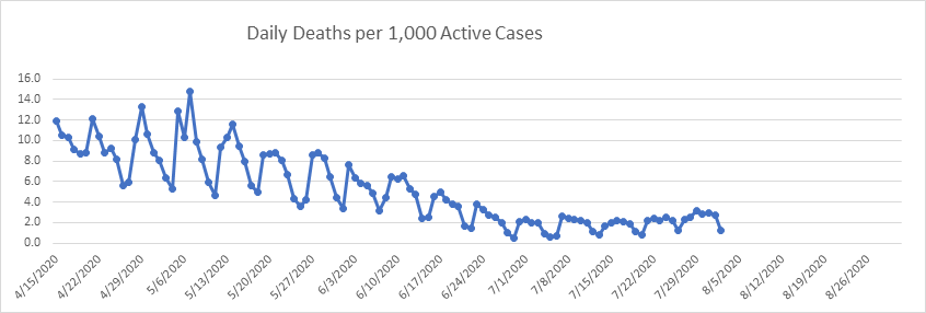
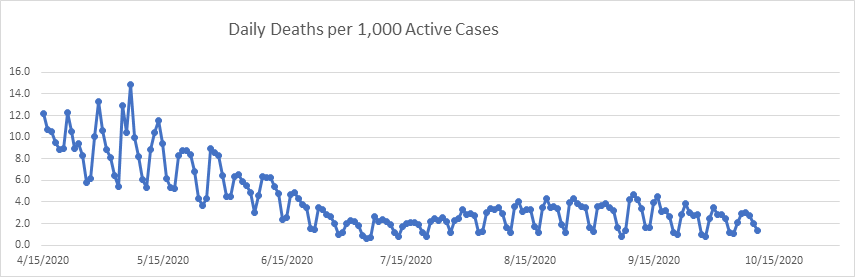
Daily deaths per 1,000 active cases is the best measure of the deadliness of this disease in my opinion. It’s been relatively stable for 2 months now, and decidedly below April and May levels.
On to the states.
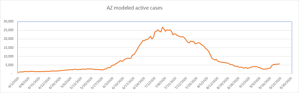
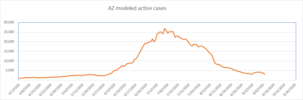
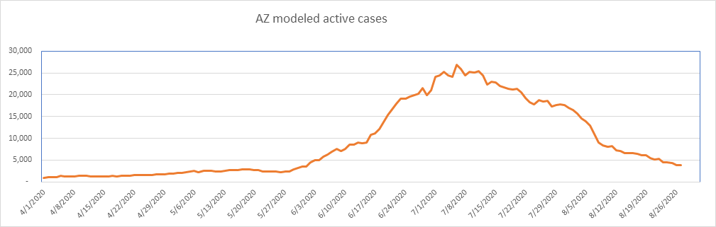
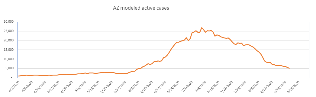
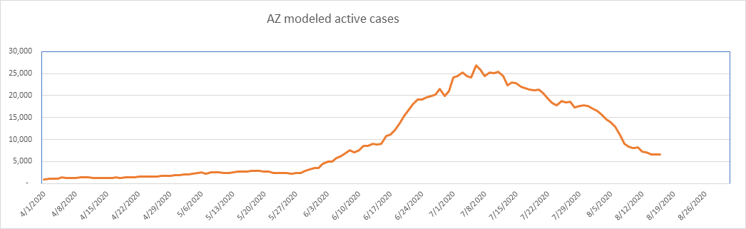
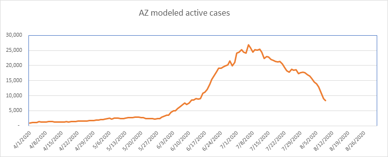
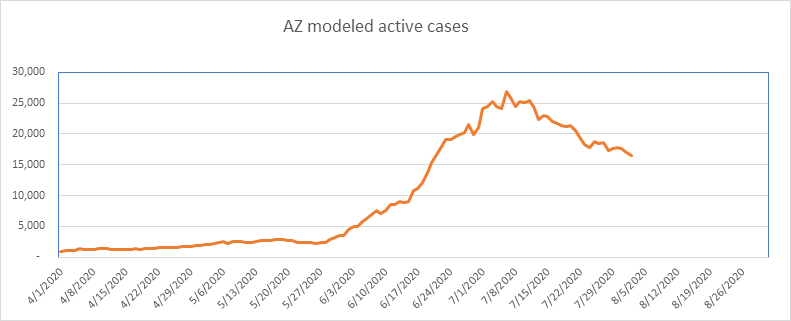
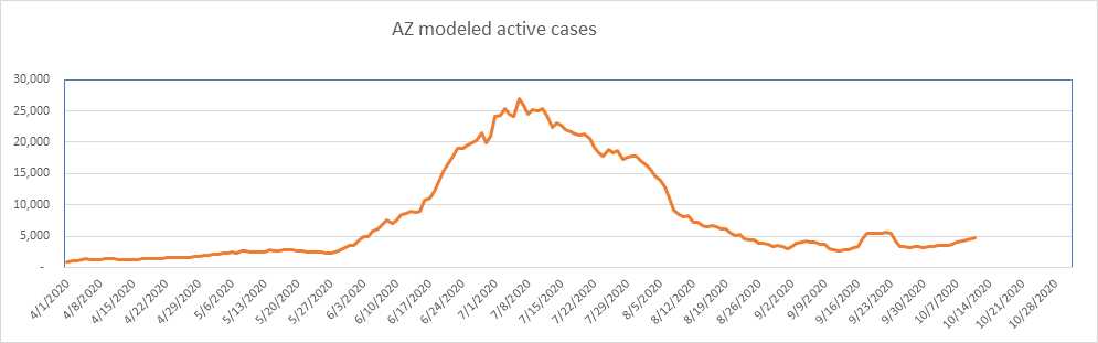
Here is Arizona. They changed their reporting protocol on September 17 to add the results of antigen testing. The mild upward drift is a result of this definitional change. Arizona continues with a fraction of the COVID they had in July.
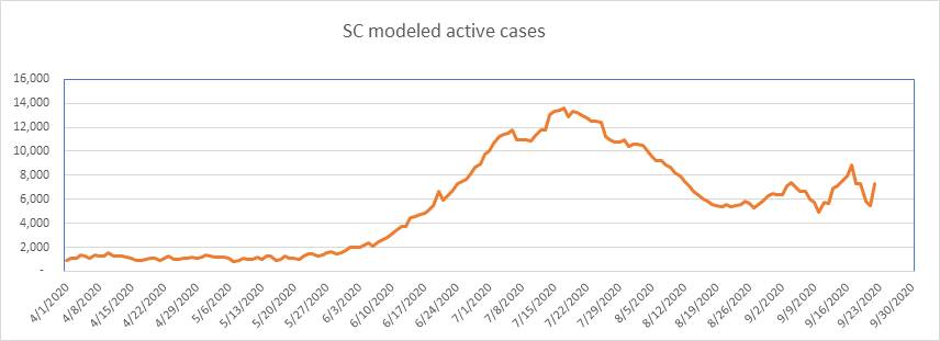
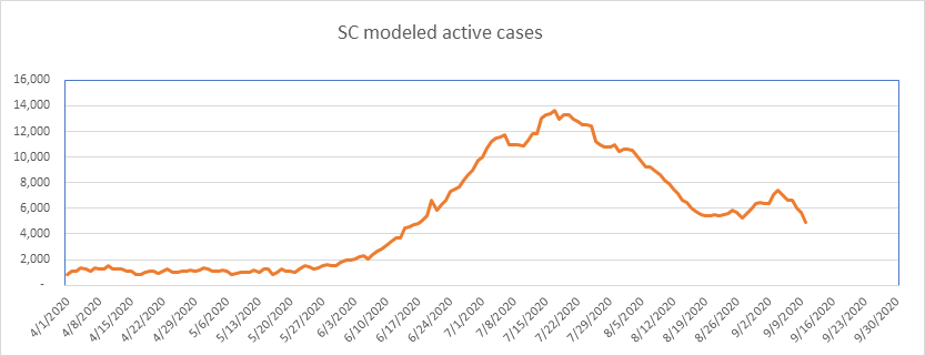
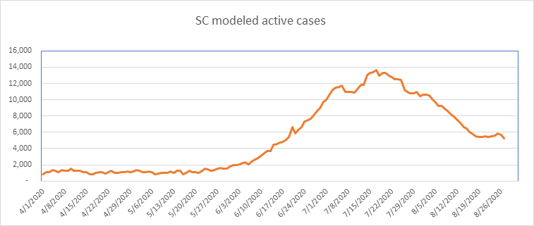
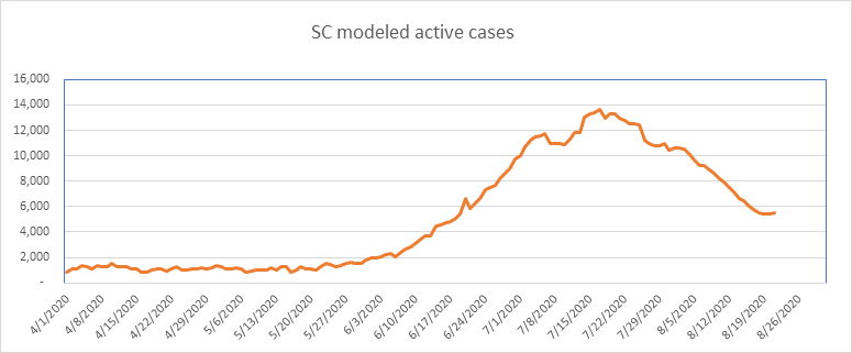
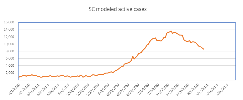
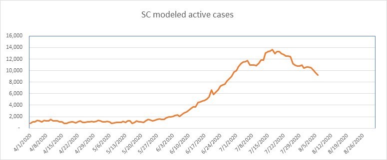
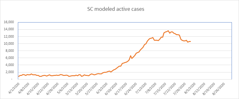
SC has been relatively flat for 6 weeks. Note that South Carolina double counts cases, as they treat each positive test as a new case (per The Covid Tracking Project).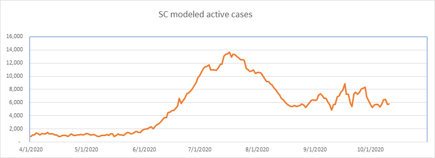
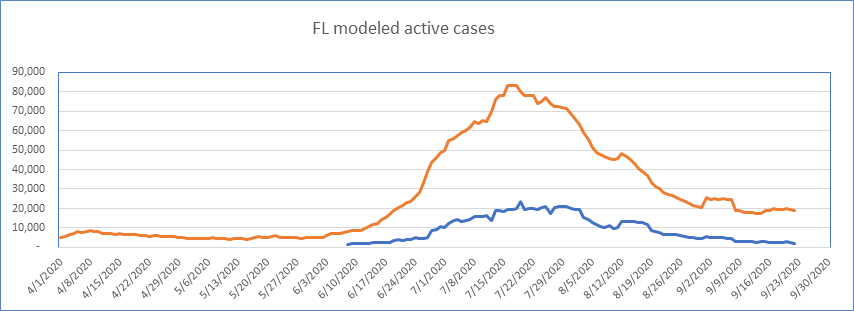
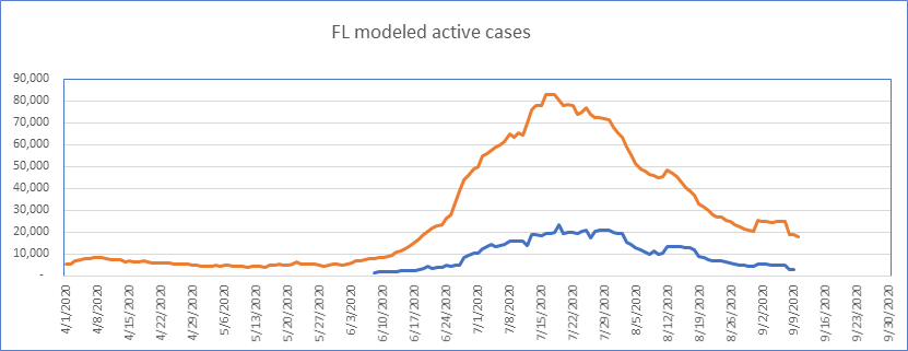
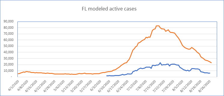
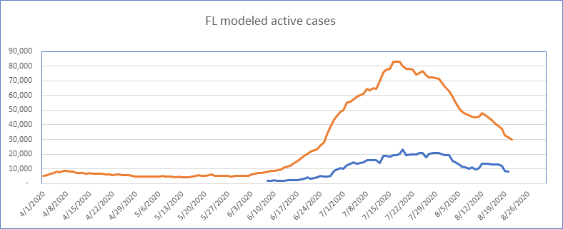
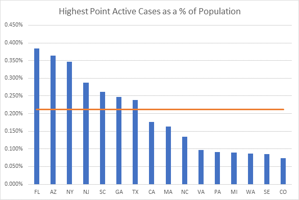
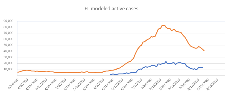
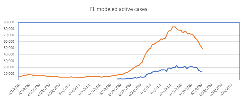
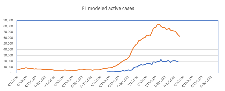
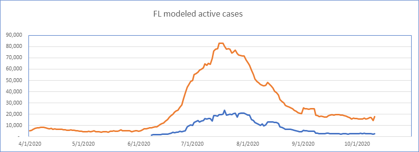
Here is Florida – down dramatically from the top, and fairly flat for a month. Same for Miami.
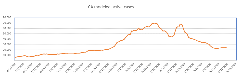
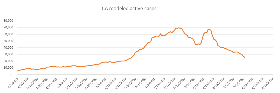
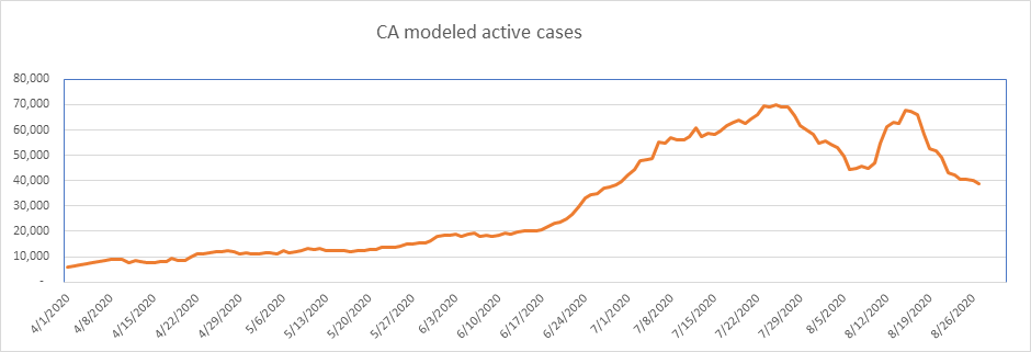
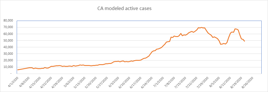
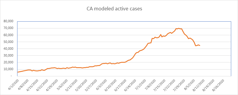
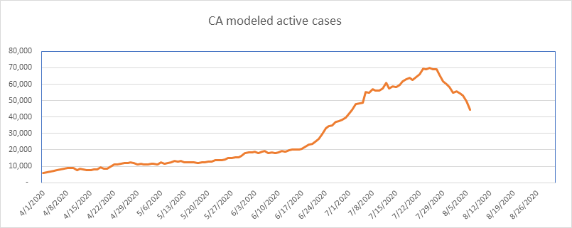
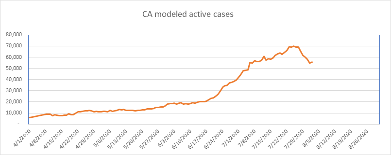
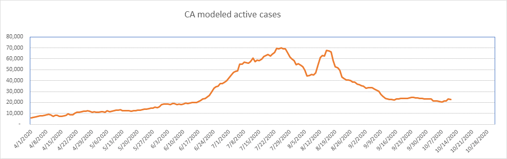
California has had a great recovery, but now flat for the past month. College testing? I think so, but don’t know for sure. As always, I need to report that California is one of the states that counts tests rather than people.
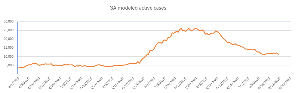
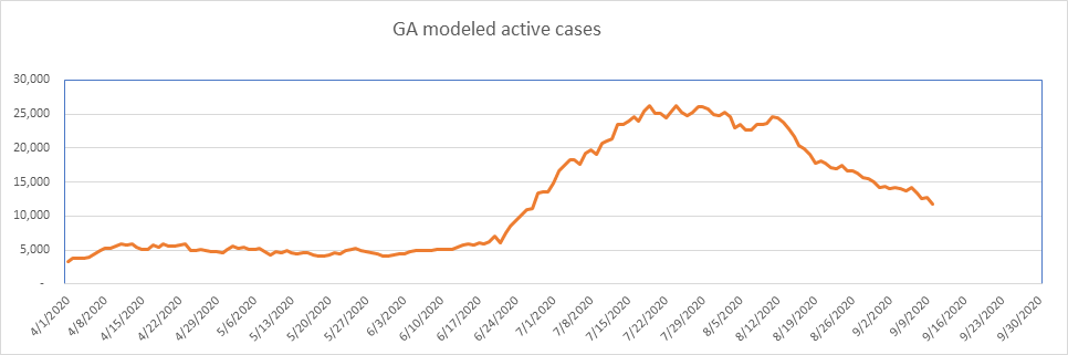
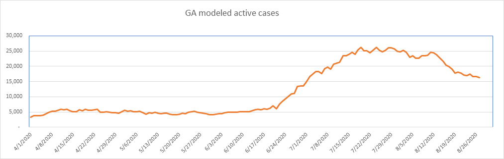
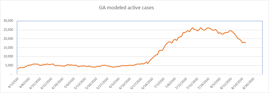
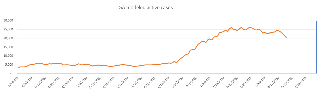
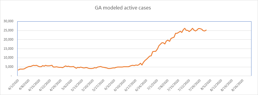
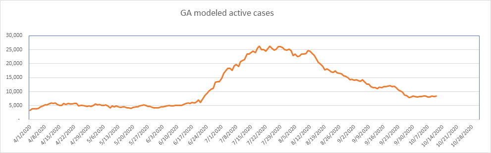
Georgia is still doing pretty well. Flat for a couple of weeks, but no increases. Georgia hit a high of 0.25% of the population, so I’d be surprised to see any real increases here. GA is now down 66% from the peak. Note here again, the case numbers are exaggerated. Georgia counts each positive test as a case (according to The COVID Tracking Project).
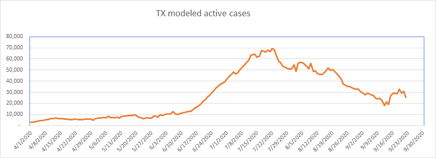
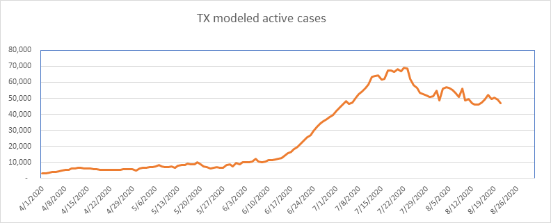
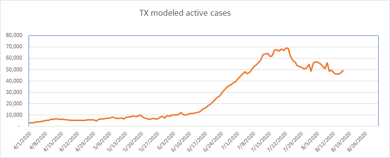
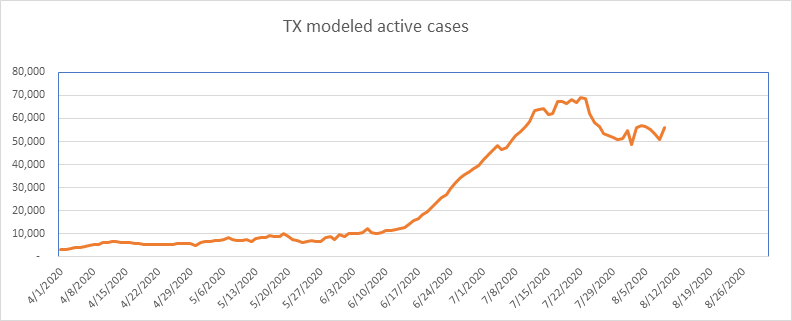
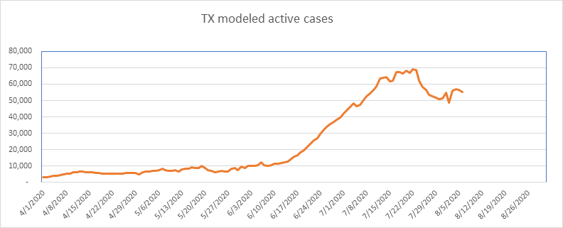
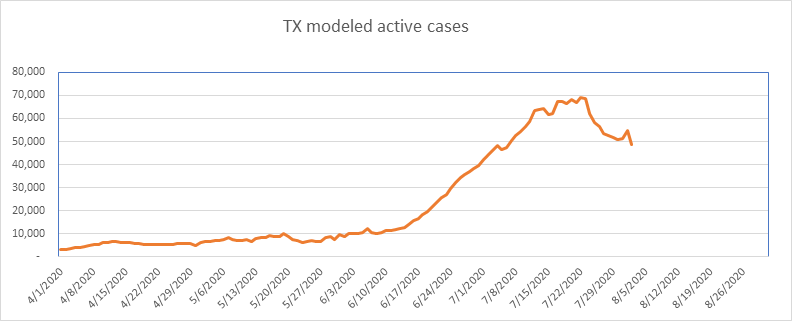
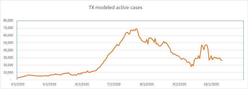
Texas reported nearly 22,000 historical cases around September 23rd, and this skews the data. Note that Texas also reports positive tests as cases, so is doing some level of double counting (per The COVID Tracking Project).
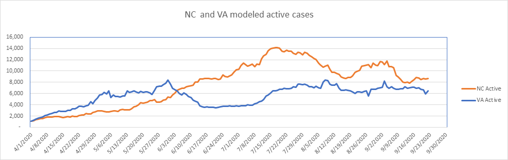
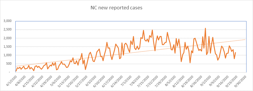
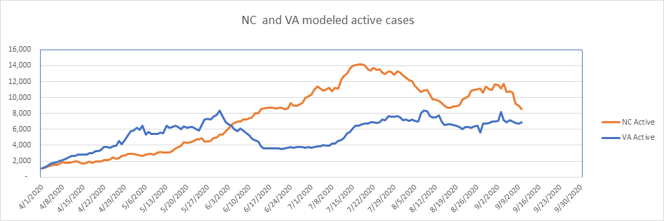
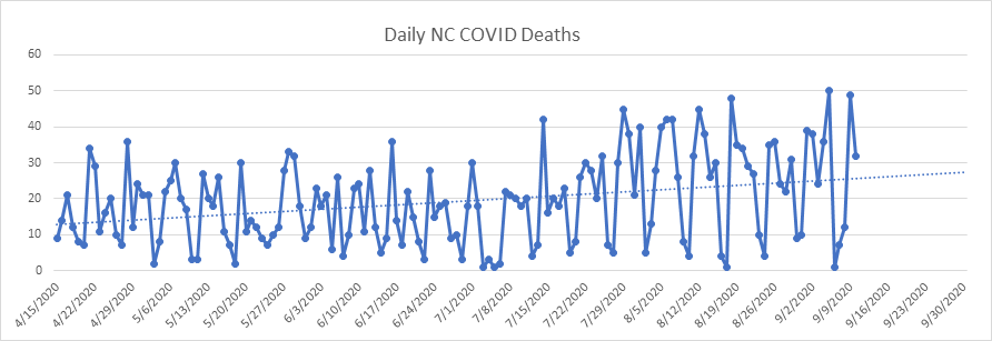
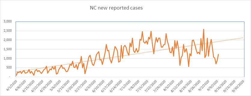
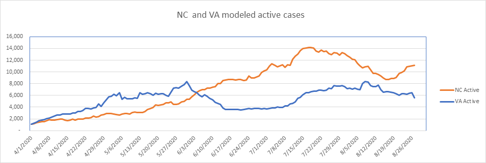
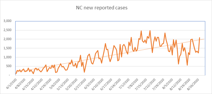
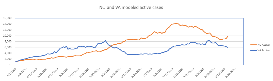
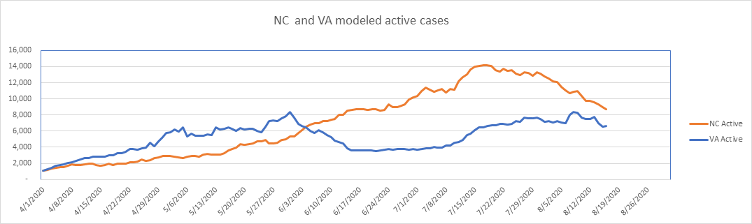
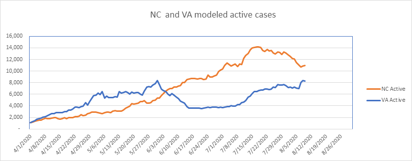
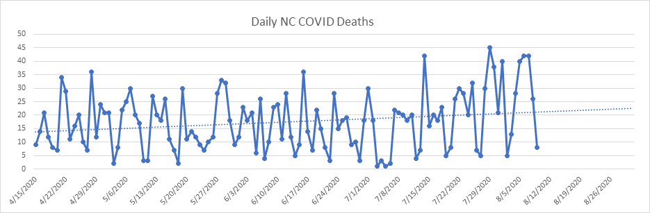
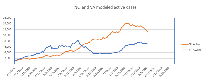
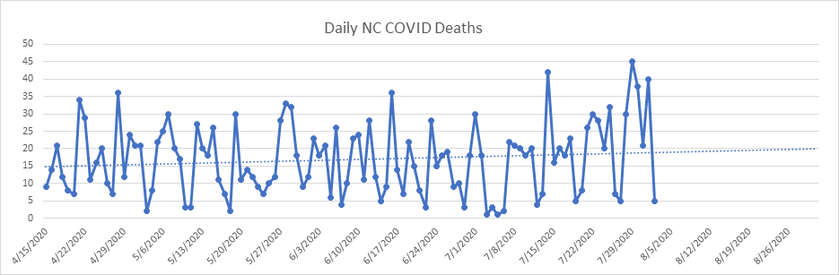
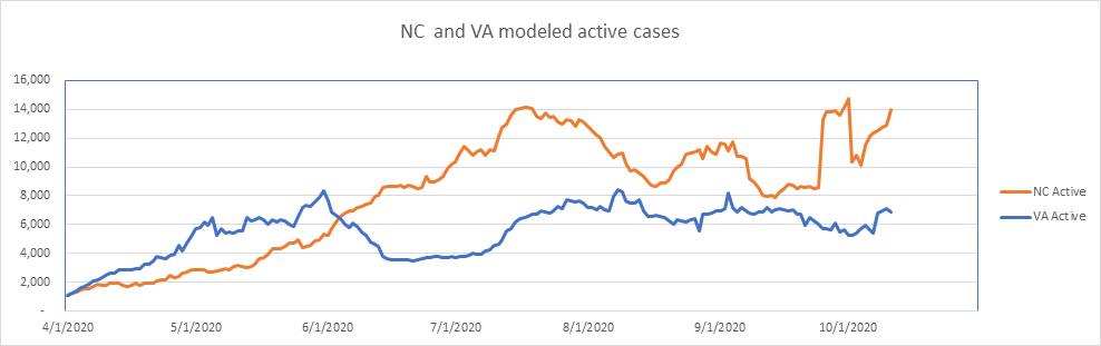
NC and VA tend to track each other, but NC reported an additional 4,563 “probable” cases on September 25th, which skews the results upward inappropriately.
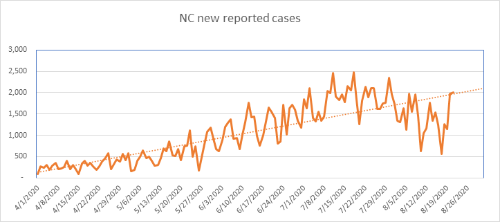
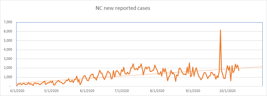
Here is the daily new case count for NC – you can see the anomaly. I should point out that this is not the fault of NC. They simply report the total each day, and the new totals are picked up by the reporting sites and catalogued as new.
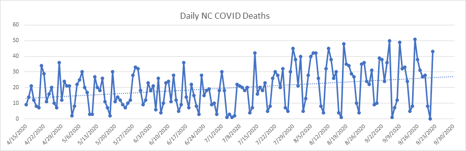
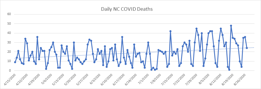
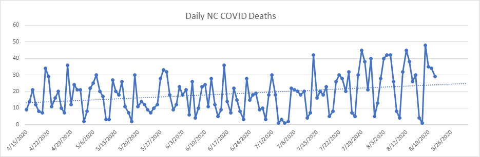
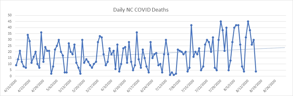
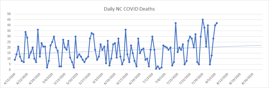
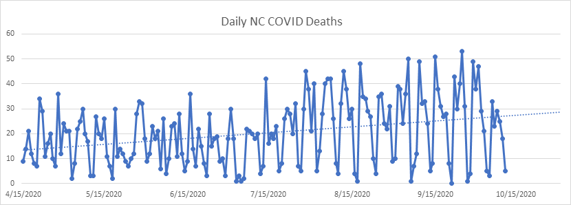
Here is the daily death report for NC, flat for months now.
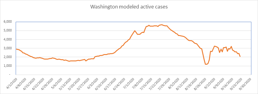
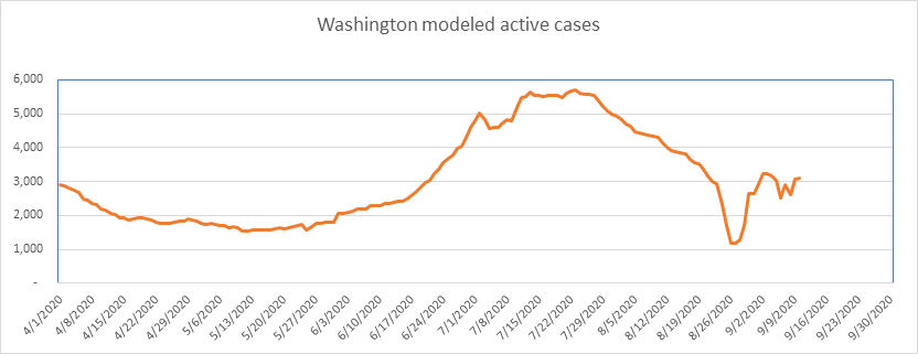
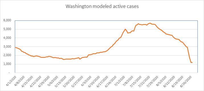
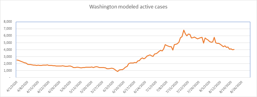
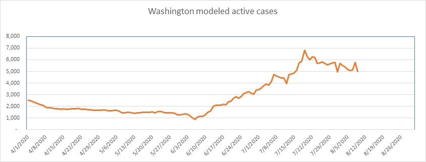
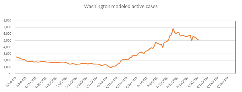
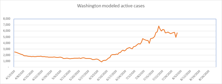
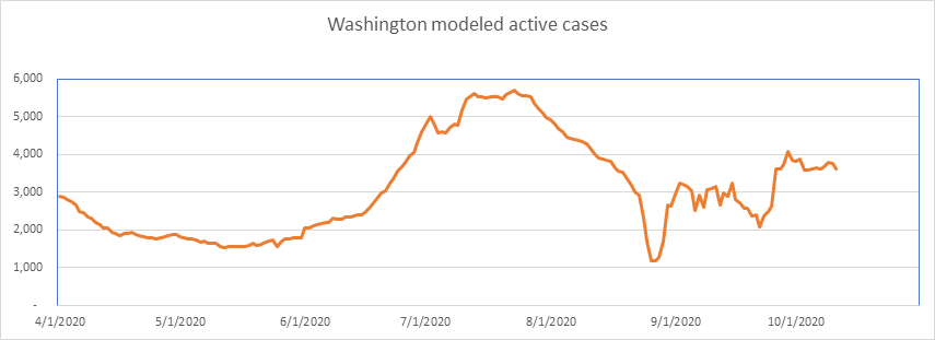
The COVID Tracking Project did a major revision of Washington data in late August, which created the sharp decline you see at the end of the month. It’s popped back up again, based on yet another change in the reporting protocol. These data aberrations have settled now, and we’re back seeing a bit of stability (until they change the protocol again!).
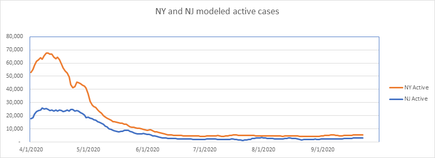
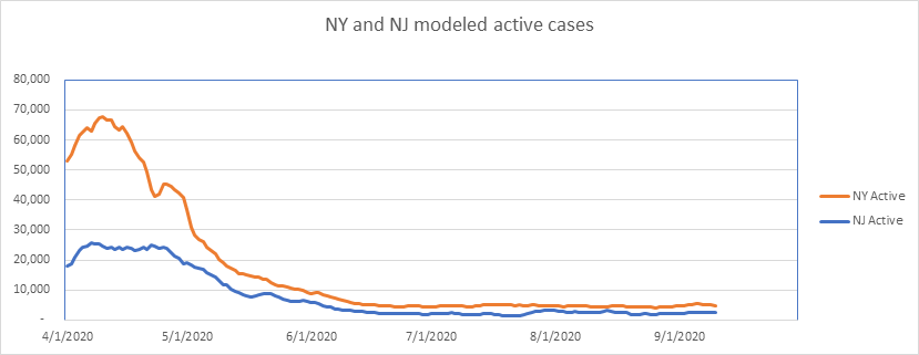
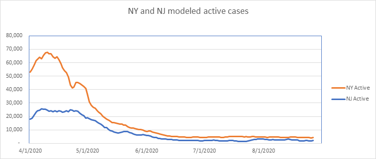
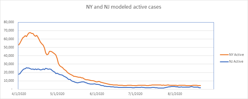
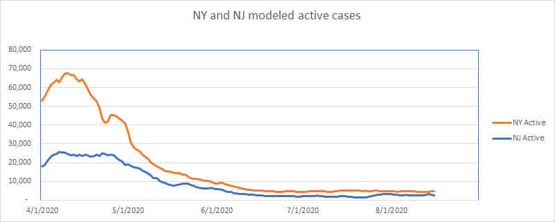
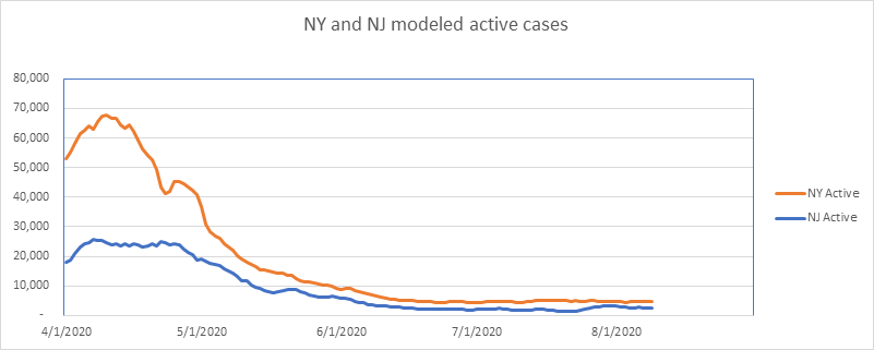
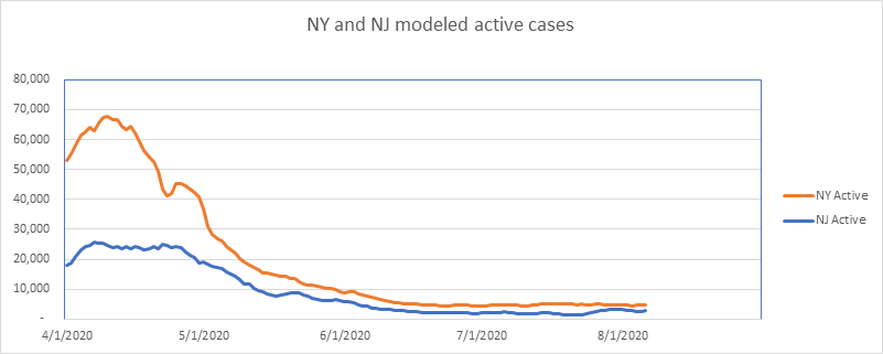
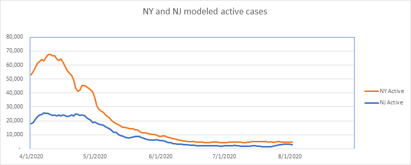
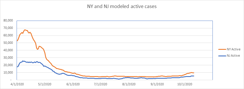
Here are NY and NJ – Significant percentage increases in both NY and NJ, albeit from small numbers.
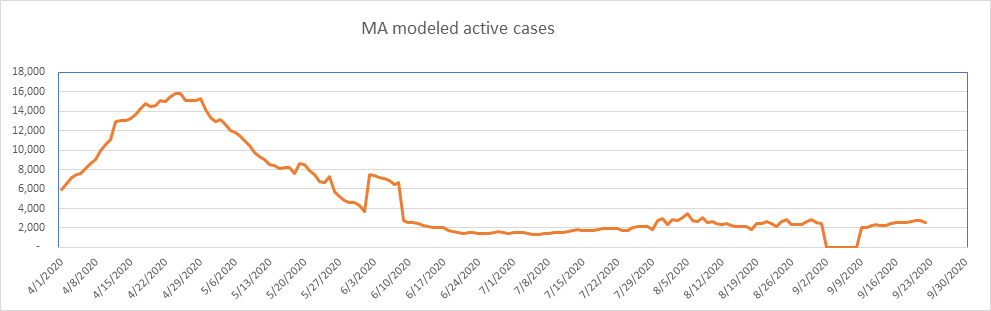
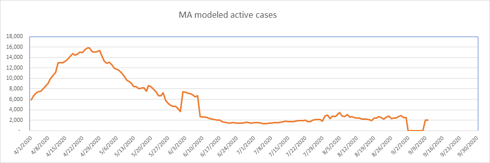
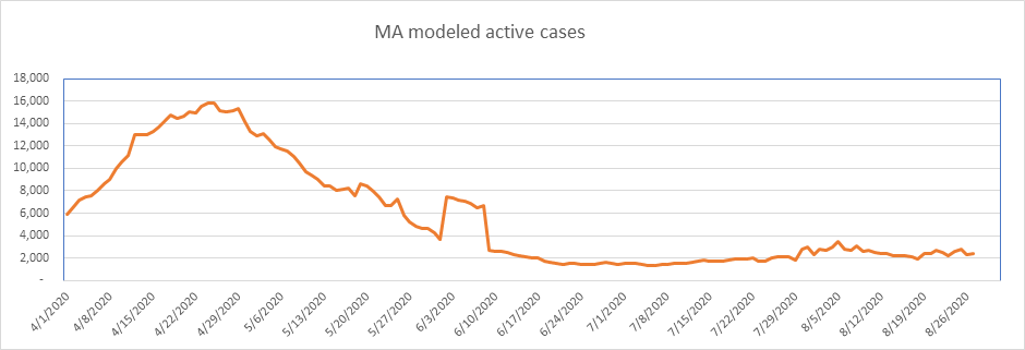
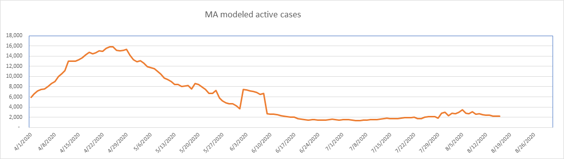
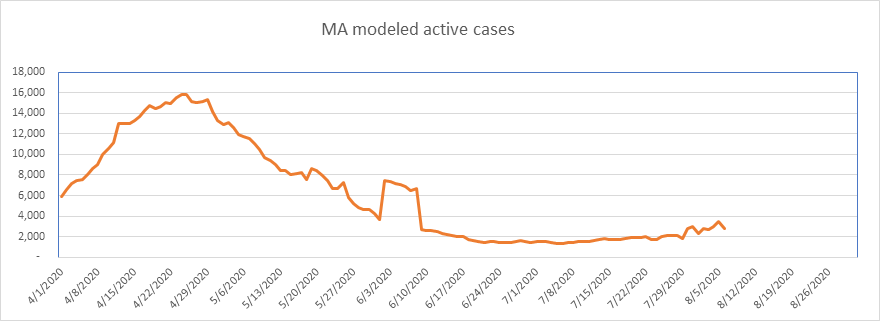
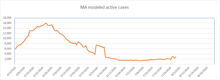
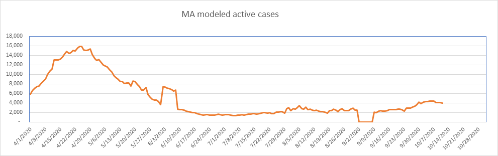
Here is Massachusetts. Like NY, they have a significant percentage increase in active cases, but again, on top of a small base.
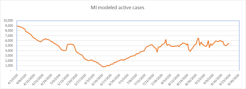
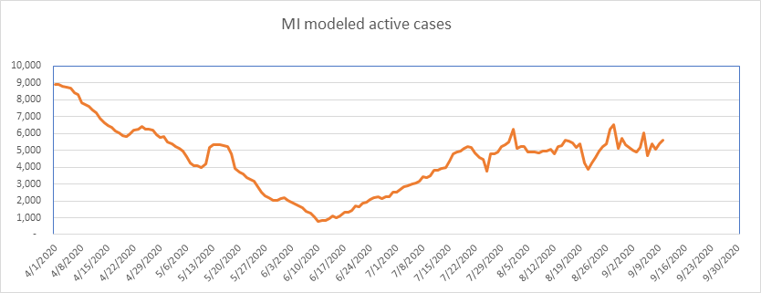
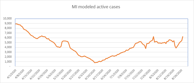
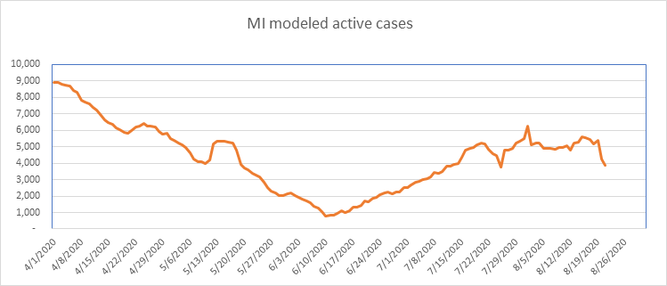
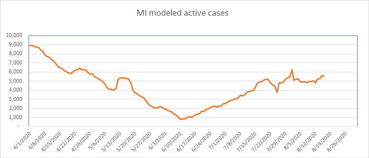
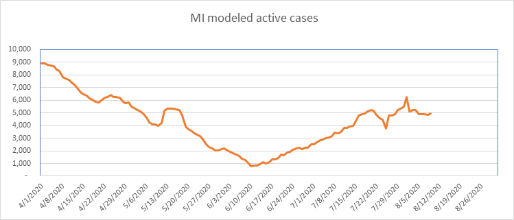
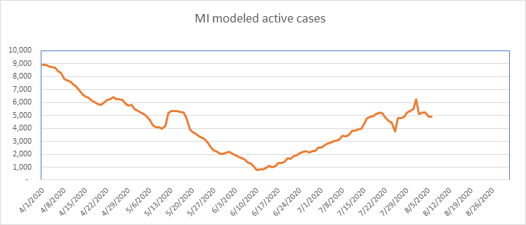
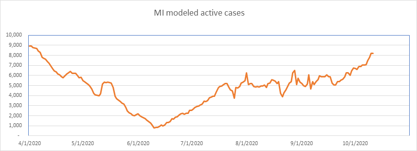
…And here is Michigan. As I expected, Michigan is growing again. They peaked at a very low 0.089% of the population, so have a way to go before hitting the population ceiling.
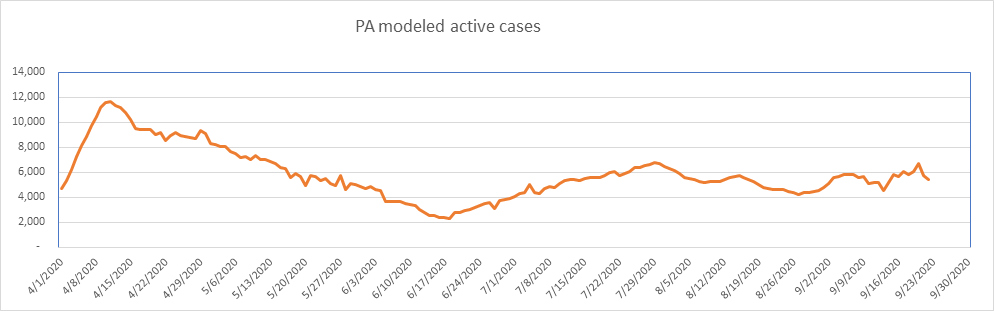
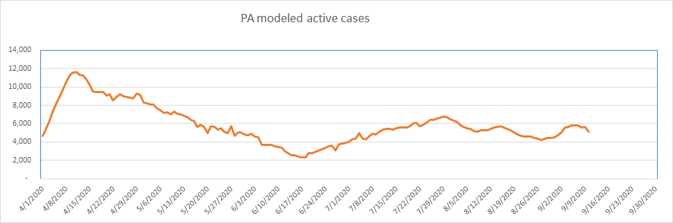
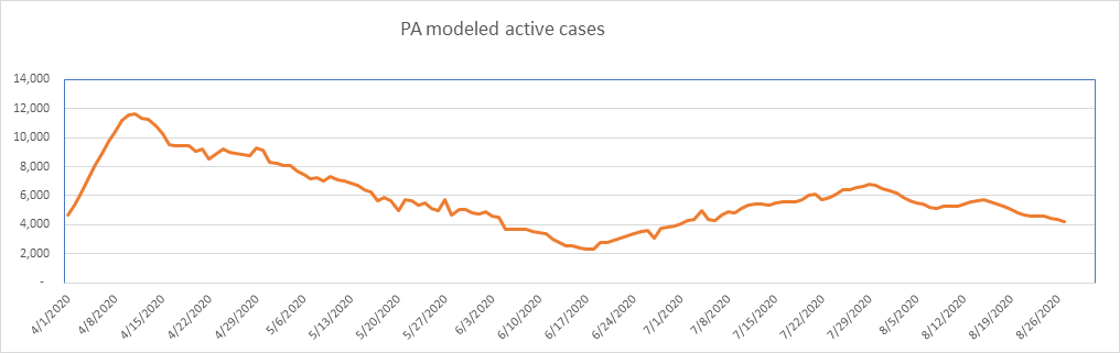
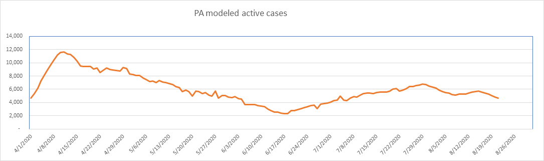
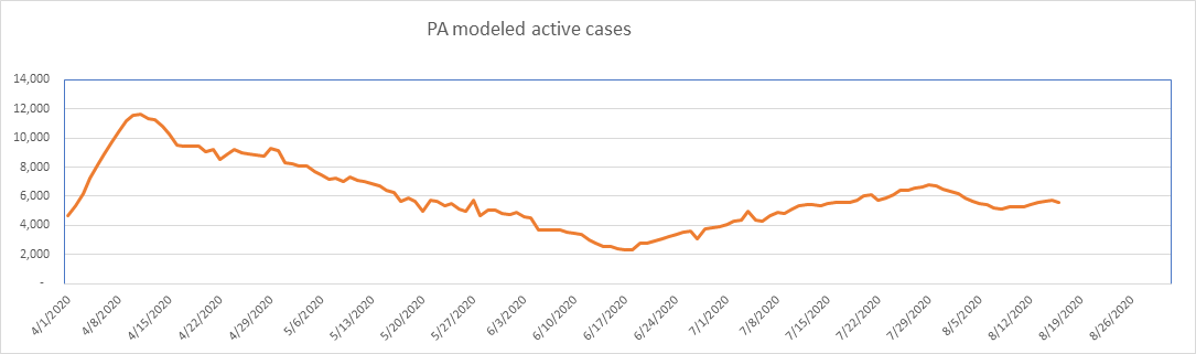
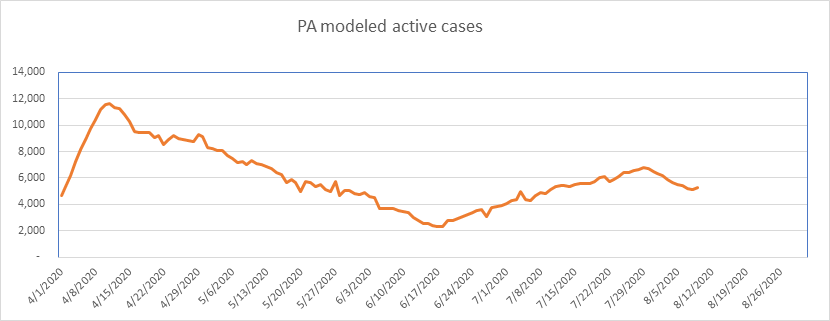
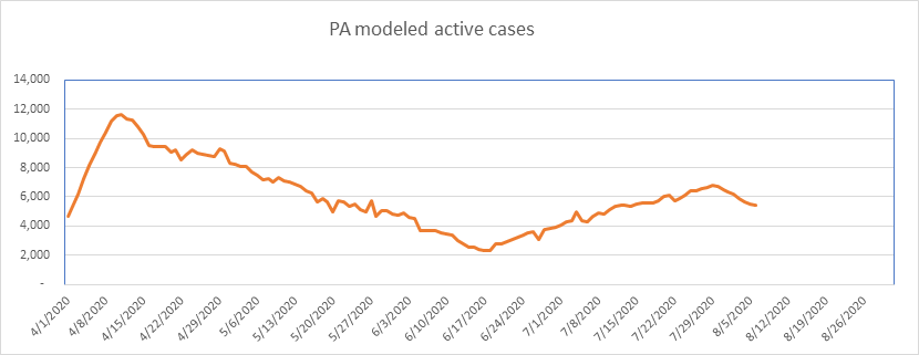
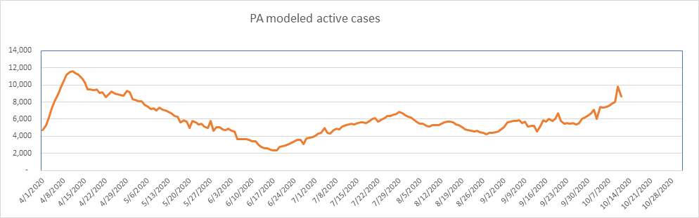
PA is also growing, as expected. The peak was very low (0.091% of the population), so I believe there is more to come.
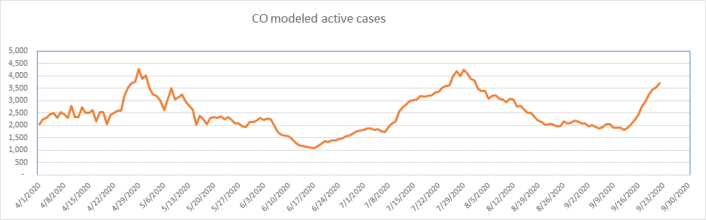
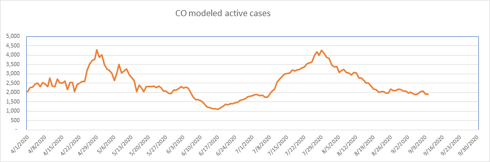
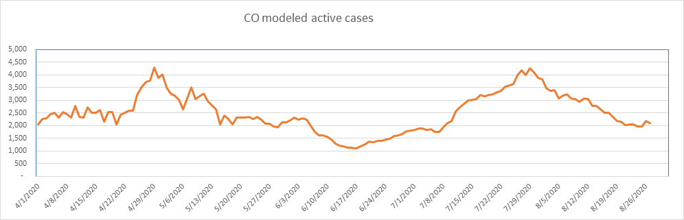
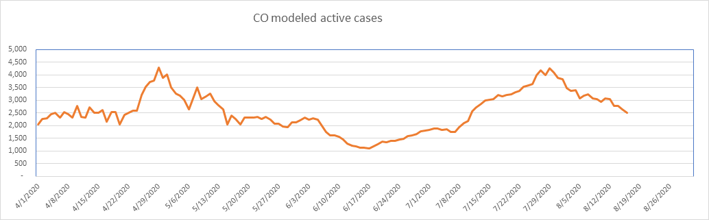
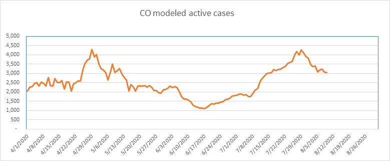
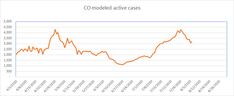
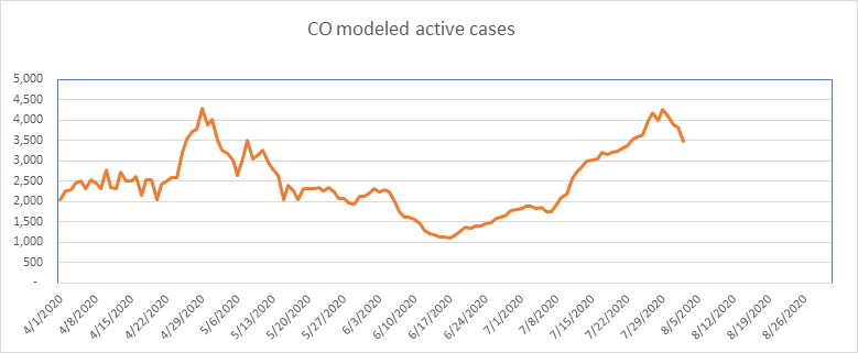
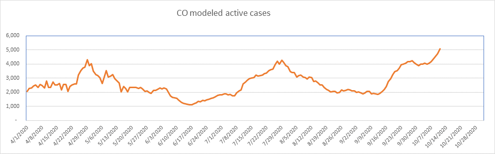
And finally, here is Colorado, at a new peak. It’s still only 0.087% of the population, so more to come I’m afraid.
So that’s it for today. I’ll report again in a week or so (longer if absolutely nothing changes).
The numbers are still very small as a percentage of the population. Unless you’re in a high density area, your chances of contracting COVID are very small. However, even though the probability is very small, you still don’t want to get it. Everyone please continue to be as cautious as you feel necessary.
–Shane Chalke, FSA